GW Library

Library Version 5.5
Documentation Version 20210224
Library written by Nicolas Mougin
Documentation written by Robert A. Rioja
Table of Contents
GW LibraryTable of Contents
1 Introduction
1.1 Disclaimer
1.2 Acknowledgments
1.3 Download the GW Doc Examples
1.4 Technologies Behind GW
1.5 Controls and Control IDs
1.6 Customizing the Controls
1.7 User Interaction
1.8 Conflicts
2 Before Loading the Library
2.1 GW_COLOR$
2.2 GW_ORIENTATION$
2.3 GW_SILENT_LOAD
3 Loading the Library
3.1 INCLUDE "GW.bas"
3.2 GW_VER$()
4 Pages
4.1 Specify Page Settings Before Page Creation
4.1.1 GW_DEFAULT_TRANSITIONS()
4.1.2 GW_LOAD_THEME()
4.1.3 GW_UNLOAD_THEME()
4.1.4 GW_ZOOM_INPUT()
4.2 Page Creation
4.2.1 GW_NEW_PAGE()
4.2.2 Page Customization
4.2.3 Page Transitions
4.3 Specify Page Settings After Page Creation
4.3.1 GW_ADD_LOADING_IMG()
4.3.2 GW_CENTER_PAGE_VER()
4.3.3 GW_PREVENT_SELECT()
4.3.4 GW_ALLOW_SELECT()
4.3.5 GW_SET_TRANSITION()
4.3.6 GW_USE_FONT()
4.4 Using the Page
4.4.1 GW_RENDER()
4.4.2 GW_CLOSE_PAGE()
4.5 Interacting With Page Contents
4.5.1 GW_WAIT_ACTION$()
4.5.2 GW_ACTION$()
4.5.3 GW_ADD_LISTENER()
5 Title and Foot Bars
5.1 GW_ADD_BAR_TITLE$()
5.2 GW_ADD_BAR_LBUTTON$()
5.3 GW_ADD_BAR_LMENU$()
5.4 GW_ADD_BAR_RBUTTON$()
5.5 GW_ADD_BAR_RMENU$()
5.6 GW_ICON$()
5.7 GW_ADD_TITLEBAR()
5.8 GW_ADD_FOOTBAR()
5.9 GW_ADD_LISTENER()
5.10 Title and Foot Bar Example
5.11 Title and Foot Bar Customization
5.12 Changing Title and Foot Bar Content
6 Specify Layout of Controls Before Adding Them
6.1 GW_OPEN_COLLAPSIBLE()
6.2 GW_CLOSE_COLLAPSIBLE()
6.3 GW_OPEN_GROUP()
6.4 GW_CLOSE_GROUP()
6.5 GW_START_CENTER()
6.6 GW_STOP_CENTER()
6.7 GW_SHELF_OPEN()
6.8 GW_SHELF_NEWCELL()
6.9 GW_SHELF_NEWROW()
6.10 GW_SHELF_CLOSE()
7 Apply Customization to Controls Before Adding Them
7.1 GW_USE_THEME_CUSTO_ONCE()
7.2 GW_NEW_THEME_CUSTO()
7.3 GW_USE_THEME_CUSTO()
7.4 GW_RESET_THEME_CUSTO()
7.5 GW_ADD_FONT$()
7.6 GW_NEW_CLASS()
7.7 Customization Parameters
7.7.1 align
7.7.2 alpha
7.7.3 big
7.7.4 class
7.7.5 color
7.7.6 fit-screen
7.7.7 font
7.7.8 hover
7.7.9 icon
7.7.10 iconpos
7.7.11 inline
7.7.12 mini
7.7.13 notext
7.7.14 position
7.7.15 style
7.7.16 valign
7.7.17 wrap
8 Standard Controls
8.1 GW_ADD_AUDIO()
8.1.1 Changing Audio Source
8.2 GW_ADD_BUTTON()
8.2.1 Button Customization
8.2.2 Changing Button Value and Interacting With Buttons
8.3 GW_ADD_ICON()
8.4 GW_ADD_IMAGE()
8.4.1 Image Customization
8.4.2 Changing Image Source
8.4.3 GW_GET_IMAGE_DIM$()
8.5 GW_ADD_LINK()
8.5.1 Changing Link Values
8.6 GW_LINK$()
8.7 GW_ADD_LISTVIEW()
8.7.1 Read-Only Listview
8.7.2 Selectable Listview
8.7.3 Ordered Listview
8.7.4 Text Bubbles
8.7.5 Title/Separator
8.7.6 Inline Icons
8.7.7 Thumbnails
8.7.8 Two-line Listview Element
8.7.9 Sortable Listview
8.7.10 GW_LISTVIEW_CHANGED()
8.7.11 GW_GET_LISTVIEW_ORDER$()
8.7.12 GW_REORDER_ARRAY()
8.7.13 Sortable Listview Full Example
8.7.14 Swipeable Listview
8.7.15 GW_HIDE_LISTVIEW_ROW()
8.7.16 Swipeable Listview Full Example
8.7.17 Changing ListView Content
8.8 GW_ADD_PROGRESSBAR()
8.8.1 GW_SET_PROGRESSBAR()
8.8.2 Progressbar Customization
8.9 GW_ADD_TABLE()
8.9.1 Changing Table Content
8.10 GW_ADD_TEXT()
8.10.1 Text Customization
8.10.2 Changing Text Value
8.11 GW_ADD_TEXTBOX()
8.11.1 TextBox Customization
8.11.2 Changing TextBox Value
8.12 GW_ADD_TITLE()
8.12.1 Title Customization
8.12.2 Changing Title Value
8.13 GW_ADD_VIDEO()
8.13.1 Changing Video Source
9 Input Controls
9.1 GW_ADD_CHECKBOX()
9.1.1 GW_CHECKBOX_CHECKED()
9.1.2 CheckBox Customization
9.1.3 Getting and Setting CheckBox Values
9.2 GW_ADD_RADIO()
9.2.1 GW_RADIO_SELECTED()
9.2.2 Radio Control Customization
9.2.3 Getting and Setting Radio Control Values
9.3 GW_ADD_FLIPSWITCH()
9.3.1 GW_FLIPSWITCH_CHANGED()
9.3.2 FlipSwitch Customization
9.3.3 Getting and Setting FlipSwitch Values
9.4 GW_ADD_INPUTLINE()
9.4.1 InputLine Customization
9.4.2 Getting and Setting InputLine Values
9.5 GW_ADD_INPUTBOX()
9.5.1 InputBox Customization
9.5.2 Getting and Setting InputBox Values
9.6 GW_ADD_INPUTDATE()
9.6.1 InputDate Customization
9.6.2 Getting and Setting InputDate Values
9.7 GW_ADD_INPUTTIME()
9.7.1 InputTime Customization
9.7.2 Getting and Setting InputTime Values
9.8 GW_ADD_INPUTDATETIME()
9.8.1 InputDateTime Customization
9.8.2 Getting and Setting InputDateTime Values
9.9 GW_ADD_INPUTMONTH()
9.9.1 InputMonth Customization
9.9.2 Getting and Setting InputMonth Values
9.10 GW_ADD_INPUTWEEK()
9.10.1 InputWeek Customization
9.10.2 Getting and Setting InputWeek Values
9.11 GW_ADD_INPUTEMAIL()
9.11.1 InputEmail Customization
9.11.2 Getting and Setting InputEmail Values
9.12 GW_ADD_INPUTNUMBER()
9.12.1 InputNumber Customization
9.12.2 Getting and Setting InputNumber Values
9.13 GW_ADD_INPUTPASSWORD()
9.13.1 InputPassword Customization
9.13.2 Getting and Setting InputPassword Values
9.14 GW_ADD_INPUTTEL()
9.14.1 InputTel Customization
9.14.2 Getting and Setting Input TelValues
9.15 GW_ADD_INPUTURL()
9.15.1 InputUrl Customization
9.15.2 Getting and Setting InputUrl Values
9.16 GW_ADD_INPUTMINI()
9.16.1 Input MiniCustomization
9.16.2 Getting and Setting Input MiniValues
9.17 GW_ADD_INPUTLIST()
9.17.1 GW_CLOSE_INPUTLIST()
9.17.2 InputList Customization
9.17.3 Getting and Setting InputList Values
9.18 GW_ADD_INPUTCOLOR()
9.18.1 InputColor Customization
9.18.2 Getting and Setting InputColor Values
9.19 GW_ADD_LOCK_PATTERN()
9.19.1 LockPattern Options
9.19.2 GW_CLEAR_LOCK_PATTERN()
9.19.3 GW_SHOW_WRONG_PATTERN()
9.20 GW_ADD_SELECTBOX()
9.20.1 SelectBox Customization
9.20.2 Getting and Setting SelectBox Values
9.21 GW_ADD_SLIDER()
9.21.1 Slider Customization
9.21.2 Getting and Setting Slider Values
9.22 GW_ADD_COLORPICKER()
10 Interacting with Controls
10.1 GW_GET_VALUE$()
10.2 GW_GET_VALUE()
10.3 GW_ID$()
10.4 GW_ID()
10.5 GW_LAST_ID()
10.6 GW_FOCUS()
10.7 GW_ENABLE()
10.8 GW_DISABLE()
10.9 GW_SHOW()
10.10 GW_HIDE()
10.11 GW_MODIFY()
10.12 GW_AMODIFY()
10.13 GW_MODIFY and GW_AMODIFY Notes
11 Dialogs and Spinners
11.1 GW_ADD_DIALOG_MESSAGE()
11.2 GW_ADD_DIALOG_CHECKBOX()
11.3 GW_ADD_DIALOG_INPUT()
11.4 GW_SHOW_DIALOG$()
11.5 GW_SHOW_DIALOG()
11.6 GW_CLOSE_DIALOG()
11.7 GW_CUSTO_DLGBTN()
11.8 Dialog transitions
11.9 Dialog Customization
11.10 Getting and Setting Dialog Values
11.11 GW_ADD_SPINNER()
11.12 GW_SHOW_SPINNER()
11.13 GW_HIDE_SPINNER()
11.14 Spinner Customization
11.15 Changing Spinner Text
12 GW_ADD_*$() Functions
13 Panels
13.1 GW_ADD_PANEL()
13.2 GW_SHOW_PANEL$()
13.3 GW_SHOW_PANEL()
13.4 GW_CLOSE_PANEL()
13.5 Panel Example
13.6 Panel Customization
13.7 Panel Transitions
13.8 Populating a Panel With GW Controls
13.9 Changing Panel Content
14 Advanced Functions
14.1 Place Holders
14.1.1 GW_ADD_PLACEHOLDER()
14.1.2 GW_FILL_PLACEHOLDER()
14.1.3 Populating a place holder with GW controls example
14.1.4 Place holder real life use-case
14.2 GW_INJECT_HTML()
14.3 GW_INJECT_JS()
14.4 GW_INJECT_CSS()
14.5 JS()
15 Themes
15.1 GW_DOWNLOAD_THEME()
15.2 GW_LOAD_THEME()
15.3 GW_UNLOAD_THEME()
15.4 GW_THEME$[]
15.5 GW_THEME_EXISTS()
16 GW APK and Resource Management
16.1 IS_APK()
16.2 MAKE_SURE_IS_ON_SD()
16.3 GW APK Resource Management Example
17 Debugging and Development Functions
17.1 GW_DUMP()
17.2 GW_DUMP_TO_FILE()
17.3 GW_ADD_DEBUGGER()
17.3.1 Console
17.3.2 Info
17.3.3 Elements
17.3.4 Resources
17.3.5 Snippets
17.3.6 Dom
17.3.7 About
17.4 GW_LOG()
17.5 Syntax Highlighting Functions
17.5.1 GW_KEYWORD_NB()
17.5.2 GW_POPULATE_KEYWORD_ARRAY()
17.5.3 GW_CODE_HIGHLIGHT$()
18 Third-Party Extensions
18.1 GW_DOWNLOAD_THIRD_PARTY()
18.2 GW Gallery
18.2.1 GW_ADD_GALLERY()
18.2.2 GW_GALLERY_IS_OPEN()
18.2.3 GW_CLOSE_GALLERY()
18.2.4 GW_AMODIFY()
18.2.5 GW_GALLERY_UPDATE()
18.2.6 Gallery Demo
18.3 GW File/Folder Picker
18.3.1 GW_PICK_FILE$()
18.3.2 GW_PICK_FOLDER$()
18.3.3 GW File/Folder Picker Demo
18.4 Loading a Third Party Javascript Library in GW
18.4.1 Javascript Signature Pad Demo
18.4.2 jQuery Treeview Demo
18.5 Interfacing GW With a Third Party Android App
19 GW Tips and Tricks
19.1 Switch an App from Light to Dark Mode.
20 Index of GW Functions and Variables
1 Introduction
GW (GUIs with Web technologies) is an open source library (GW.bas) that also comes with a demonstration program (GW_demo.bas). With this library, it is super simple to create professional looking Android apps in minutes! The demo has side-panels in every page to show the corresponding rfo-basic code.
GW only works with rfo-basic for Android, and its variants: OliBasic, hbasic etc. You can download rfo-basic at https://play.google.com/store/apps/details?id=com.rfo.Basic.
The GW library and its demonstration program can be downloaded from the website http://mougino.free.fr/tmp/GW/download.html.
Download the two files to your rfo-basic/source folder. Then load and run GW_demo.bas.
This documentation is also available online at http://mougino.free.fr/tmp/GW/doc.
In case of problems you can find help at https://www.tapatalk.com/groups/rfobasic/gw-lib-f27/.
1.1 Disclaimer
The GW library and its documentation are provided with no warranty. Although the authors will make an effort to ensure the correctness of GW, the software and documentation are provided "as is", with any faults, defects, bugs, and errors.
1.2 Acknowledgments
Thanks to Paul Laughton who created rfo-basic. Without his creation this document would be empty.
Thanks to Nicolas Mougin for writing and maintaining the GW library. Also for currently maintaining rfo-basic. We are certainly fortunate that programming is one of his many talents.
Thanks to all of the members of the vibrant rfo-basic community.
And, of course, thanks to George Boole, who taught us the value of 0 and 1.
1.3 Download the GW Doc Examples
Available for download to your Android device is a companion app to this documentation, available at https://play.google.com/store/apps/details?id=com.rfo.gwdoc.
It offers you access to the online version of the doc, to the doc PDF, and gives you the ability to download all examples of this documentation directly to the rfo-basic/source/gw doc folder. The examples are prepended with their chapter number and named with a description of their content, for ease of use.
You can also download or consult each example one-by-one at the following URL:
http://mougino.free.fr/tmp/GW/doc/examples.
1.4 Technologies Behind GW
Technically, the library relies on HTML5, CSS3, JavaScript, and jQuery Mobile.
Many GW functions require parameters that are strings of text to be displayed. In these cases, you can use HTML tags to enhance the appearance of the text. Therefore, if the string begins with a tag (starts with "<"), the function will accept the string as is. Otherwise, the string will be processed as an HTML paragraph (enclosed in <p> and </p> tags). In this case, some functions will use paragraphs with preset properties, resulting in visual differences.
1.5 Controls and Control IDs
All the GW_ADD_*$() Functions can be invoked as is (inline), or be called prefixed with a variable name and the equal sign. In this case the variable will contain a pointer to the newly created control. So, either use:
GW_ADD_BUTTON (mypage, "Button 1", "ACTION")
or
mybtn = GW_ADD_BUTTON (mypage, "Button 1", "ACTION")
The second form is needed if you want to change the content of the control after creation (with GW_MODIFY()), or get the value of input controls (with GW_GET_VALUE$()), in this case you need the pointer to the control. But in all other cases, you can use the first simpler form (without a variable name followed by equal).
1.6 Customizing the Controls
Controls (or page elements such as title/foot bar or panel) can be CUSTOmized but this needs to be done before ADDing them to the page. Call GW_NEW_THEME_CUSTO() + GW_USE_THEME_CUSTO(), or GW_USE_THEME_CUSTO_ONCE() before any GW_ADD_*(). See section 7 Apply Customization to Controls Before Adding Them.
There is one exception: buttons from a DIALOG (MESSAGE/INPUT/CHECKBOX) cannot be customized before being added, since they are provided as an array of labels. In this case, add your DIALOG first, then call GW_CUSTO_DLGBTN() for each of the buttons you want CUSTOmized. See section 11 Dialogs and Spinners for details.
1.7 User Interaction
The following functions: GW_GET_VALUE(), GW_GET_VALUE$(), GW_RADIO_SELECTED(), GW_FLIPSWITCH_CHANGED() and GW_CHECKBOX_CHECKED() can either be used after GW_WAIT_ACTION$() to parse and analyze the user interaction with the GW page when the user validates it, or at any other moment if you want the live state of a control (CHECKBOX, RADIO, SLIDER, SELECTBOX, all the INPUT* controls).
If you want to track the change of a control in real-time, see GW_ADD_LISTENER().
1.8 Conflicts
All GW functions and variables begin with "GW_". Therefore, it is recommended that you do not create any functions or variables of your own that begin with "GW_". Otherwise, you might create a conflict which could result in unpredictable, and difficult to debug, behavior.
GW uses a bundle to simulate global variables. By default, GW uses bundle number 1, as in BUNDLE.CREATE 1. Therefore, if your program uses bundle number 1, make sure to not use any bundle key starting with "GW_" as well.
2 Before Loading the Library
Before loading the library (by INCLUDE "GW.bas"), there are variables that can be set to control the loading process.
2.1 GW_COLOR$
| Syntax: | |
| GW_COLOR$ = color$ | |
| Parameter: | |
| color$ | String containing color name. |
GW_COLOR$ is a variable, not a function. As the GW library is being loaded (by INCLUDE "GW.bas"), a screen with a progress bar is displayed. This variable sets the background color of this screen. The color can be any HTML color name, or color hexadecimal code as listed at https://www.w3schools.com/colors/colors_hex.asp
GW_COLOR$ = "black" % can also be "#ff00aa" or any valid HTML color string
INCLUDE "GW.bas"
END
2.2 GW_ORIENTATION$
| Syntax: | |
| GW_ORIENTATION$ = s$ | |
| Parameter: | |
| s$ | "" (default: orientation controlled by sensors) "portrait" "landscape" "reverse-portrait" "reverse-landscape" |
GW_ORIENTATION$ is a variable, not a function. It sets the default screen orientation. If this variable is not set, or is set to an empty string, it defaults to orientation controlled by sensors.
2.3 GW_SILENT_LOAD
| Syntax: | |
| GW_SILENT_LOAD = n | |
| Parameter: | |
| n | 0 = Progress bar displayed (default). 1 = Progress bar not displayed (silent). 2 = Same as 1, but used only if HTML mode is already open. |
GW_SILENT_LOAD is a variable, not a function. As the GW library is being loaded (by INCLUDE "GW.bas"), a screen with a progress bar is displayed by default. This variable can override the default when set to 1.
Use a setting of 2 only if you had already opened the HTML mode in your program.
GW_SILENT_LOAD = 1 % Load the library in silent mode
INCLUDE "GW.bas"
END
3 Loading the Library
3.1 INCLUDE "GW.bas"
This is the rfo-basic command that loads the GW library. It should be executed before any of the following GW commands and functions are invoked.
NOTE: GW opens the rfo-basic HTML engine, and uses the HTML commands. Should you use the RUN command to run another app that uses GW (or any HTML commands), you may get a run-time error. This is because the HTML engine has to be closed before it can be opened again. Simple add an HTML.CLOSE statement before the RUN command.
3.2 GW_VER$()
| Syntax: | |
| version$ = GW_VER$() | |
| Returns: | |
| version$ | String containing library version number. |
This function returns the version number of the GW library. Your program can use this information to check for a specific library version.
4 Pages
The user interface that you are creating for your program is organized into pages. Obviously, you have to create at least one page.
4.1 Specify Page Settings Before Page Creation
There are some settings that can be specified BEFORE the page is created.
4.1.1 GW_DEFAULT_TRANSITIONS()
| GW_DEFAULT_TRANSITIONS ("PAGE=fx, PANEL=fx, DIALOG=fx") | ||
| Parameters: | ||
| ELEMENT | POSSIBLE TRANSITION VALUES | DEFAULT |
| PAGE | fade | flip | flow | none | pop | slide | slidedown | slidefade | slideup|turn | pop |
| PANEL | push | reveal | overlay | push |
| DIALOG | fade | flip | flow | none | pop | slide | slidedown | slidefade | slideup | turn | pop |
Establishes how subsequently created elements (pages, panels or dialogs) will transition from one to another.
See the following sections which contain examples that show all available transitions:
- For pages:4.2.3 Page Transitions
- For panels:13.7 Panel Transitions
- For dialogs:11.8 Dialog transitions
4.1.2 GW_LOAD_THEME()
| Syntax: | |
| GW_LOAD_THEME (theme_name$) | |
| Parameters: | |
| theme_name$ | String containing name of a theme. User can use the preset values GW_THEME$[0] to GW_THEME$[9] |
Load a theme to be used by all newly created pages. Themes are discussed in chapter 15 Themes.
4.1.3 GW_UNLOAD_THEME()
Unloads the current theme. Equivalent to GW_LOAD_THEME ("default") so that subsequently created pages will have the default theme until a new theme is loaded. Themes are discussed in chapter 15 Themes.
4.1.4 GW_ZOOM_INPUT()
| Syntax: | |
| GW_ZOOM_INPUT (n) | |
| Parameters: | |
| n | 0 = disable zoom. 1 = enable zoom (default). |
Disable/enable zoom in input controls when being edited. When an input control is placed in the lower part of the page, and a soft (virtual) keyboard pops up so you can enter text, the keyboard might cover the input control so that you will not be able to see what you are typing. This is what happens when setting GW_ZOOM_INPUT(0). When it is set to 1 (the default), the page scrolls up so that the input control is not hidden by the soft keyboard and you will see what you are typing. GW_ZOOM_INPUT(n) must be called before you create the page that you want it applied to.
NOTE: An INPUTBOX control spans across the screen, and manages its own zoom/swipe system. If you swipe inside it, it will move the cursor inside the control. Therefore GW_ZOOM_INPUT(1) may not work as expected.
The following example will display two pages, the first with zoom enabled and the second with zoom disabled.
INCLUDE "GW.bas"

% Enable zoom.
GW_ZOOM_INPUT(1)

% This page has zoom enabled.
page1 = GW_NEW_PAGE()

% Prepare title bar string.
Title$ = GW_ADD_BAR_TITLE$("Zoom Example, page 1")

% Add title to page.
GW_ADD_TITLEBAR(page1, Title$)

% Add a button to go to next page.
GW_ADD_BUTTON(page1, "Go to page 2", "page2")

% Add ten line input controls.
FOR i = 1 TO 10
s$ = "This is page 1, line " + int$(i)
GW_ADD_INPUTLINE(page1, "Input line", s$)
NEXT

% Disable zoom.
GW_ZOOM_INPUT(0)

% This page has zoom disabled.
page2 = GW_NEW_PAGE()

% Prepare title bar string.
Title$ = GW_ADD_BAR_TITLE$("Zoom Example, page 2")

% Add title to page.
GW_ADD_TITLEBAR(page2, Title$)

% Add a button to go to next page.
GW_ADD_BUTTON(page2, "Go to page 1", "page1")

% Add ten line input controls.
FOR i = 1 TO 10
s$ = "This is page 2, line " + int$(i)
GW_ADD_INPUTLINE(page2, "Input line", s$)
NEXT

% Let's start with page 1.
page = page1

DO
% Display the page.
GW_RENDER(page)

% Wait for user action.
r$ = GW_WAIT_ACTION$()
 % Place here any necessary code to process user actions.

 % Test for new page number.
IF r$ = "page1" THEN
page = page1

ELSEIF r$ = "page2" THEN
page = page2

ENDIF

% End when BACK key is pressed.
UNTIL r$ = "BACK"

END "End of Zoom example."
Screenshots: 

4.2 Page Creation
The user interface that you are creating for your program is organized into pages. You have to create at least one page. Each page is then populated with controls, dialogs, panels, etc. (all described in later chapters).
This is the basic architecture of a page:

4.2.1 GW_NEW_PAGE()
| Syntax: | |
| page_id = GW_NEW_PAGE () | |
| Returns: | |
| page_id | ID of new page created. |
This function creates a new page and returns its ID. This ID is important as it will be used to reference the page by other functions. Please note that this function crates a page so that you can then populate it. The page is not actually displayed until you render it with the GW_RENDER() function.
4.2.2 Page Customization
Pages, and all the controls they contain, can be customized to appear in light mode (default) or in dark mode. See the section 7.7.5 color customization to see how to achieve this.
4.2.3 Page Transitions
GW offers a set of 10 different transitions to show the user when they navigate between pages:
| PAGE | fade | flip | flow | none | pop | slide | slidedown | slidefade | slideup | turn | pop |
Read about how to set transitions in sections 4.1.1 GW_DEFAULT_TRANSITIONS() and 4.3.5 GW_SET_TRANSITION().
The following example demonstrates all available page transitions:
INCLUDE "GW.bas"
% Create transition array.
ARRAY.LOAD transition$[], "fade", "flip", "flow", "none", "pop", "slide", "slidedown", "slidefade", "slideup", "turn"
% Create a titlebar button.
GW_USE_THEME_CUSTO_ONCE("notext icon=power")
btn$ = GW_ADD_BAR_RBUTTON$(">BACK")
% Create two footbar buttons.
GW_USE_THEME_CUSTO_ONCE("notext icon=arrow-l")
lbtn$ = GW_ADD_BAR_LBUTTON$(">PREV")
GW_USE_THEME_CUSTO_ONCE("notext icon=arrow-r")
rbtn$ = GW_ADD_BAR_RBUTTON$(">NEXT")
% Create 10 pages, one per transition.
DIM page[10]
FOR i = 1 TO 10
 page[i] = GW_NEW_PAGE()
 GW_SET_TRANSITION(page[i], transition$[i])
 GW_ADD_TITLEBAR(page[i], "Transition: " + transition$[i] + btn$)
 GW_ADD_TEXT(page[i], ~
 "This app demonstrates the transitions when opening/closing a page.")
 GW_ADD_TEXT(page[i], ~
 "This is page #" + INT$(i) + " with the transition \"<b>" + ~
 transition$[i] + "</b>\"")
 e$ = GW_ADD_BAR_TITLE$("Page #" + INT$(i))
 GW_ADD_FOOTBAR(page[i], lbtn$ + e$ + rbtn$)
NEXT
% Display page #1.
idx = 1
GW_RENDER(page[idx])
% Handle user input.
DO
 r$ = GW_WAIT_ACTION$()
 % Place here any necessary code to process user actions.

 % User tapped "Next page" button
 IF r$ = "NEXT"
 idx = MOD(idx, 10) + 1
 GW_RENDER(page[idx])
 % User tapped "Previous page" button
 ELSEIF r$ = "PREV"
 idx = idx - 1
 IF idx = 0 THEN idx = 10
 GW_RENDER(page[idx])
 ENDIF
UNTIL r$ = "BACK"
END "End of Page Transitions example"
4.3 Specify Page Settings After Page Creation
After a page was created, the following functions can be used to specify certain settings.
4.3.1 GW_ADD_LOADING_IMG()
| Syntax: | |
| GW_ADD_LOADING_IMG (page_id, image_path$, dark) | |
| Parameters: | |
| page_id | Page ID. |
| image_path$ | String containing a path to the image file. |
| dark | 0 = normal background. 1 = dark background. |
Display an image as the page is loading. An animated gif typically brings nice results. By default, the image file must be in the app’s data folder, but it can be an online resource if you provide an URL.
In the example below, the first screenshot shows the page as it is loading, with ajax-loader.gif as the loading image. The second screenshot shows the page after it finished loading (the loading image went away).
INCLUDE "GW.bas"

% Create a page.
p = GW_NEW_PAGE()

GW_ADD_LOADING_IMG(p, "GW/images/ajax-loader.gif", 0)

% Prepare title bar string.
Title$ = GW_ADD_BAR_TITLE$("Loading Image Example")

% Add title to page.
GW_ADD_TITLEBAR(p,Title$)

% Add descriptive text.
GW_ADD_TEXT(p, "This is an example of the LOADING IMAGE function.")

% Add descriptive text.
GW_ADD_TEXT(p, "Here we add an IMAGE just to waste time:")

% Now add an image control.
GW_ADD_IMAGE(p, "cartman.png")

% Now show the page.
GW_RENDER(p)

DO
% Wait for user action.
r$ = GW_WAIT_ACTION$()

 % Place here any necessary code to process user actions.

 % Some feedback.
POPUP r$

% End when BACK key is pressed.
UNTIL r$ = "BACK"

END "End of Loading Image example."
Screenshots: 

4.3.2 GW_CENTER_PAGE_VER()
| Syntax: | |
| GW_CENTER_PAGE_VER (page_id) | |
| Parameters: | |
| page_id | Page ID. |
Vertically center the page content on the page. This only works if the content is smaller than the page. This has no effect if the page content height is greater than the page height.
INCLUDE "GW.bas"

% Create a page.
p = GW_NEW_PAGE()

% Prepare title bar string.
Title$ = GW_ADD_BAR_TITLE$("Vertical Center Example")

% Add title to page.
GW_ADD_TITLEBAR(p,Title$)

% Vertically center page content.
% Comment the following line to prevent centering.
GW_CENTER_PAGE_VER(p)

% Add descriptive text.
GW_ADD_TEXT(p, "This is an example of the CENTER PAGE VER function.")

% Add descriptive text.
GW_ADD_TEXT(p, "Here we add an IMAGE:")

% Now add an image control.
GW_ADD_IMAGE(p, "cartman.png")

% Now show the page.
GW_RENDER(p)

DO
% Wait for user action.
 r$ = GW_WAIT_ACTION$()

 % Place here any necessary code to process user actions.

% Some feedback.
POPUP r$

% End when BACK key is pressed.
UNTIL r$ = "BACK"

END "End of Vertical Center example."
Screenshot: 
4.3.3 GW_PREVENT_SELECT()
| Syntax: | |
| GW_PREVENT_SELECT (page_id) | |
| Parameters: | |
| page_id | Page ID. |
Prevent text selection after a long-press. Normally, a long-press of a text selects the text to allow you to copy it to the clipboard for future pasting. This function disables that feature in the specified page. This is useful when displaying a page with sensitive information (e.g. a password as a confirmation after the user defines it in a form), that the user should not be allowed to copy to the clipboard.
INCLUDE "GW.bas"

protection = 0 % Start with no protection.

% Create the page.
p = GW_NEW_PAGE()

% Prepare title bar string.
Title$ = GW_ADD_BAR_TITLE$("Protection Example")

% Title bar on top of page.
GW_ADD_TITLEBAR(p, Title$)

GW_ADD_TEXT(p, "This page may be protected against copy-paste.")
GW_ADD_TITLE(p, "Try to select + copy this text")

% Protection status.
tx = GW_ADD_TEXT(p, "")
GW_ADD_BUTTON(p, "Toggle protection", "protect")

decide:
IF protection = 1 THEN
GW_PREVENT_SELECT(p) % This needs to be set.
ELSE
GW_ALLOW_SELECT(p) % Before a GW_RENDER().
ENDIF

GW_RENDER(p)

GW_MODIFY(tx, "text", "protection: "+INT$(protection))

DO
 % Wait for user action.
r$ = GW_WAIT_ACTION$()

 % Place here any necessary code to process user actions.

% Test for the "Toggle protection" button.
IF r$ = "protect" THEN
protection = 1 - protection
GOTO decide
ENDIF

% End when BACK key is pressed.
UNTIL r$ = "BACK"

END "End of Protection example."
4.3.4 GW_ALLOW_SELECT()
| Syntax: | |
| GW_ALLOW_SELECT (page_id) | |
| Parameters: | |
| page_id | Page ID. |
Allow text selection after a long-press. This is the default condition, so this function should be used after GW_PREVENT_SELECT() and before another GW_RENDER() to return to the default condition. See example above.
4.3.5 GW_SET_TRANSITION()
| Syntax: | |
| GW_SET_TRANSITION (page_id | panel_id | dialog_id, fx$) | |
| Parameters: | |
page_id panel_id dialog_id |
Page ID or panel ID or dialog ID. |
| fx$ | String containing transition value. |
Set the transition for the specified page, panel or dialog. Available transitions are summed-up in the table below:
| PAGE | fade | flip | flow | none | pop | slide | slidedown | slidefade | slideup|turn | pop |
| PANEL | push | reveal | overlay | push |
| DIALOG | fade | flip | flow | none | pop | slide | slidedown | slidefade | slideup | turn | pop |
See the following sections which contain examples that show all available transitions:
- For pages:4.2.3 Page Transitions
- For panels:13.7 Panel Transitions
- For dialogs:11.8 Dialog transitions
4.3.6 GW_USE_FONT()
| Syntax: | |
| GW_USE_FONT (page_id, font_name$) | |
| Parameters: | |
| page_id | Page ID. |
| font_name$ | String containing the name of the font. |
Use the specified font for the whole page. Example of natively supported fonts: "monospace", "serif", "sans-serif", "cursive". For the following example, the screenshots show the fonts as they are selected by the buttons.
INCLUDE "GW.bas"

% Create a page.
p = GW_NEW_PAGE()

% Prepare title bar string.
Title$ = GW_ADD_BAR_TITLE$("Use Font Example")

% Add title to page.
GW_ADD_TITLEBAR(p,Title$)

% Add descriptive text.
GW_ADD_TEXT(p, "This is an example of the USE FONT function.")

% Add some text.
GW_ADD_TEXT(p, "Here is some text.")

% Add buttons to select different fonts.
GW_ADD_BUTTON(p, "monospace", "monospace")
GW_ADD_BUTTON(p, "serif", "serif")
GW_ADD_BUTTON(p, "sans-serif", "sans-serif")
GW_ADD_BUTTON(p, "cursive", "cursive")

Show: % Show the page.
GW_RENDER(p)

% Wait for user action.
r$ = GW_WAIT_ACTION$()

% Place here any necessary code to process user actions.

% End when BACK key is pressed.
IF r$ = "BACK" then END "End of USE FONT example."

% Use the selected font.
GW_USE_FONT(p, r$)

% And go back to redisplay the page.
GOTO Show
Screenshots: 


4.4 Using the Page
4.4.1 GW_RENDER()
| Syntax: | |
| GW_RENDER (page_id) | |
| Parameters: | |
| page_id | Page ID. |
Once a page has been created, and populated with controls, dialogs and panels (all described in later chapters), it is time to display it. This function’s only parameter is the ID of the page you wish to show. This is the ID that was returned by a previous GW_NEW_PAGE() function.
If a transition or a loading image has been set for the page, it will show while the page appears on screen, and also when the page disappears (when another page is rendered).
Virtually all examples in this document include this function.
4.4.2 GW_CLOSE_PAGE()
| Syntax: | |
| GW_CLOSE_PAGE (page_id) | |
| Parameters: | |
| page_id | Page ID. |
Once a page has been rendered, you can close it so that it is no longer displayed. In this case, a blank (white page) will be displayed. If you want to display another page instead, directly GW_RENDER() the new page, you do not need to close the previous one.
4.5 Interacting With Page Contents
4.5.1 GW_WAIT_ACTION$()
| Syntax: | |
| r$ = GW_WAIT_ACTION$ () | |
| Returns: | |
| r$ | String returned by user action. |
Once a page has been rendered, you will probably want to wait for the user to take action. This could be pressing a button, selecting a menu item, etc. Every control that allows for user input will produce a string (aka an action message, specified by you: the developer) that will be returned by this function.
Note that if the user presses the Back-key, the returned string is "BACK".
Virtually all examples in this document include this function.
NOTE: If the action string starts with "#" or "http", it may not be interpreted as expected. The "#" is reserved for HTML links, and is to be used only by savvy HTML programmers. And "http" is used specifically with the GW_ADD_LINK() function.
4.5.2 GW_ACTION$()
| Syntax: | |
| r$ = GW_ACTION$ () | |
| Returns: | |
| r$ | String returned by user action. |
This function is similar to GW_WAIT_ACTION$() but it does not wait for user input. Instead, it reads the input buffer and returns immediately.
NOTE: If the action string starts with "#" or "http", it may not be interpreted as expected. The "#" is reserved for HTML links, and is to be used only by savvy HTML programmers. And "http" is used specifically with the GW_ADD_LINK() function.
4.5.3 GW_ADD_LISTENER()
| Syntax: | |
| GW_ADD_LISTENER (page_id, ctl_id, event$, action$) | |
| Parameters: | |
| page_id | Page ID. |
| ctl_id | Id of the control to be monitored. If 0, the entire page is monitored. |
| event$ | String which specifies the event to catch, and in the case of title/foot bar menus, which side (left or right). |
| action$ | String to be passed to a subsequent GW_WAIT_ACTION$() or GW_ACTION$() function. |
A listener is a function that "listens" for a specific event, and then takes a specific action to respond to that event. Menus are treated a little differently from other controls; see section 5.9 GW_ADD_LISTENER() for details.
The following table shows the available events for every type of control.
| TITLEBAR, FOOTBAR | "lmenuchange" "rmenuchange" |
| PANEL | "close" |
| INPUT (all types) | "keydown" (user writing something) "clear" (user tap on (x) to clear content) |
| CHECKBOX, FLIPSWITCH | "change" |
| any control, or 0 (whole page) | "longpress" "swipeleft" "swiperight" |
| 0 (whole page) | "idleN" (N in seconds e.g. idle30) "swipedown" (e.g. to refresh page content) |
INCLUDE "GW.bas"
% Create a page.
p = GW_NEW_PAGE()
% Prepare title bar string.
Title$ = GW_ADD_BAR_TITLE$("Listeners Example")
% Prepare two bar menus.
ARRAY.LOAD ar$[], "#File", "New", "Open", "Save"
Lmenu$ = GW_ADD_BAR_LMENU$(ar$[])
ARRAY.LOAD br$[], "#Options", "Settings", "Help", "About", "Exit"
Rmenu$ = GW_ADD_BAR_RMENU$(br$[])
% Add a title bar + 2 bar menu listeners.
titlebar = GW_ADD_TITLEBAR(p, Lmenu$ + Title$ + Rmenu$)
GW_ADD_LISTENER(p, titlebar, "lmenuchange", "Event: left bar menu changed!")
GW_ADD_LISTENER(p, titlebar, "rmenuchange", "Event: right bar menu changed!")
GW_ADD_TEXT(p, "The titlebar above has listeners on the events \"lmenuchange\" and \"rmenuchange\".")
% Add a panel + its listener.
panel = GW_ADD_PANEL(p, "<h1>I'm a panel</h1>\n<p>I have a listener on the \"close\" event. Tap outside of me.</p>")
GW_ADD_LISTENER(p, panel, "close", "Event: panel closed!")
% Add a link to open the panel.
GW_ADD_LINK(p, "Open the panel.", GW_SHOW_PANEL$(panel))
% Add an inputline + its 2 listeners.
inpuline = GW_ADD_INPUTLINE(p, "I'm an input line. I have a listener on 2 events: \"keydown\" (user typing) and \"clear\".", "Type something, or use the X button ->")
GW_ADD_LISTENER(p, inpuline, "keydown", "Event: key down in input line!")
GW_ADD_LISTENER(p, inpuline, "clear", "Event: input line cleared!")
% Add a checkbox + its listener.
checkbox = GW_ADD_CHECKBOX(p, ">I'm a checkbox, I have a listener on \"change\".")
GW_ADD_LISTENER(p, checkbox, "change", "Event: checkbox changed!")
% Add a flip switch + its listener.
flipswitch = GW_ADD_FLIPSWITCH(p, "I'm a flip switch with a listener on \"change\".", "Off", ">On")
GW_ADD_LISTENER(p, flipswitch, "change", "Event: flip switch changed!")
% Add 2 buttons + their listeners.
button1 = GW_ADD_BUTTON(p, "I'm a button with a listener on \"swipeleft\".", "")
GW_ADD_LISTENER(p, button1, "swipeleft", "Event: swipe left on button #1!")
button2 = GW_ADD_BUTTON(p, "I'm a button with a listener on \"swiperight\".", "")
GW_ADD_LISTENER(p, button2, "swiperight", "Event: swipe right on button #2!")
% Add an image + a listener.
GW_ADD_TEXT(p, "Below is an image with a listener on \"longpress\".")
image = GW_ADD_IMAGE(p, "cartman.png")
GW_ADD_LISTENER(p, image, "longpress", "Event: long press on image!")
% Add listener on whole page.
GW_ADD_TEXT(p, "This whole page has a listener on \"swipeleft\".")
GW_ADD_LISTENER(p, 0, "swipeleft", "Event: swipe left in page!")
% Now show the page.
GW_RENDER(p)
DO % Wait for user action.
 r$ = GW_WAIT_ACTION$()
 % Place here any necessary code to process user actions.
 POPUP r$ % Some feedback.
% End when BACK key is pressed.
UNTIL r$ = "BACK"
END "End of Listeners example."
5 Title and Foot Bars
After a page is created, you can optionally add a title bar and/or a foot bar. A title bar appears at the top of the page while a foot bar appears at the bottom of the page. However, before adding the bars you have to prepare their contents. There are three predefined areas in a bar: left, center and right. There are functions to specify the contents of each area, and these functions have to be called before the bars are actually added to the page.
There are some functions that are used specifically for the creation of title/foot bars. Other functions, although very useful in the process of creating title/foot bars, are also useful in other areas of a page. Such functions are described in this chapter only as they relate to title/foot bars, but are more completely described in other chapters.
5.1 GW_ADD_BAR_TITLE$()
| Syntax: | |
| title_out$ = GW_ADD_BAR_TITLE$ (title_in$) | |
| Parameters: | |
| title_in$ | String containing title text. |
| Returns: | |
| title_out$ | Processed string. |
Returns a properly processed string to be used in the center section of either the title or foot bars. The parameter to this function is a string that contains what you want displayed in the center of the bar. If you have both a title and a foot bar, you will need this function twice.
For example, to display "My Program" centered in a bar:
INCLUDE "GW.bas"

% Make a page.
MainPage = GW_NEW_PAGE()

% Prepare title string.
Center$ = GW_ADD_BAR_TITLE$("My Program")
% Add the title bar to the page.
GW_ADD_TITLEBAR(MainPage, Center$)
% Render the page and wait for user action.
GW_RENDER(MainPage)
DO
 % Wait for user action.
 r$ = GW_WAIT_ACTION$()
 % Place here any necessary code to process user actions.
 % Example feedback.
 POPUP r$
% End when BACK key is pressed.
UNTIL r$ = "BACK"
END "End of GW_ADD_BAR_TITLE$ example."
5.2 GW_ADD_BAR_LBUTTON$()
| Syntax: | |
| left_button_out$ = GW_ADD_BAR_LBUTTON$ (caption_action$) | |
| Parameters: | |
| caption_action$ | String containing button text and action text. |
| Returns: | |
| left_button_out$ | Processed string. |
Returns a properly formatted string to specify a button to be placed in the leftmost position of the title or foot bar. The parameter is a string that specifies the caption of the button, and the text returned when the button is pressed, separated by the ">" character.
Example, to display a "GET HELP" button that returns the word "help":
INCLUDE "GW.bas"

% Make a page.
MainPage = GW_NEW_PAGE()

% Prepare title string.
Center$ = GW_ADD_BAR_TITLE$("My Program")
% Prepare left button string.
LeftButton$ = GW_ADD_BAR_LBUTTON$("GET HELP>help")
% Add the title bar to the page.
GW_ADD_TITLEBAR(MainPage, LeftButton$ + Center$)
% Render the page and wait for user action.
GW_RENDER(MainPage)
DO
 % Wait for user action.
 r$ = GW_WAIT_ACTION$()
 % Place here any necessary code to process user actions.
 % Example feedback.
 POPUP r$
% End when BACK key is pressed.
UNTIL r$ = "BACK"
END "End of GW_ADD_BAR_LBUTTON$ example."
Some applications can show a no-text, icon-only, round button in the title bar, as such:

This can be achieved with the following:
INCLUDE "GW.bas"
MainPage = GW_NEW_PAGE()
Center$ = GW_ADD_BAR_TITLE$("My Program")
GW_USE_THEME_CUSTO_ONCE("notext icon=power")
LeftButton$ = GW_ADD_BAR_LBUTTON$(">BACK")
GW_ADD_TITLEBAR(MainPage, LeftButton$ + Center$)
GW_RENDER(MainPage)
DO
 % Wait for user action.
 r$ = GW_WAIT_ACTION$()
 % Place here any necessary code to process user actions.
 % Example feedback.
 POPUP r$
% End when BACK key is pressed.
UNTIL r$ = "BACK"
END
See chapter 7 Apply Customization to Controls Before Adding Them for customizations.
5.3 GW_ADD_BAR_LMENU$()
| Syntax: | |
| left_menu_out$ = GW_ADD_BAR_LMENU$ (values$[]) | |
| Parameters: | |
| values$[] | String array containing menu items text and actions text. |
| Returns: | |
| left_menu_out$ | Processed string. |
Returns a properly formatted string to specify a button which activates a popup menu. The button is to be placed in the leftmost position of the title or foot bar. The menu is actually a SELECTBOX. Once the button is pressed, the menu will appear. To dismiss it, you can select any item, or touch anywhere outside the menu, or press the BACK key on your device. If you select any item, the menu will be removed and the button’s caption will be that of the selected item. Once a menu item has been selected, it cannot be unselected again until the entire page has been rendered.
The parameter is an array of strings, each string containing a menu item caption.
For example, for a menu entitled "File" with the items "Open", "Close" and "Rename":
INCLUDE "GW.bas"

% Make a page.
MainPage = GW_NEW_PAGE()

% Prepare title string.
Center$ = GW_ADD_BAR_TITLE$("My Program")
% Prepare left menu string.
array.load FileArray$[], "#File", "Open", "Close", "Rename"
LeftMenu$ = GW_ADD_BAR_LMENU$(FileArray$[])
% Add the title bar to the page.
GW_ADD_TITLEBAR(MainPage, LeftMenu$ + Center$)
% Render the page and wait for user action.
GW_RENDER(MainPage)
DO
 % Wait for user action.
 r$ = GW_WAIT_ACTION$()
 % Place here any necessary code to process user actions.
 % Example feedback.
 POPUP r$
% End when BACK key is pressed.
UNTIL r$ = "BACK"
END
Note that the menu title (the button caption) is specified by preceding it with the # character.
In order for your program to know that an item was selected, a "listener" function must be called, as described in section 5.9 GW_ADD_LISTENER().
5.4 GW_ADD_BAR_RBUTTON$()
| Syntax: | |
| right_button_out$ = GW_ADD_BAR_RBUTTON$ (caption_action$) | |
| Parameters: | |
| caption_action$ | String containing button text and action text. |
| Returns: | |
| right_button_out$ | Processed string. |
Returns a properly formatted string to specify a button to be placed in the rightmost position of the title or foot bar. The parameter is a string that specifies the caption of the button, and the text returned by the button when it is pressed, separated by the > character.
For example, to display a "GET HELP" button that returns the word "help":
INCLUDE "GW.bas"

% Make a page.
MainPage = GW_NEW_PAGE()

% Prepare title string.
Center$ = GW_ADD_BAR_TITLE$("My Program")
% Prepare right button string.
RightButton$ = GW_ADD_BAR_RBUTTON$("GET HELP>help")
% Add the title bar to the page.
GW_ADD_TITLEBAR(MainPage, Center$ + RightButton$)
% Render the page and wait for user action.
GW_RENDER(MainPage)
DO
 % Wait for user action.
 r$ = GW_WAIT_ACTION$()
 % Place here any necessary code to process user actions.
 % Example feedback.
 POPUP r$
% End when BACK key is pressed.
UNTIL r$ = "BACK"
END
5.5 GW_ADD_BAR_RMENU$()
| Syntax: | |
| right_menu_out$ = GW_ADD_BAR_RMENU$ (values$[]) | |
| Parameters: | |
| values$[] | String array containing menu items text and actions text. |
| Returns: | |
| right_menu_out$ | Processed string. |
Returns a properly formatted string to specify a button which activates a popup menu. The button is to be placed in the rightmost position of the title or foot bar. The menu is actually a SELECTBOX. Once the button is pressed, the menu will appear. To dismiss it, you can select any item, or touch anywhere outside the menu, or press the BACK key on your device. If you select any item, the menu will be removed and the button’s caption will be that of the selected item. Once a menu item has been selected, it cannot be selected again until the entire page has been rendered.
The parameter is an array of strings, each string containing a menu item caption.
For example, for a menu entitled "File" with the items "Open", "Close" and "Rename":
INCLUDE "GW.bas"

% Make a page.
MainPage = GW_NEW_PAGE()

% Prepare title string.
Center$ = GW_ADD_BAR_TITLE$("My Program")
% Prepare right menu string.
array.load FileArray$[], "#File", "Open", "Close", "Rename"
RightMenu$ = GW_ADD_BAR_RMENU$(FileArray$[])
% Add the title bar to the page.
GW_ADD_TITLEBAR(MainPage, Center$ + RightMenu$)
% Render the page and wait for user action.
GW_RENDER(MainPage)
DO
 % Wait for user action.
 r$ = GW_WAIT_ACTION$()
 % Place here any necessary code to process user actions.
 % Example feedback.
 POPUP r$
% End when BACK key is pressed.
UNTIL r$ = "BACK"
END
Note that the menu title (the button caption) is specified by preceding it with the # character.
In order for your program to know that an item was selected, a "listener" function must be called, as described in section 5.9 GW_ADD_LISTENER().
5.6 GW_ICON$()
| Syntax: | |
| icon_out$ = GW_ICON$ (icon_id) | |
| Parameters: | |
| icon_id | Icon ID generated by GW_ADD_ICON(). |
| Returns: | |
| icon_out$ | Processed string. |
Although the parameter passed to either the GW_ADD_BAR_RBUTTON$() or the GW_ADD_BAR_LBUTTON$() functions is a string which normally contains text, you can insert an icon into the string using this function. Its parameter is an icon ID which can be obtained using the GW_ADD_ICON() function, and it returns a string that contains an encoded version of the icon. Note that the icon replaces the text that would be seen in the button, but you still need to specify the button’s action following the > character.
Example: shows the relationship between GW_ADD_ICON() / GW_ICON$(), and GW_ADD_BAR_LBUTTON$() or GW_ADD_BAR_RBUTTON$().
INCLUDE "GW.bas"

% Make a page.
MainPage = GW_NEW_PAGE()

% Get an icon from a file.
Cartman = GW_ADD_ICON(MainPage, "cartman.png", 24, 24)

% Prepare a left button.
LeftButton$ = GW_ADD_BAR_LBUTTON$(GW_ICON$(Cartman) + ">Left")

% Prepare title bar text.
Center$ = GW_ADD_BAR_TITLE$("The icon is to the left")

% Now add the title bar.
TitleBar = GW_ADD_TITLEBAR(MainPage, LeftButton$ + Center$)

% Prepare a right button.
RightButton$ = GW_ADD_BAR_RBUTTON$(GW_ICON$(Cartman) + ">Right")

% Prepare foot bar text.
Center$ = GW_ADD_BAR_TITLE$("The icon is to the right.")

% Finally add the foot bar.
FootBar = GW_ADD_FOOTBAR (MainPage, Center$ + RightButton$)

% Display everything.
GW_RENDER(MainPage)

DO
 % Wait for user action.
 r$ = GW_WAIT_ACTION$()
 % Place here any necessary code to process user actions.
 % Example feedback.
 POPUP r$
% End when BACK key is pressed.
UNTIL r$ = "BACK"
END
The above code produces the following title and foot bars:


5.7 GW_ADD_TITLEBAR()
| Syntax: | |
| bar_id = GW_ADD_TITLEBAR (page_id, left$ + center$ + right$) | |
| Parameters: | |
| page_id | Page ID. |
| left$ + center$ + right$ | Processed string containing button or menu text for the left side, plus processed string containing text for the centered title, plus processed string containing button or menu for right side. |
| Returns: | |
| bar_id | ID generated for this bar. |
Adds a title bar to the top of a page and returns the bar’s ID. The string parameter is the concatenation of up to three previously defined strings. The first string defines the caption and action of either a button or a menu (one or the other but not both) that will appear on the left side of the bar. The second string defines the caption in the middle of the bar. The third string defines the caption and action of either a button or a menu (one or the other but not both) that will appear on the right side of the bar. Any of the strings can be left out if not needed, but obviously at least one string must be used.
5.8 GW_ADD_FOOTBAR()
| Syntax: | |
| bar_id = GW_ADD_FOOTBAR (page_id, left$ + center$ + right$) | |
| Parameters: | |
| page_id | Page ID. |
| left$ + center$ + right$ | Processed string containing button or menu text for the left side, plus processed string containing text for the centered title, plus processed string containing button or menu for right side. |
| Returns: | |
| bar_id | ID generated for this bar. |
Adds a foot bar to the bottom of a page and returns the bar’s ID. The string parameter is the concatenation of up to three previously defined strings. The first string defines the caption and action of either a button or a menu (one or the other but not both) that will appear on the left side of the bar. The second string defines the caption in the middle of the bar. The third string defines the caption and action of either a button or a menu (one or the other but not both) that will appear on the right side of the bar. Any of the strings can be left out if not needed, but obviously at least one string must be used.
5.9 GW_ADD_LISTENER()
| Syntax: | |
| GW_ADD_LISTENER (page_id, ctl_id, event$, action$) | |
| Parameters: | |
| page_id | Page ID. |
| ctl_id | Id of the control to be monitored. If 0, the entire page is monitored. |
| event$ | String which specifies the event to catch, and in the case of title/foot bar menus, which side (left or right). |
| action$ | String to be passed to a subsequent GW_WAIT_ACTION$() or GW_ACTION$() function. |
Although this function is fully described in section 4.5.3 GW_ADD_LISTENER(), here we will see how it pertains specifically to menus in title or foot bars. A listener is a function that "listens" for a specific event, and then takes a specific action to respond to that event. In the case of menus, the event is a "menu change" which is what happens when the user selects a menu item.
The first parameter is the page id. The second parameter is the id of the title or foot bar that contains the menu. The third parameter is a string which specifies which menu (left or right, in case the bar has two menus) and the event to catch. With a menu, this string must be either "lmenuchange" or "rmenuchange". The first letter determines whether to listen to the left menu or the right menu. The fourth parameter is a string you specify as a prefix to the menu item text. The prefix and the menu item text will be concatenated with a colon delimiter, and passed to the next GW_WAIT_ACTION$() function. You will need a listener for each menu in your page.
5.10 Title and Foot Bar Example
This is a complete example of a page with a title bar and a foot bar + button/menu interaction.
% Load the library.
INCLUDE "GW.bas"

% Create a new page.
MainPage = GW_NEW_PAGE()

% Make a title bar : Prepare a string for the bars.
Center$ = GW_ADD_BAR_TITLE$("Title/Foot Bars")

% Prepare a button for the left side.
AboutButton$ = GW_ADD_BAR_LBUTTON$("About>About")

% Prepare a menu for the right side.
ARRAY.LOAD FileArray$[], "#Menu", "Item 1", "Item 2", "Item 3"
FileMenu$ = GW_ADD_BAR_RMENU$(FileArray$[])

% Add a title bar to the page.
Header = GW_ADD_TITLEBAR(MainPage, AboutButton$+Center$+FileMenu$)

% Make a foot bar : Prepare a button for the left side.
QuitButton$ = GW_ADD_BAR_LBUTTON$("Exit>BACK")

% Add a foot bar to the page.
Footer = GW_ADD_FOOTBAR(MainPage, QuitButton$+Center$)

% Add listener for the title bar menu.
GW_ADD_LISTENER(MainPage, Header, "rmenuchange", "MyMenu")

% Add a text message.
Msg = GW_ADD_TEXT(MainPage, "Waiting...")

% Show the page.
GW_RENDER(MainPage)

% Infinite loop.
WHILE 1

% Now wait for user input.
Response$ = GW_WAIT_ACTION$()

 % Place here any necessary code to process user actions.

% Parse the user inut.
SW.BEGIN Response$

% Test for the About button.
SW.CASE "About"
% Code to take care of About.
GW_MODIFY(Msg, "text", "Well it's about time!")
SW.BREAK

% Test for the Exit button as well as the BACK key.
SW.CASE "BACK"
% This is how we end the program.
END "Come back soon!"
SW.BREAK

% Tests for the menu items
 SW.CASE "MyMenu:Item 1"
% Code to take care of menu item 1.
GW_MODIFY(Msg, "text", "You chose item 1.")
SW.BREAK

SW.CASE "MyMenu:Item 2"
% Code to take care of menu item 2.
GW_MODIFY(Msg, "text", "You chose the second item.")
SW.BREAK

SW.CASE "MyMenu:Item 3"
% Code to take care of menu item 3.
GW_MODIFY(Msg, "text", "That was the last item.")
SW.BREAK

SW.END

% Go back for more input
REPEAT
5.11 Title and Foot Bar Customization
Apart from GW_ICON$() seen in section 5.6, you can heavily customize Title and Foot Bar BUTTONS by using a customization before calling GW_ADD_BAR_LBUTTON$() or GW_ADD_BAR_RBUTTON$().
See section 7 on how to Apply Customization to Controls Before Adding Them.
Here is a list of possible customizations for the Title/Foot Bar BUTTONs:
| Customization | See section |
| Set button in light/dark mode via "color=a" / "color=b". | 7.7.5 |
| Button round with no text via "notext". | 7.7.13 |
| Add 1 of the 50 built-it icons via "icon". | 7.7.9 |
| Add your own icon, from any jpg/png/gif... image, via GW_ADD_ICON() and "icon=" + GW_ID$(). | 7.7.9 |
| Position the icon up, down, left or right in the button via "iconpos". | 7.7.10 |
| Change the text font of the button via "font". | 7.7.7 |
| Deeply customize the button with CSS via "style". | 7.7.15 |
You can also change the TITLE font of the Title/Foot Bar via a "font=*" customization before calling GW_ADD_BAR_TITLE$(). See section 7.7.7 font.
5.12 Changing Title and Foot Bar Content
All get and set functions are to be used after the GW_RENDER() of the page, they will not work before.
You can get a notification that the user pressed a LBUTTON/RBUTTON via an action message in the button string: "caption>action_message".
You can get the value picked by the user from a LMENU/RMENU by adding a listener on the Title or Foot Bar on the "lmenuchange" or "rmenuchange" event. See section 5.9 GW_ADD_LISTENER().
Once a Title or Foot Bar has been rendered, you can still change its TITLE via GW_MODIFY() and the modification key "title". You can also change its LBUTTON or RBUTTON (both caption and action message) via GW_MODIFY() and respectively the modification keys "lbutton" and "rbutton". See section 10.11 GW_MODIFY() for more details on modifying controls after the page is rendered.
6 Specify Layout of Controls Before Adding Them
6.1 GW_OPEN_COLLAPSIBLE()
| Syntax: | |
| GW_OPEN_COLLAPSIBLE (page_id, title$) | |
| Parameters: | |
| page_id | Page ID. |
| title$ | String containing caption. |
Gives the user the ability to expand / collapse a group of controls.
The GW_OPEN_COLLAPSIBLE() control looks like a button. When it is first pressed, it will expand (show) all controls that are between it and a subsequent GW_CLOSE_COLLAPSIBLE(). Every time the GW_OPEN_COLLAPSIBLE() control is pressed, it will toggle between collapsing (hiding) and expanding (showing) all encompassed controls.
For the following example, the first screenshot shows the page with some controls "collapsed". The second screenshot shows the result of tapping the collapse button.
INCLUDE "GW.bas"

p = GW_NEW_PAGE()

% Prepare title bar string.
Title$ = GW_ADD_BAR_TITLE$("Collapsible Example")

% Add title to page.
GW_ADD_TITLEBAR(p, Title$)

% Start a collapsible group.
GW_OPEN_COLLAPSIBLE(p, "Tap this line to show or hide the controls")

% The following 2 controls will be hidden or shown.
GW_ADD_BUTTON(p, "I'm a simple button", "")
GW_ADD_TEXTBOX(p, "I'm a textbox")

% End of the group.
GW_CLOSE_COLLAPSIBLE(p)

% The following control will never be hidden.
GW_ADD_TEXTBOX(p, "This textbox does not collapse.")

% Show the page.
GW_RENDER(p)

DO
% Wait for user action.
r$ = GW_WAIT_ACTION$()

% Place here any necessary code to process user actions.

% Example feedback.
POPUP r$

% End when BACK key is pressed.
UNTIL r$ = "BACK"

END "End of Collapsible example."
Screenshots: 

6.2 GW_CLOSE_COLLAPSIBLE()
| Syntax: | |
| GW_CLOSE_COLLAPSIBLE (page_id) | |
| Parameters: | |
| page_id | Page ID. |
Closes the group of controls to be expanded / collapsed by GW_OPEN_COLLAPSIBLE(). See above example.
6.3 GW_OPEN_GROUP()
| Syntax: | |
| GW_OPEN_GROUP (page_id) | |
| Parameters: | |
| page_id | Page ID. |
Visually group checkbox or radio controls with no gaps between them (custom "inline" is possible). GW_OPEN_GROUP() is not mandatory. Without it, there will be a gap between the controls. The group ends with the GW_CLOSE_GROUP() function.
INCLUDE "GW.bas"

p = GW_NEW_PAGE()

% Prepare title bar string.
Title$ = GW_ADD_BAR_TITLE$("Group Example")

% Add title to page.
GW_ADD_TITLEBAR(p, Title$)

GW_ADD_TEXT(p, "Checkboxes provide options where more than one can be selected.")

GW_ADD_TEXT(p, "The following Checkboxes are grouped together.")

GW_OPEN_GROUP(p)
ctl_check1 = GW_ADD_CHECKBOX(p, "I like red")
ctl_check2 = GW_ADD_CHECKBOX(p, ">I like green")
ctl_check3 = GW_ADD_CHECKBOX(p, "I like black")
GW_CLOSE_GROUP(p)

GW_ADD_TEXT(p, "The following Checkboxes are NOT grouped together.")

ctl_check4 = GW_ADD_CHECKBOX(p, ">I like blue")
ctl_check5 = GW_ADD_CHECKBOX(p, "I like yellow")

GW_RENDER(p)

DO
% Wait for user action.
r$ = GW_WAIT_ACTION$()

% Place here any necessary code to process user actions.

% Example feedback.
POPUP r$

% End when BACK key is pressed.
UNTIL r$ = "BACK"

END "End of Group example."
Screenshot: 
6.4 GW_CLOSE_GROUP()
| Syntax: | |
| GW_CLOSE_GROUP (page_id) | |
| Parameters: | |
| page_id | Page ID. |
Closes the group of controls started by GW_OPEN_GROUP(). See example above.
6.5 GW_START_CENTER()
| Syntax: | |
| GW_START_CENTER (page_id) | |
| Parameters: | |
| page_id | Page ID. |
Horizontally center controls. This shows good results with controls placed horizontally by the "inline" customization, or which stand alone on a line (like for an image). The group ends with the GW_STOP_CENTER() function.
Note that this function can be applied to individual controls within the page, while its similar sister function 4.3.2 GW_CENTER_PAGE_VER() (that centers controls vertically) applies to all the controls on a page:


Both can be combined for vertical + horizontal centered controls.
INCLUDE "GW.bas"
% Create a page.
p = GW_NEW_PAGE()
% Prepare title bar string.
Title$ = GW_ADD_BAR_TITLE$("Horizontal Center Example")
% Add title to page.
GW_ADD_TITLEBAR(p,Title$)
% Add descriptive text.
GW_ADD_TEXTBOX(p, "The following controls are centered horizontally:")
% Start centering.
GW_START_CENTER(p)
 % Add some controls.
 GW_USE_THEME_CUSTO_ONCE("inline")
 GW_ADD_BUTTON(p, "Question", "Button Q")
 GW_USE_THEME_CUSTO_ONCE("inline")
 GW_ADD_BUTTON(p, "A button", "Button 1")
 GW_USE_THEME_CUSTO_ONCE("mini")
 GW_ADD_INPUTNUMBER(p, "", "42")

 GW_ADD_IMAGE(p, "cartman.png")
% End of centering.
GW_STOP_CENTER(p)
% Add more descriptive text.
GW_ADD_TEXTBOX(p, "The following controls are NOT centered horizontally:")
% Add some controls.
GW_USE_THEME_CUSTO_ONCE("inline")
GW_ADD_BUTTON(p, "Answer", "Button A")
GW_USE_THEME_CUSTO_ONCE("inline")
GW_ADD_BUTTON(p, "Another button", "Button 2")
GW_USE_THEME_CUSTO_ONCE("mini")
GW_ADD_INPUTNUMBER(p, "", "42")
GW_ADD_IMAGE(p, "cartman.png")
% Show the page.
GW_RENDER(p)
DO
 % Wait for user action.
 r$ = GW_WAIT_ACTION$()
 % Place here any necessary code to process user actions.
 % Example feedback.
 POPUP r$
% End when BACK key is pressed.
UNTIL r$ = "BACK"
END "End of Horizontal Center example."
Screenshot: 
6.6 GW_STOP_CENTER()
| Syntax: | |
| GW_STOP_CENTER (page_id) | |
| Parameters: | |
| page_id | Page ID. |
Closes the group of horizontally centered controls started by GW_START_CENTER(). See example above.
6.7 GW_SHELF_OPEN()
| Syntax: | |
| GW_SHELF_OPEN (page_id) | |
| Parameters: | |
| page_id | Page ID. |
By default, controls added to a page are placed vertically, or one on top of another. A shelf is an invisible structure that enables the placement of controls horizontally. This function allows you to place subsequent controls horizontally, from left to right. The GW_SHELF_CLOSE() function is used to stop placing controls horizontally.
See the following sections for examples.
6.8 GW_SHELF_NEWCELL()
| Syntax: | |
| GW_SHELF_NEWCELL (page_id) | |
| Parameters: | |
| page_id | Page ID. |
Once a shelf has been opened, the next control will be placed at the leftmost position. However, a GW_SHELF_NEWCELL() must be used before any and all subsequent controls.
INCLUDE "GW.bas"

p = GW_NEW_PAGE()

% Prepare title bar string.
Title$ = GW_ADD_BAR_TITLE$("Shelf Example")

% Add title to page.
GW_ADD_TITLEBAR(p, Title$)

GW_ADD_TEXT(p, ~
 "Shelf = invisible structure to place controls on the same line:")

% Start the shelf system.
GW_SHELF_OPEN(p)

% First control on the shelf.
 GW_ADD_BUTTON(p, "Button #1", "")

 % Open a new cell on the shelf for a control.
GW_SHELF_NEWCELL(p)
GW_ADD_INPUTLINE(p, "Input line:", "Sample")

 % Another new cell for another control.
GW_SHELF_NEWCELL(p)
 GW_ADD_BUTTON(p, "Button #2", "")
% End of shelf system.
GW_SHELF_CLOSE(p)

% Show the page.
GW_RENDER(p)

DO
% Wait for user action.
r$ = GW_WAIT_ACTION$()

% Place here any necessary code to process user actions.

% Example feedback.
POPUP r$

% End when BACK key is pressed.
UNTIL r$ = "BACK"

END "End of Shelf example."
Screenshot: 
6.9 GW_SHELF_NEWROW()
| Syntax: | |
| GW_SHELF_NEWROW (page_id) | |
| Parameters: | |
| page_id | Page ID. |
Ends the current row of controls and starts a new row below the last row of controls.
INCLUDE "GW.bas"

% Create a page.
p = GW_NEW_PAGE()

% Prepare title bar string.
Title$ = GW_ADD_BAR_TITLE$("Shelf_Newrow Example")

% Add title to page.
GW_ADD_TITLEBAR(p, Title$)

% Start a shelf, force it to be split
% 50/50 horizontally via a custo.
GW_USE_THEME_CUSTO_ONCE("style='width:50%'")
GW_SHELF_OPEN(p)

% First control.
GW_USE_THEME_CUSTO_ONCE("color=a")
pgblue = GW_ADD_PROGRESSBAR(p, "a = blue")

% Second control.
GW_SHELF_NEWCELL(p)
GW_USE_THEME_CUSTO_ONCE("color=b")
pggreen = GW_ADD_PROGRESSBAR(p, "b = green")

% Go to the next line.
GW_SHELF_NEWROW(p)

% First control on second line.
GW_USE_THEME_CUSTO_ONCE("color=c")
pgred = GW_ADD_PROGRESSBAR (p, "c = red")

% Second control on second line.
GW_SHELF_NEWCELL(p)
GW_USE_THEME_CUSTO_ONCE("color=d")
pgorange = GW_ADD_PROGRESSBAR(p, "d = orange")

% Go to next line.
GW_SHELF_NEWROW(p)

% First conrol on third line.
GW_USE_THEME_CUSTO_ONCE("color=e")
pgpink = GW_ADD_PROGRESSBAR(p, "e = pink")

% Second control on third line.
GW_SHELF_NEWCELL(p)
GW_USE_THEME_CUSTO_ONCE("color=f")
pgdarkblue = GW_ADD_PROGRESSBAR(p, "f = dark blue")

% Close the shelf.
GW_SHELF_CLOSE(p)

% Dhow the page.
GW_RENDER(p)

% Set progressbars values.
GW_SET_PROGRESSBAR(pgblue, 50)
GW_SET_PROGRESSBAR(pggreen, 50)
GW_SET_PROGRESSBAR(pgred, 50)
GW_SET_PROGRESSBAR(pgorange, 50)
GW_SET_PROGRESSBAR(pgpink, 50)
GW_SET_PROGRESSBAR(pgdarkblue, 50)

DO % Wait for user action.
r$ = GW_WAIT_ACTION$()

% Place here any necessary code to process user actions.

% Example feedback.
POPUP r$

% End when BACK key is pressed.
UNTIL r$ = "BACK"

END "End of SHELF_NEWROW example."
Screenshot: 
6.10 GW_SHELF_CLOSE()
| Syntax: | |
| GW_SHELF_CLOSE (page_id) | |
| Parameters: | |
| page_id | Page ID. |
Closes the group of controls to be placed on the shelf opened by GW_SHELF_OPEN(). See examples above.
7 Apply Customization to Controls Before Adding Them
Controls that you add to a page (such as Buttons, CheckBoxes, etc.) have default parameters such as color, font, etc. The functions described in this chapter allow you to customize such parameters. There are actually two functions that perform the actual customization. The first, GW_USE_THEME_CUSTO_ONCE(), is used to customize only one control. The second, GW_USE_THEME_CUSTO(), is used to customize several controls all at once.
7.1 GW_USE_THEME_CUSTO_ONCE()
| Syntax: | |
| GW_USE_THEME_CUSTO_ONCE ("param1=value1 param2=value2 …") | |
| Parameters: | |
| "param1=value1 ..." | String containing parameter=value pairs. |
This function is used to customize only the control that follows it. The parameter is a string containing a combination of one or more "parameter" or "parameter=value" pairs. Note that parameters must be separated by a space.
The following table defines the possible parameters and values:
| PARAMETER | VALUE | APPLIES TO |
| alpha | from 0% to 100% | any control |
| align | left | center | right | justify | any control |
| big | <no value needed> increase size of notext button | button |
| class | 'myclass' as defined in GW_NEW_CLASS() | any control |
| color | a | b | c | d | e | f | g | progressbar, slider, button depending on theme |
| fit-screen | <no value needed> forces an image width to fit (be lower or equal than) the page width | image |
| font | myfont$ as returned by GW_ADD_FONT$() | any control |
| hover | N | S | E | W | NE | NW | SE | SW | button |
| icon | see http://demos.jquerymobile.com/1.4.5/icons/#Iconset | button, spinner |
| iconpos | left | right | top | bottom | button |
| inline | <no value needed> | group, button, dialog*, selectbox |
| mini | <no value needed> decrease size of text button | button |
| notext | <no value needed> | button |
| position | left | right | panel |
| style | 'color:blue' or any other CSS-formatted string | any control |
| valign | top | middle | bottom | any control |
| wrap | <no value needed> | button |
Section 7.7 Customization Parameters describes each of the parameters in the above table.
In the following example, note that the parameter string contains a "parameter=value" pair followed by a single "parameter".
INCLUDE "GW.bas"

p = GW_NEW_PAGE()

% Prepare title bar string.
Title$ = GW_ADD_BAR_TITLE$("USE_THEME_CUSTO_ONCE Example")

% Add title to page.
GW_ADD_TITLEBAR(p,Title$)

% Collect parameters into a string.
myCusto$ = "color=b mini"

% Activate a 1-time customization.
GW_USE_THEME_CUSTO_ONCE(myCusto$)

% This control WILL be customized with myCusto$.
GW_ADD_BUTTON(p, "Customized Button", "")

% This control will NOT be customized.
bt2 = GW_ADD_BUTTON(p, "NOT Customized Button", "")

% Show the page.
GW_RENDER(p)

DO
% Wait for user action.
r$ = GW_WAIT_ACTION$()

% Place here any necessary code to process user actions.

% Example feedback.
POPUP r$

% End when BACK key is pressed.
UNTIL r$ = "BACK"

END "End of USE_THEME_CUSTO_ONCE example."
Screenshots: 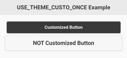
7.2 GW_NEW_THEME_CUSTO()
| Syntax: | |
| custo_id = GW_NEW_THEME_CUSTO ("param1=value1 param2=value2 …") | |
| Parameters: | |
| "param1=value1 ..." | String containing parameter=value pairs. |
| Returns: | |
| custo_id | Generated customization ID. |
Sets up a customization to be used by a subsequent GW_USE_THEME_CUSTO()function. The parameter is a string containing one or more "parameter=value" pairs. The returned value is to be passed to a subsequent GW_USE_THEME_CUSTO(). See parameters table above. See example in next section.
7.3 GW_USE_THEME_CUSTO()
| Syntax: | |
| GW_USE_THEME_CUSTO (custo_id) | |
| Parameters: | |
| custo_id | Previously generated customization ID. |
This function is used to customize all controls that follows it. Its parameter is a customization ID previously returned by GW_NEW_THEME_CUSTO().
% Load the library
INCLUDE "GW.bas"
% Create a page.
p = GW_NEW_PAGE()
% Prepare titl<e bar string.
Title$ = GW_ADD_BAR_TITLE$("GW_USE_THEME_CUSTO Example")
% Add title to page.
GW_ADD_TITLEBAR(p,Title$)
% Add descriptive text.
GW_ADD_TEXTBOX(p, "Starting using a customization...")
% Create a permanent customization.
myCusto$ = "color=b mini" % Collect parameters into a string.
myCusto = GW_NEW_THEME_CUSTO(myCusto$)
GW_USE_THEME_CUSTO(myCusto) % Activate it for all newly added controls.
bt1=GW_ADD_BUTTON(p, "Button 1", "") % This control is customized with myCusto$.
bt2=GW_ADD_BUTTON(p, "Button 2", "") % This control is also customized with myCusto$.
% Add descriptive text.
GW_ADD_TEXTBOX(p, "Now we stop the customization:")
% Stop the permanent customization.
GW_RESET_THEME_CUSTO()
bt3=GW_ADD_BUTTON(p, "Button 3", "") % This control is NOT customized.
% Render the page.
GW_RENDER(p)
DO
 % Wait for user action.
 r$ = GW_WAIT_ACTION$()
 % Place here any necessary code to process user actions.

% Example feedback.
POPUP r$

% End when BACK key is pressed.
UNTIL r$ = "BACK"
END "End of GW_USE_THEME_CUSTO Example"
Screenshots: 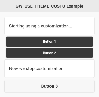
7.4 GW_RESET_THEME_CUSTO()
| Syntax: |
| GW_RESET_THEME_CUSTO () |
Once GW_USE_THEME_CUSTO() has been called, all subsequent controls will be customized. Once all all desired controls have been customized, use GW_RESET_THEME_CUSTO() to stop further customization. See above examples.
7.5 GW_ADD_FONT$()
| Syntax: | |
| font_id$ = GW_ADD_FONT$ (page_id, path_to_font$) | |
| Parameters: | |
| page_id | Page ID. |
| path_to_font$ | String containing path to font file. |
| Returns: | |
| font_id$ | String containing font ID. |
Returns a properly processed string to be used where a font reference is needed. If one of the "parameter=value" pairs used by either GW_USE_THEME_CUSTO_ONCE() or GW_NEW_THEME_CUSTO() specifies a font, the font must be referenced by this string.
% Download font from the web.
FILE.EXISTS fe, "BebasNeue.ttf"
IF !fe
 POPUP "Downloading font..."
 BYTE.OPEN r, fid, "http://mougino.free.fr/tmp/pctl/BebasNeue Regular.ttf"
 IF fid<0 THEN END "Error accessing http://mougino.free.fr"
 BYTE.COPY fid, "BebasNeue.ttf"
ENDIF
% Load the library.
INCLUDE "GW.bas"
% Create a page.
p = GW_NEW_PAGE()
% Prepare title bar string.
Title$ = GW_ADD_BAR_TITLE$("GW_ADD_FONT$ Example")
% Add title to page.
GW_ADD_TITLEBAR(p,Title$)
% Add descriptive text.
GW_ADD_TEXTBOX(p, "The following control is customized with a local True Type Font (.ttf):")
% Create customization from local font.
myfont$ = GW_ADD_FONT$(p, "BebasNeue.ttf")
% Activate a 1-time customization.
GW_USE_THEME_CUSTO_ONCE("style='color:blue' font=" + myfont$)
% Add customized text.
GW_ADD_TEXTBOX(p, "I am a textbox written with the BebasNeue Regular font.")
% Show the page.
GW_RENDER(p)
DO
 % Wait for user action.
 r$ = GW_WAIT_ACTION$()
 % Place here any necessary code to process user actions.
 % Example feedback.
 POPUP r$
% End when BACK key is pressed.
UNTIL r$ = "BACK"
END "End of GW_ADD_FONT$ Example."
Screenshots: 
7.6 GW_NEW_CLASS()
| Syntax: | |
| class_id = GW_NEW_CLASS (class$) | |
| Parameters: | |
| class$ | String containing a class name. |
| Returns: | |
| class_id | Generated class ID. |
This function allows you to create a class in order to modify multiple controls with a single command. You create the class with an arbitrary name that will be referenced by the returned class ID in future customizations.
INCLUDE "GW.bas"
p = GW_NEW_PAGE() % Create new page.
GW_NEW_CLASS("flash") % Create a new class of controls
 % named 'flash'.
GW_USE_THEME_CUSTO_ONCE("class=flash") % Activate a one time customization.
GW_ADD_BUTTON(p, "BUTTON", "button") % This control has the class 'flash'.
GW_RENDER(p) % Show the page.
DO
 r$ = GW_WAIT_ACTION$() % Wait for user action.
 % Place here any necessary code to process user actions.
 POPUP r$ % Example feedback.
UNTIL r$ = "BACK" % End when BACK key is pressed.
END "End of GW_NEW_CLASS example."
Screenshot: 
After the page has been rendered, you can alter the classed controls by simply applying GW_MODIFY() to the class. For this you need the class ID which was returned by GW_NEW_CLASS(). The following example is identical to the previous example with the addition of class modification to change the button’s color to red.
INCLUDE "GW.bas"
p = GW_NEW_PAGE() % Create new page.
flashClassId = GW_NEW_CLASS("flash") % Create a new class of controls
 % named 'flash'.
GW_USE_THEME_CUSTO_ONCE("class=flash") % Activate a one time customization.
GW_ADD_BUTTON(p, "BUTTON", "button") % This control has the class 'flash'.
GW_RENDER(p) % Show the page.
% Now we can apply customizations to all controls of class 'flashClassId'.
GW_MODIFY(flashClassId, "style:color", "red")
DO
 r$ = GW_WAIT_ACTION$() % Wait for user action.
 % Place here any necessary code to process user actions.
 POPUP r$ % Example feedback.
UNTIL r$ = "BACK" % End when BACK key is pressed.
END
Screenshot: 
Here is a full example that creates buttons with flashing text by modifying the class color from black to transparent, and back to black, every 500 milliseconds:
INCLUDE "GW.bas"
mypage = GW_NEW_PAGE()
GW_ADD_TITLEBAR(mypage, "Page 1")
flashClassId = GW_NEW_CLASS("flash")
FOR i = 1 TO 9
 GW_USE_THEME_CUSTO_ONCE("class=flash")
 GW_ADD_BUTTON(mypage, "Button "+INT$(i), "")
NEXT
GW_USE_THEME_CUSTO_ONCE("style='background:red; color:white'")
GW_ADD_BUTTON(mypage, "EXIT", "BACK")
GW_RENDER(mypage)
DO
 GW_MODIFY(flashClassId, "style:color", "transparent")
 IF GW_ACTION$() = "BACK" THEN END
 PAUSE 500
 GW_MODIFY(flashClassId, "style:color", "black")
 IF GW_ACTION$() = "BACK" THEN END
 PAUSE 500
UNTIL 0
7.7 Customization Parameters
The following sections describe each of the parameters in the table in section 7.1 GW_USE_THEME_CUSTO_ONCE().
7.7.1 align
Applies alignment to the text in controls. Allowed parameters are align=left, align=center, align=right, and align=justify.
INCLUDE "GW.bas"

p = GW_NEW_PAGE()

% Prepare title bar string.
Title$ = gw_add_bar_title$("Align Example")

% Left button for title bar.
GW_USE_THEME_CUSTO_ONCE("icon=power iconpos=left")
LB$=GW_ADD_BAR_LBUTTON$("Exit>Exit")

% Add title to page.
GW_ADD_TITLEBAR(p,LB$ + Title$)

GW_USE_THEME_CUSTO_ONCE("align=left")
GW_ADD_TEXT(p, "I'm a left-aligned TEXT")

GW_USE_THEME_CUSTO_ONCE("align=center")
GW_ADD_TEXT(p, "I'm a centered TEXT")

GW_USE_THEME_CUSTO_ONCE("align=right")
GW_ADD_TEXT(p, "I'm a right-aligned TEXT")

GW_USE_THEME_CUSTO_ONCE("align=justify")
GW_ADD_TEXT(p, "I'm a justify-aligned TEXT."+~
" I'm a justify-aligned TEXT.")

GW_USE_THEME_CUSTO_ONCE("align=left")
GW_ADD_TEXTBOX(p, "I'm a left-aligned TEXTBOX")

%GW_USE_THEME_CUSTO_ONCE("align=center")
%GW_ADD_TEXTBOX(p, "I'm a centered TEXTBOX")

GW_USE_THEME_CUSTO_ONCE("align=right")
GW_ADD_TEXTBOX(p, "I'm a right-aligned TEXTBOX")

%GW_USE_THEME_CUSTO_ONCE("align=justify")
%GW_ADD_TEXTBOX(p,"I'm a justify-aligned TEXT."+~
%" I'm a justify-aligned TEXT.")

GW_USE_THEME_CUSTO_ONCE("align=left")
GW_ADD_TITLE(p, "I'm a left-aligned TITLE")

GW_USE_THEME_CUSTO_ONCE("align=center")
GW_ADD_TITLE(p, "I'm a centered TITLE")

GW_USE_THEME_CUSTO_ONCE("align=right")
GW_ADD_TITLE(p, "I'm a right-aligned TITLE")

GW_RENDER(p)

% Wait for user action.
r$ = GW_WAIT_ACTION$()

END "End of Align example."
Screenshot: 
7.7.2 alpha
Applies a transparency to a control, from alpha=0% (default, no transparency) to alpha=100% (completely transparent).
Example: |
Result:
|

7.7.3 big
This parameter is only applicable to notext buttons and needs no value. It simply makes the button bigger.
Example: |
Result:
|

7.7.4 class
See section 7.6 GW_NEW_CLASS().
7.7.5 color
Some controls have a predefined set of colors that can be chosen via customization.
PAGEs support two color modes: color=a for light mode (default), and color=b for dark mode. This mode will apply to all child controls populating the PAGE, so it offers an easy way to make a GW application in dark mode.
Example of a basic app in dark mode:
INCLUDE "GW.bas"
GW_USE_THEME_CUSTO_ONCE("color=b")
mypage = GW_NEW_PAGE()
GW_ADD_TITLEBAR(mypage, "Page 1")
GW_ADD_TEXT(mypage, "This page is customized with <b>color=b</b>")
GW_ADD_BUTTON(mypage, "EXIT", "BACK")
GW_RENDER(mypage)
% Wait for user action.
GW_WAIT_ACTION$()
END "End of 'color' example."
PROGRESSBARs, and SLIDERs support 6 different colors:
 |
color=a is light blue color=b is green color=c is red color=d is orange color=e is pink color=f is dark blue |
INCLUDE "GW.bas"
GW_USE_THEME_CUSTO_ONCE("color=b")
mypage = GW_NEW_PAGE()
GW_ADD_TITLEBAR(mypage, "Page 1")
GW_ADD_TEXT(mypage, "This page is customized with <b>color=b</b>")
DIM pg[6]
FOR i=ASCII("a") TO ASCII("f")
 GW_USE_THEME_CUSTO_ONCE("color="+CHR$(i))
 pg[++n] = GW_ADD_PROGRESSBAR(mypage, "<b>color="+CHR$(i)+"</b> progressbar")
NEXT
GW_ADD_BUTTON(mypage, "EXIT", "BACK")
GW_RENDER(mypage)
FOR i=1 TO 6
 GW_SET_PROGRESSBAR(pg[i], 80+20*RND())
NEXT
% Wait for user action.
GW_WAIT_ACTION$()
END "End of 'color' example."
BUTTONs, like PAGEs support two color modes: color=a for light (black writing on white background, default), and color=b for dark (white writing on black background). You can give BUTTONs unlimited colors via CSS style, See section 7.7.15 style.
7.7.6 fit-screen
This parameter is only applicable to images and needs no value. If the image width is larger than the screen width, it will fit the image into the screen (reduce its dimensions, keeping the aspect ratio). If the image width is smaller than the screen width, this parameter has no effect.
7.7.7 font
See section 7.5 GW_ADD_FONT$().
7.7.8 hover
This parameter is only applicable to notext buttons and needs no value. It makes the button float at a chosen cardinal point of the screen, among N, S, E, W, NE, NW, SE, SW.
|
Result:
|

7.7.9 icon
You can use your own icons (see below), or the GW library offers a set of 50 built-in icons that you can use to customize controls. The typical control where icons are best used is the button:
INCLUDE "GW.bas"
mypage = GW_NEW_PAGE()
GW_USE_THEME_CUSTO_ONCE("icon=power")
GW_ADD_BUTTON(mypage, "EXIT", "BACK")
GW_RENDER(mypage)
% Wait for user action.
GW_WAIT_ACTION$()
END "End of 'icon' example."
Here is the full list of the 50 icon names and appearance:
 |
 |
 |
 |
 |
Apart from these 50 built-in icons, it is possible to use any picture (png, jpg, etc.), from a local file or online, to customize your buttons thanks to the function GW_ADD_ICON() as seen in section 8.3 GW_ADD_ICON().
You then reference the icon with a customization string: "icon=" + GW_ID$(icon_id). See section 10.3 GW_ID$().
The following example demonstrates customized button icons:
INCLUDE "GW.bas"
% Create a page.
p = GW_NEW_PAGE()
% Prepare title bar string.
title$ = GW_ADD_BAR_TITLE$("GW_ADD_ICON example")
% Add title to page.
GW_ADD_TITLEBAR(p, title$)
% Add a customized button.
earth = GW_ADD_ICON(p, "http://mougino.free.fr/tmp/earth.png", 32, 32)
GW_USE_THEME_CUSTO_ONCE("icon="+GW_ID$(earth))
GW_ADD_BUTTON(p, "Give me an E", "")
% Add a second customized button.
wind = GW_ADD_ICON(p, "http://mougino.free.fr/tmp/wind.png", 32, 32)
GW_USE_THEME_CUSTO_ONCE("icon="+GW_ID$(wind))
GW_ADD_BUTTON(p, "Give me a W", "")
% Add a third customized button.
fire = GW_ADD_ICON(p, "http://mougino.free.fr/tmp/fire.png", 32, 32)
GW_USE_THEME_CUSTO_ONCE("icon="+GW_ID$(fire))
GW_ADD_BUTTON(p, "Give me an F", "")
% Add a title.
GW_USE_THEME_CUSTO_ONCE("align=center")
GW_ADD_TITLE(p, "Earth Wind and Fire!")
% Render the page
GW_RENDER(p)
DO
 % Wait for user action.
 r$ = GW_WAIT_ACTION$()
 % Place here any necessary code to process user actions.
 % Example feedback.
 POPUP r$
% End when BACK key is pressed.
UNTIL r$ = "BACK"
END "End of GW_ADD_ICON example"
Screenshot: 
7.7.10 iconpos
You can choose the position of the icon inside the button with the customization parameter iconpos. The different values for iconpos are: left, right, top and bottom. |
 |
7.7.11 inline
Allows placement of several controls on the same line. This parameter can apply to the following controls:
- buttons
|
Result:
|

- buttons of a dialog message, dialog checkbox, or dialog input.
|
Result:
|

- group of checkboxes
|
Result:
|

- group of radio controls
|
Result:
|

- selectbox
|
Result:
|

7.7.12 mini
This parameter is only applicable to text buttons and needs no value. It simply makes the button smaller.
|
Result:
|

7.7.13 notext
This parameter is only applicable to buttons and needs no value. It simply makes the button have no text displayed. This is especially useful for buttons in title or foot bars (see section 5.2 GW_ADD_BAR_LBUTTON$()):

You can combine notext with the hover parameter to make floating buttons!
7.7.14 position
Defines the position of a panel when it is opened on a page. You can set the panel position customization to left (default) or right. See section 13.6 Panel Customization for more details and an example.
 |
 |
7.7.15 style
This is a very powerful parameter which allows you to use CSS customization. There are simple examples in GW_demo.bas, e.g. a red or green button here and there:
INCLUDE "GW.bas"
mypage = GW_NEW_PAGE()
GW_USE_THEME_CUSTO_ONCE("icon=check iconpos=right style='background:green; color:white'")
GW_ADD_BUTTON (mypage, "GREEN BUTTON", "")
GW_USE_THEME_CUSTO_ONCE("icon=alert iconpos=left style='background:red; color:white'")
GW_ADD_BUTTON(mypage, "RED BUTTON", "")
GW_RENDER(mypage)
% Wait for user action.
GW_WAIT_ACTION$()
END "End of 'style' example."
But CSS is a topic on its own and beyond the scope of this manual. With it you can do powerful things, if you know how to use it!
7.7.16 valign
Applies vertical alignment of controls in a shelf. Allowed parameters are valign=top, valign=center, and valign=bottom.
INCLUDE "GW.bas"

% Create page.
p=GW_NEW_PAGE()

% Prepare title bar string.
ti$=GW_ADD_BAR_TITLE$("Shelf valign top")
GW_ADD_TITLEBAR(p, ti$)

% Add shelf, 2 columns with respectively 1 and 4 buttons
GW_SHELF_OPEN(p)
GW_ADD_BUTTON(p, "Forever alone", "")
GW_SHELF_NEWCELL(p)
FOR i=1 TO 4
GW_ADD_BUTTON(p, "Lil Soldier #"+INT$(i), "")
NEXT
GW_SHELF_CLOSE(p)

% Same, but force 1st column to vertically align at top
GW_USE_THEME_CUSTO_ONCE("style='vertical-align:top'")
GW_SHELF_OPEN(p)
GW_ADD_BUTTON(p, "Forever alone", "")
GW_SHELF_NEWCELL(p)
FOR i=1 TO 4
GW_ADD_BUTTON(p, "Lil Soldier #"+INT$(i), "")
NEXT
GW_SHELF_CLOSE(p)

% Render the page.
GW_RENDER(p)

% Wait for user input.
DO
r$=GW_WAIT_ACTION$()
POPUP r$

UNTIL r$="BACK"

END "End of Shelf valign top Test"
Screenshot: 
7.7.17 wrap
Normally, controls like the button will display the caption in a single line. If the text is too long, whatever does not fit will be lost. The wrap parameter makess the caption wrap around, increasing the height of the caption space, so that all text can be displayed.
INCLUDE "GW.bas"

ipsum$="Lorem ipsum dolor sit amet, consectetur adipiscing elit, sed do eiusmod tempor incididunt ut labore et dolore magna aliqua"

% Create page.
p=GW_NEW_PAGE()

% Prepare title bar string.
ti$=GW_ADD_BAR_TITLE$("Wrap, align & valign Test")
GW_ADD_TITLEBAR(p, ti$)

% Add button with looong label (visually truncated)
GW_ADD_BUTTON(p, ipsum$, "")

% Add shelf with 2 columns
% vertically align first column elements at the top + make column 50% wide
GW_USE_THEME_CUSTO_ONCE("valign=top style='width:50%'")
GW_SHELF_OPEN(p)
% Add button with long label but 'wrap' custo
GW_USE_THEME_CUSTO_ONCE("align=left wrap") % test "align=.. wrap" bugfix
GW_ADD_BUTTON(p, ipsum$, "")
GW_USE_THEME_CUSTO_ONCE("wrap align=right") % test "wrap align=.." bugfix
GW_ADD_BUTTON(p, ipsum$, "")
GW_SHELF_NEWCELL(p)
FOR i=1 TO 9
GW_ADD_BUTTON(p, "Button #"+INT$(i), "")
NEXT
GW_SHELF_CLOSE(p)

% Render the page.
GW_RENDER(p)

% Wait for user input.
DO
r$=GW_WAIT_ACTION$()
POPUP r$

UNTIL r$="BACK"

END "End of wrap, valign & valign Test"
Screenshots: 
8 Standard Controls
Once a page has been created, it can be populated with controls. This chapter describes the standard controls. These are controls that display or otherwise output information to the user.
A function that adds a control to a page always returns an ID number for the new control. This ID can then be used to reference the control by subsequent functions.
8.1 GW_ADD_AUDIO()
| Syntax: | |
| ctl_id = GW_ADD_AUDIO (page_id, link_to_audio$) | |
| Parameters: | |
| page_id | Page ID. |
| link_to_audio$ | String containing name of audio source. |
| Returns: | |
| ctl_id | Control ID. |
Adds an audio player control to the page. A typical audio control looks like this:

where the first number shows the current position of the audio cursor, and the second number shows the length of the audio file, both in minutes:seconds. The icon on the left is the Play/Stop button. The slider in the middle can be used to go to any point in the audio file. The icon on the right is a mute button. The control can also play audio from web radio by passing to it an appropriate link.
INCLUDE "GW.bas"

% Create a page.
p = GW_NEW_PAGE()

% Prepare title bar string.
Title$ = GW_ADD_BAR_TITLE$("Audio Example")

% Add title to page.
GW_ADD_TITLEBAR(p, Title$)

% String that holds a caption.
t$ = "This AUDIO control plays "


% Add descriptive text.
mytext = GW_ADD_TEXT(p, t$ + "boing.mp3")

% Now add the audio control.
myaudio = GW_ADD_AUDIO(p, "boing.mp3")

% Add a button to change audio file.
GW_ADD_BUTTON(p, "Change audio to whee.mp3", "whee")

% Add another button to change audio file.
GW_ADD_BUTTON(p, "Change audio to boing.mp3", "boing")

% Now show the page.
GW_RENDER(p)

DO
% Wait for user action.
r$ = GW_WAIT_ACTION$()

IF r$ = "whee" THEN
GW_MODIFY(myaudio, "content", "whee.mp3")
GW_MODIFY(mytext, "text", t$ + "whee.mp3")
ENDIF

IF r$ = "boing" THEN
GW_MODIFY(myaudio, "content", "boing.mp3")
GW_MODIFY(mytext, "text", t$ + "boing.mp3")
 ENDIF

% End when BACK key is pressed.
UNTIL r$ = "BACK"

END "End of Audio example."
Screenshot: 
8.1.1 Changing Audio Source
You can change the source of an audio control, after a GW_RENDER() of the page, via GW_MODIFY() and the modification key "content". The source can be local (base path is rfo-basic/data) or an internet resource if you provide its complete URL. Supported file types are: mp3, wave, ogg vorbis, wma, etc.
8.2 GW_ADD_BUTTON()
| Syntax: | |
| ctl_id = GW_ADD_BUTTON (page_id, caption$, action$) | |
| Parameters: | |
| page_id | Page ID. |
| caption$ | String containing caption shown in button. |
| action$ | String containing action to be taken. |
| Returns: | |
| ctl_id | Control ID. |
The BUTTON is probably the most commonly used control. The caption is what you want the button to display. The action is what you want your program to do when the user presses the button. It is often a text which can be tested for by GW_WAIT_ACTION$() or GW_ACTION$() functions.
INCLUDE "GW.bas"

% Create a page.
p = GW_NEW_PAGE()

% Prepare title bar string.
title$ = GW_ADD_BAR_TITLE$("Button Example")

% Add title to page.
GW_ADD_TITLEBAR(p, title$)

% Add descriptive text.
GW_ADD_TEXT(p, "This is an example of the BUTTON control:")

% Now add the button control.
GW_ADD_BUTTON(p, "BASIC! oficial forum", ~
"https://www.tapatalk.com/groups/rfobasic")

% Add more descriptive text.
GW_ADD_TEXT(p, "You can also use a BUTTON control to open a dialog:")

% Let's prepare the dialog.
ARRAY.LOAD a$[], "OK"
dlg = GW_ADD_DIALOG_MESSAGE(p, "Dialog", "Message", a$[])

% Now add the next button control.
GW_ADD_BUTTON(p, "Show dialog", GW_SHOW_DIALOG$(dlg))

% Add last descriptive text.
GW_ADD_TEXT(p, "...or a panel:")

% Now prepare the panel.
panel = GW_ADD_PANEL(p, "Hello, World!")

% And the last button control.
GW_ADD_BUTTON(p, "Open side panel", GW_SHOW_PANEL$(panel))
% Now show the page.
GW_RENDER(p)

DO
% Wait for user action.
r$ = GW_WAIT_ACTION$()

% Place here any necessary code to process user actions.
 % Example feedback.
POPUP r$

% End when BACK key is pressed.
UNTIL r$ = "BACK"

END "End of Button example."
Screenshots: 
8.2.1 Button Customization
See section 7 on how to Apply Customization to Controls Before Adding Them.
Here is a list of possible customizations for the BUTTON control:
| Customization | See section |
| Set button in light/dark mode via "color=a" / "color=b". | 7.7.5 |
| Smaller button via "mini". | 7.7.12 |
| Bigger button via "big". | 7.7.3 |
| Button with no text via "notext". | 7.7.13 |
| Make several buttons stand on a same line via "inline". | 7.7.11 |
| Add 1 of the 50 built-it icons to a button via "icon". | 7.7.9 |
| Add your own icon to a button, from any jpg/png/gif... image, via GW_ADD_ICON() and "icon=" + GW_ID$() + icon_id. | 7.7.9 |
| Position the icon up, down, left or right in the button via "iconpos". | 7.7.10 |
| Make a notext button hover at a cardinal point via "hover". | 7.7.8 |
| Change the text font of the button via "font". | 7.7.7 |
| Align the text in the button via "align". | 7.7.1 |
| Vertically align button in a shelf via "valign". | 7.7.16 |
| Wrap the text via "wrap". | 7.7.17 |
| Deeply customize a button with CSS via "style". | 7.7.15 |
8.2.2 Changing Button Value and Interacting With Buttons
You can disable a button after a GW_RENDER() of the page via GW_DISABLE().
You can also hide a button after a GW_RENDER() of the page via GW_HIDE().
You can change the value of a button after a GW_RENDER() of the page via GW_MODIFY() and the modification keys "text" to change its caption, or "link" to change its action message.
8.3 GW_ADD_ICON()
| Syntax: | |
| icon_id = GW_ADD_ICON (page_id, path_to_img$, width, height) | |
| Parameters: | |
| page_id | Page ID. |
| path_to_img$ | Path to an image (in the data directory, or online). |
| width | Icon width. |
| height | Icon height. |
| Returns: | |
| icon_id | ID generated for this icon. |
This function returns an icon ID to be used for button customization (see section 7.7.9 icon) or in a titlebar/footbar by a subsequent GW_ICON$() function. The image can be local (base path is rfo-basic/data) or an internet resource if you provide its complete URL.
8.4 GW_ADD_IMAGE()
| Syntax: | |
| ctl_id = GW_ADD_IMAGE (page_id, path_to_image$) | |
| Parameters: | |
| page_id | Page ID. |
| path_to_image$ | String containing path to image file. |
| Returns: | |
| ctl_id | Control ID. |
Adds an image which, by default, should be in the rfo-basic/data directory. The image name could be something like "mypicture.png". You can also add an online image by providing a URL.
This control can act as a button in that it can deliver an action string to your program. Simply append ">" followed by a string containing the desired action after the file name, such as "exit.png>BYE".
INCLUDE "GW.bas"

% Create a page.
p = GW_NEW_PAGE()

% Prepare title bar string.
title$ = GW_ADD_BAR_TITLE$("Image Example")

% Add title to page.
GW_ADD_TITLEBAR(p, title$)

% Add descriptive text.
GW_ADD_TEXT(p, "This is an example of the IMAGE control:")

% Now add the image control.
GW_ADD_IMAGE(p, "cartman.png")

% Add more descriptive text.
GW_ADD_TEXT(p, ~
"You can also use an IMAGE control as a BUTTON."+~
" So you will get feedback when you press it:")

% Now add the next button control.
GW_ADD_IMAGE(p, "cartman.png>pressed")

% Now show the page.
GW_RENDER(p)

DO
% Wait for user action.
r$ = GW_WAIT_ACTION$()

% Place here any necessary code to process
 % user actions.
 % Example feedback.
POPUP r$

% End when BACK key is pressed.
UNTIL r$ = "BACK"

END "End of Image example."
Screenshots: 
8.4.1 Image Customization
See section 7 on how to Apply Customization to Controls Before Adding Them.
There is one dedicated customization for IMAGE controls: "fit-screen" that makes them fit in the page if their width is bigger than the page width: see 7.7.6 fit-screen.
Other than that, it is possible to deeply customize an image with CSS via the "style" customization: see section 7.7.15 style.
8.4.2 Changing Image Source
You can change the source of an image control, after a GW_RENDER() of the page, via GW_MODIFY() and the modification key "content". The source can be local (base path is rfo-basic/data) or an internet resource if you provide its complete URL. Supported file types are: jpg, png, gif, bmp, etc. Windows icons (*.ico files) are not supported by Android/rfo-basic.
8.4.3 GW_GET_IMAGE_DIM$()
| Syntax: | |
| wxh$ = GW_GET_IMAGE_DIM$ (path_to_img$) | |
| Parameter: | |
| path_to_image$ | String containing path to image file. |
| Returns: | |
| wxh$ | A string composed of the width, character ‘x’ and height of the image. |
In case you need to know the dimensions of an image in pixels, you can use this utility function. It will return a string of the form "WxH" with W being the image width and H the image height, both in pixels as integer numbers.
8.5 GW_ADD_LINK()
| Syntax: | |
| ctl_id = GW_ADD_LINK (page_id, link$, action$) | |
| Parameters: | |
| page_id | Page ID. |
| link$ | String containing link text. |
| action$ | String containing action to be taken. |
| Returns: | |
| ctl_id | Control ID. |
Adds a link (usually shown as underlined blue text) on the page. It is actually like a button, only it looks different.
INCLUDE "GW.bas"
% Create a page.
p = GW_NEW_PAGE()
% Prepare title bar string.
title$ = GW_ADD_BAR_TITLE$("Link Example")

% Add title to page.
GW_ADD_TITLEBAR(p, title$)

% Add descriptive text.
GW_ADD_TEXT(p, "This is an example of the LINK control:")
% Now add the link control.
GW_ADD_LINK(p, "BASIC! oficial forum", ~
 "https://www.tapatalk.com/groups/rfobasic")
% Add more descriptive text.
GW_ADD_TEXT(p, "You can also use a LINK control to open a dialog:")
% Let's prepare the dialog.
ARRAY.LOAD a$[], "OK"
dlg = GW_ADD_DIALOG_MESSAGE(p, "Dialog", "Message", a$[])
% Now add the next link control.
GW_ADD_LINK(p, "Show dialog", GW_SHOW_DIALOG$(dlg))
% Add last descriptive text.
GW_ADD_TEXT(p, "...or a panel:")
% Now prepare the panel.
panel = GW_ADD_PANEL(p, "Hello, World!")
% And the last link control.
GW_ADD_LINK(p, "Open side panel", GW_SHOW_PANEL$(panel))
% Now show the page.
GW_RENDER(p)
DO
 % Wait for user action.
 r$ = GW_WAIT_ACTION$()
 % Place here any necessary code to process user actions.
 % Example feedback.
 POPUP r$
% End when BACK key is pressed.
UNTIL r$ = "BACK"
END "End of Link example."
Screenshots: 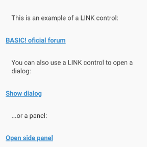
8.5.1 Changing Link Values
You can change the value of a link control after a GW_RENDER() of the page via GW_MODIFY() and the modification keys "text" to change its caption, or "link" to change its action message.
8.6 GW_LINK$()
| Syntax: | |
| l$ = GW_LINK$ (link_text$) | |
| Parameters: | |
| link_text$ | String containing a standard link such as "http://mylink.com". |
| Returns: | |
| l$ | String containing formatted link. |
This function allows you to create a link embedded in a text, in order to populate a Text or TextBox (or any other) control.
INCLUDE "GW.bas"

% Create a page.
p = GW_NEW_PAGE()

% Prepare text string embedding a GW_LINK$.
txt$ = "Click here to go to "
txt$ += GW_LINK$("https://www.tapatalk.com/groups/rfobasic")
txt$ += " for additional support."

% Add in a Text control.
GW_ADD_TEXT(p, txt$)

% You can also add a standalone link with GW_ADD_LINK.
GW_ADD_TEXT(p, "...or use this direct link:")
GW_ADD_LINK(p, "BASIC! oficial forum", ~
 "https://www.tapatalk.com/groups/rfobasic")

% Add a Dialog.
ARRAY.LOAD bna$[], "OK"
dlg = GW_ADD_DIALOG_MESSAGE(p, "Dialog", "Message", bna$[])

% And a standalone link to show the Dialog.
GW_ADD_TEXT(p, "You can also use a LINK control to open directly a dialog:")
GW_ADD_LINK(p, "Show dialog", GW_SHOW_DIALOG$(dlg))

% Add a Panel.
panel = GW_ADD_PANEL(p, "Hello, World!")

% And a standalone link to open the Panel.
GW_ADD_TEXT(p, "...or a panel:")
GW_ADD_LINK(p, "Open side panel", GW_SHOW_PANEL$(panel))

GW_ADD_TEXT(p, "Hope it helped!")

GW_ADD_BUTTON(p, "Exit demo", "BACK")

GW_RENDER(p)

DO
 % Wait for user action.
 r$ = GW_WAIT_ACTION$()

 % Place here any necessary code to process user actions.

 % Example feedback.
 POPUP r$

% End when BACK key is pressed.
UNTIL r$ = "BACK"

END "End of LINK example."
Screenshots: 
8.7 GW_ADD_LISTVIEW()
| Syntax: | |
| ctl_id = GW_ADD_LISTVIEW (page_id, values_and_actions$[]) | |
| Parameters: | |
| page_id | Page ID. |
| values_and_actions$ | String array containing values (texts) to be displayed, and actions to be taken. |
| Returns: | |
| ctl_id | Control ID. |
The LISTVIEW is the most versatile control in order to present a set of data, with or without user interaction.
8.7.1 Read-Only Listview
Use a String array without action (no greater than character ">" in the strings) to display a read-only listview.
INCLUDE "GW.bas"
mypage = GW_NEW_PAGE()
ARRAY.LOAD fruits$[], "Apple", "Banana", "Cherry", "Cranberry", "Grape", "Orange"
GW_ADD_LISTVIEW(mypage, fruits$[])
GW_RENDER(mypage)
% Wait for user action.
GW_WAIT_ACTION$()
Screenshots: 
8.7.2 Selectable Listview
In your listview, use a String array composed of labels followed by the greater than character ">" and an action, to propose a choice to the user:
INCLUDE "GW.bas"
mypage = GW_NEW_PAGE()
ARRAY.LOAD lang$[], "English>EN", "French>FR", "Spanish>ES", "German>DE"
GW_ADD_TEXT(mypage, "Pick a language:")
GW_ADD_LISTVIEW(mypage, lang$[])
GW_RENDER(mypage)
DO
 % Wait for user action.
 r$ = GW_WAIT_ACTION$()
 % Place here any necessary code to process user actions.
 % Example feedback.
 POPUP r$
% End when BACK key is pressed.
UNTIL r$ = "BACK"
Screenshots: 
8.7.3 Ordered Listview
Start the first element of your String array with a hash/pound sign "#" to show an ordered listview:
INCLUDE "GW.bas"
mypage = GW_NEW_PAGE()
ARRAY.LOAD a$[], "#First", "Second", "Third", "Fourth"
GW_ADD_LISTVIEW(mypage, a$[])
FOR i=1 TO 4 : a$[i] += ">" + INT$(i) : NEXT
GW_ADD_LISTVIEW(mypage, a$[])
GW_RENDER(mypage)
DO
 % Wait for user action.
 r$ = GW_WAIT_ACTION$()
 % Place here any necessary code to process user actions.
 % Example feedback.
 POPUP r$
% End when BACK key is pressed.
UNTIL r$ = "BACK"
Screenshots: 
8.7.4 Text Bubbles
In your listview array, use the curly braces "{ }" to show a text bubble:
INCLUDE "GW.bas"
mypage = GW_NEW_PAGE()
ARRAY.LOAD cars$[], "Audi {$73 532}", "BMW {$58 300}", "Cadillac {$70 533}", "Ferrari {$243 090}"
GW_ADD_LISTVIEW(mypage, cars$[])
GW_RENDER(mypage)
% Wait for user action.
GW_WAIT_ACTION$()
Screenshots: 
8.7.5 Title/Separator
Directly start an array element with the greater than character ">" to show a listview title or separator:
INCLUDE "GW.bas"
mypage = GW_NEW_PAGE()
ARRAY.LOAD os$[], ">Windows", "3.11", "95", "NT", ">Linux", "Ubuntu", "Debian", "SUSE"
GW_ADD_LISTVIEW(mypage, os$[])
GW_RENDER(mypage)
% Wait for user action.
GW_WAIT_ACTION$()
Screenshots: 
8.7.6 Inline Icons
You can add small inline icons at the left of listview elements by ending your array element with a double "@@" character followed by the name of an image present in your data/ folder. This is useful for example to create a file explorer type of app:
INCLUDE "GW.bas"
mypage = GW_NEW_PAGE()
ARRAY.LOAD files$[], "subfolder>1@@folder.gif", "index.html>2@@www.gif", "pic.png>3@@image.gif", "docs.zip>4@@archive.gif", "readme.txt>5@@any.gif"
GW_ADD_LISTVIEW(mypage, files$[])
GW_RENDER(mypage)
% Wait for user action.
GW_WAIT_ACTION$()
Screenshots: 
8.7.7 Thumbnails
You can add a big thumbnail in your listview by ending an array element with the "@" character followed by the name of an image present in your data/ folder:
INCLUDE "GW.bas"
mypage = GW_NEW_PAGE()
GW_ADD_TEXT(mypage, "What is your favorite game genre?")
ARRAY.LOAD genre$[], "Space game@galaxy.png", "RPG@map.png", "Strategy@globe.png"
GW_ADD_LISTVIEW(mypage, genre$[])
GW_RENDER(mypage)
% Wait for user action.
GW_WAIT_ACTION$()
Screenshots: 
8.7.8 Two-line Listview Element
Use "\n" in the middle of your array elements to split them on two lines:
INCLUDE "GW.bas"
mypage = GW_NEW_PAGE()
GW_ADD_TEXT(mypage, "What is your favorite game genre?")
ARRAY.LOAD genre$[], ~
 "Space game\ne.g. EVE Online@galaxy.png", ~
 "RPG\ne.g. World of Warcraft@map.png", ~
 "Strategy\ne.g. Age of Empires@globe.png"
GW_ADD_LISTVIEW(mypage, genre$[])
GW_RENDER(mypage)
% Wait for user action.
GW_WAIT_ACTION$()
Screenshots: 
8.7.9 Sortable Listview
Sortable listviews are very powerful as they allow users to re-arrange the elements of a list by drag & dropping them. To create a sortable listview, start the first element of your String array with the symbol "~":
ARRAY.LOAD veggies$[], "~Salad", "Broccoli", "Tomatoes", "Carrots", "Beans", "Eggplant"
GW_ADD_LISTVIEW(mypage, veggies$[])
To show its drag & drop capacity, each element of a sortable listview starts with a hamburger button "三".
A sortable listview can then be managed through 4 functions, described below:
8.7.10 GW_LISTVIEW_CHANGED()
| Syntax: | |
| test = GW_LISTVIEW_CHANGED (ctl_id) | |
| Parameters: | |
| ctl_id | Control ID. |
| Returns: | |
| test | True or False. |
Returns 1 (‘true’) if the sortable listview has changed, i.e. if the user has re-arranged elements. Returns 0 (‘false’) otherwise.
8.7.11 GW_GET_LISTVIEW_ORDER$()
| Syntax: | |
| order$ = GW_GET_LISTVIEW_ORDER$ (ctl_id) | |
| Parameters: | |
| ctl_id | Control ID. |
| Returns: | |
| order$ | String containing listview order. |
Returns the order of a sortable listview as a string containing the (0-based) indexes of the re-arranged array, separated by spaces. E.g. if the listview contains 4 elements, the original order$ would be "0 1 2 3" ; now if the user drag & dropped the top first element (#0) at the bottom of the listview, then the order$ returned by this function would be equal to "1 2 3 0".
8.7.12 GW_REORDER_ARRAY()
| Syntax: | |
| GW_REORDER_ARRAY (array$[], order$) | |
| Parameters: | |
| ctl_id | Control ID. |
| order$ | String containing listview order. |
This function is the complement to GW_GET_LISTVIEW_ORDER$(): it allows the re-ordering of the array passed as parameter in the listview according to how the user re-arranged the sortable listview.
The following example shows a full demo of a sortable listview, with use of these functions:
8.7.13 Sortable Listview Full Example
INCLUDE "GW.bas"
mypage = GW_NEW_PAGE()
ARRAY.LOAD veggies$[], "~Salad", "Broccoli", "Tomatoes", "Carrots", "Beans", "Eggplant"
lv = GW_ADD_LISTVIEW(mypage, veggies$[])
GW_ADD_BUTTON(mypage, "Done!", "GO")
GW_RENDER(mypage)
% Wait for user action.
r$ = GW_WAIT_ACTION$()
IF r$ = "BACK" THEN END
IF GW_LISTVIEW_CHANGED(lv) THEN
 PRINT "Original array:"
 DEBUG.ON
 DEBUG.DUMP.ARRAY veggies$[]
 PRINT "Re-arranged by user:"
 order$ = GW_GET_LISTVIEW_ORDER$(lv)
 PRINT "Order: " + order$
 GW_REORDER_ARRAY(veggies$[], order$)
 DEBUG.DUMP.ARRAY veggies$[]
ELSE
 PRINT "No change!"
END IF
Screenshots: 

8.7.14 Swipeable Listview
Swipeable listviews allow users to swipe each element left or right to uncover options. A typical example would be an email app with the ability to answer or delete each email.
To create a swipeable listview, use the vertical bar character " | " to separate your "left_option | label | right_option" (see example below).
When the user touches an option, it will send a message available through GW_WAIT_ACTION$() or GW_ACTION$() in the form: "ctl_id>option#row" where ctl_id is the GW_ID$() of the listview, option is the left_option or right_option touched by the user, and row is the row index in the listview.
Swipeable listviews come with a function that allow hiding ('delete') an element/row.
8.7.15 GW_HIDE_LISTVIEW_ROW()
| Syntax: | |
| GW_HIDE_LISTVIEW_ROW (ctl_id, row) | |
| Parameters: | |
| ctl_id | Control ID. |
| row | Row number. |
Hides a row from a swipeable listview. Note that the string array used as listview parameter remains untouched, this function has only a visual effect.
8.7.16 Swipeable Listview Full Example
INCLUDE "GW.bas"
mypage = GW_NEW_PAGE()
GW_ADD_TEXT(mypage, "User mailbox. Swipe left/right for options")
ARRAY.LOAD emails$[], ~
 "Answer|John Doe\nUrgent - Can you please...|Delete", ~
 "Answer|Adam Parker\nHey mate, how's the ...|Delete", ~
 "Answer|Sophia Stall\nMeeting|Delete"
lv = GW_ADD_LISTVIEW(mypage, emails$[])
lv$ = GW_ID$(lv)
GW_RENDER(mypage)
DO
 % Wait for user action.
 r$ = GW_WAIT_ACTION$()
 IF IS_IN(lv$, r$) = 1 % message of the form 'listview_id>option#row'
 opt$ = MID$(r$, IS_IN(">",opt$)+1)
 IF IS_IN("Delete", opt$) = 1
 opt$ = MID$(opt$, IS_IN("#",opt$)+1)
 row = VAL(opt$)
 GW_HIDE_LISTVIEW_ROW(lv, row)
 ELSE
 POPUP opt$
 END IF
 END IF
% End when BACK key is pressed.
UNTIL r$ = "BACK"
END
Screenshots: 

8.7.17 Changing ListView Content
You can change the content of a listview after GW_RENDER() of the page via GW_AMODIFY() and the modification key "content". The new array that you pass to the AMODIFY function can totally change the type of the listview: give it an array with the first element starting with "~" and your existing listview will change to a Sortable Listview! Pass an array filled with "opt1|Label|opt2" strings and your listview will transform to a Swipeable Listview. Add a "@img.png" or "@@img.png" at the end of your array elements to add Inline Icons or Thumbnails. Use arrays with "Label {bubble}" to create Text Bubbles! Add a "Label>Action" to change a simple listview to a Selectable Listview. Etc. etc. the possibilities are huge!
8.8 GW_ADD_PROGRESSBAR()
| Syntax: | |
| ctl_id = GW_ADD_PROGRESSBAR (page_id, caption$) | |
| Parameters: | |
| page_id | Page ID. |
| caption$ | String containing caption. |
| Returns: | |
| ctl_id | Control ID. |
The progress bar shows a linear representation of a number from 0 to 100.
8.8.1 GW_SET_PROGRESSBAR()
| Syntax: | |
| GW_SET_PROGRESSBAR (ctl_id, n) | |
| Parameters: | |
| ctl_id | Control ID. |
| n | Number to set ProgressBar to. |
This function sets the progressbar to a specific number. The parameter n must be between 0 and 100. It needs to be called after the GW_RENDER() of the page, it will not work before.
INCLUDE "GW.bas"

% Create a page.
p = GW_NEW_PAGE()

% Prepare title bar string.
title$ = GW_ADD_BAR_TITLE$("Progressbar Example")

% Add title to page.
GW_ADD_TITLEBAR(p, title$)

% Add progressbar.
progress = GW_ADD_PROGRESSBAR(p, ~
 "This is an example of the progressbar control:")

% Add button to get progressbar value.
GW_ADD_BUTTON(p, "Get progress", "get")

% Add text to show progressbar value.
text = GW_ADD_TEXT(p, "0")

% Add button to increment progressbar value.
GW_ADD_BUTTON(p, "Increment progress", "inc")

% Show page.
GW_RENDER(p)

DO
% Wait for user action.
r$ = GW_WAIT_ACTION$()

% Parse user action.
SW.BEGIN r$

% "get" button was pressed.
SW.CASE "get"
s = GW_GET_VALUE(progress)
GW_MODIFY(text,"text",INT$(s))
SW.BREAK

% "inc" button was pressed
SW.CASE "inc"
s = GW_GET_VALUE(progress) + 1
GW_SET_PROGRESSBAR(progress, s)
SW.BREAK

SW.END

% End when BACK key is pressed.
UNTIL r$="BACK"

END "End of Progressbar example."
Screenshots: 
8.8.2 Progressbar Customization
See section 7 on how to Apply Customization to Controls Before Adding Them.
Progressbars can be presented in 6 different colors: color=a for light blue (default) ; color=b for green ; color=c for red ; color=d for orange ; color=e for pink ; and color=f for dark blue. See section 7.7.5 color.
8.9 GW_ADD_TABLE()
| Syntax: | |
| ctl_id = GW_ADD_TABLE (page_id, n_cols, table$[]) | |
| Parameters: | |
| page_id | Page ID. |
| n_cols | Number of columns. |
| table$[] | Array of strings containing table cells. |
| Returns: | |
| ctl_id | Control ID. |
This function adds a table control to the page. The table is populated by the contents of the specified string array, displayed in the specified number of columns.
If the first element of the array starts with ">", it indicates a title line.
INCLUDE "GW.bas"

% Create page.
p = GW_NEW_PAGE()

% Prepare title bar string.
title$ = GW_ADD_BAR_TITLE$("Table Example")

% Add title bar.
GW_ADD_TITLEBAR(p, title$)

% Prepare an array for the table.
ARRAY.LOAD a$[],"a","b","c","d"

GW_ADD_TEXT(p,"First table, 1 column")
GW_ADD_TABLE(p, 1, a$[])

GW_ADD_TEXT(p,"Second table, 2 columns")
GW_ADD_TABLE(p, 2, a$[])

GW_ADD_TEXT(p,"Third table, 3 columns")
GW_ADD_TABLE(p, 3, a$[])

GW_ADD_TEXT(p,"Fourth table, 4 columns")
GW_ADD_TABLE(p, 4, a$[])

% Show the page.
GW_RENDER(p)

DO
 % Wait for user action.
 r$ = GW_WAIT_ACTION$()

 % Place here any necessary code to process user actions.
 % Example feedback.
 POPUP r$
UNTIL r$ = "BACK" % End when BACK key is pressed.

END "End of Table example."
Screenshots: 
8.9.1 Changing Table Content
You can change the content of a table after GW_RENDER() of the page via GW_AMODIFY() and the modification key "content". This will reset the table and create new cells populated with each element of the array that you pass to the AMODIFY function.
8.10 GW_ADD_TEXT()
| Syntax: | |
| ctl_id = GW_ADD_TEXT (page_id, s_ini$) | |
| Parameters: | |
| page_id | Page ID. |
| s_ini$ | String containing the initial text to be displayed. |
| Returns: | |
| ctl_id | Control ID. |
This function adds a Text control to the page. It is used to display text which cannot be edited by the user (it is read-only).
INCLUDE "GW.bas"

% Create a page.
p = GW_NEW_PAGE()

% Prepare title bar string.
title$ = GW_ADD_BAR_TITLE$("Text Example")

% Add title to page.
GW_ADD_TITLEBAR(p, title$)

% Add text.
GW_ADD_TEXT(p, "This is an example of the TEXT control.")

% Add more text.
GW_ADD_TEXT(p, "And more text.")

% Now show the page.
GW_RENDER(p)

DO
% Wait for user action.
r$ = GW_WAIT_ACTION$()

% Place here any necessary code to process user actions.
 % Example feedback.
POPUP r$

% End when BACK key is pressed.
UNTIL r$ = "BACK"

END "End of text example."
Screenshots: 
8.10.1 Text Customization
See section 7 on how to Apply Customization to Controls Before Adding Them.
You can decide how to align the text in a TEXT control (left-aligned, centered, right-aligned, or justified) via a customization: see 7.7.1 align. You can also make a TEXT control partly transparent via customization: see 7.7.2 alpha. You can change the font of the text: see 7.7.7 font. Finally, it is possible to deeply customize a TEXT control with CSS via the "style" customization: see section 7.7.15 style.
8.10.2 Changing Text Value
You can change the value of a text control after a GW_RENDER() of the page via GW_AMODIFY() and the modification key "text". The new value can be raw text, or an HTML string with bold (<b></b>), italic (<i></i>) or any other HTML tag used to enhance text.
8.11 GW_ADD_TEXTBOX()
| Syntax: | |
| ctl_id = GW_ADD_TEXTBOX (page_id, s_ini$) | |
| Parameters: | |
| page_id | Page ID. |
| s_ini$ | String containing the initial text to be displayed. |
| Returns: | |
| ctl_id | Control ID. |
The TEXTBOX control is similar to the TEXT control but has a rectangular border around it.
8.11.1 TextBox Customization
See section 7 on how to Apply Customization to Controls Before Adding Them.
Available TEXTBOX customizations are the same as for the TEXT control: align the text inside the control (left-aligned, centered, right-aligned, or justified): see 7.7.1 align. Make the TEXTBOX control partly transparent: see 7.7.2 alpha. Change the font of the text: see 7.7.7 font. Deeply customize a TEXTBOX control with CSS via the "style" customization: see section 7.7.15 style.
8.11.2 Changing TextBox Value
You can change the value of a TextBox control after a GW_RENDER() of the page via GW_AMODIFY() and the modification key "text". The new value can be raw text, or an HTML string with bold (<b></b>), italic (<i></i>) or any other HTML tag used to enhance text.
8.12 GW_ADD_TITLE()
| Syntax: | |
| ctl_id = GW_ADD_TITLE (page_id, title$) | |
| Parameters: | |
| page_id | Page ID. |
| title$ | String containing the title to be displayed. |
| Returns: | |
| ctl_id | Control ID. |
The TITLE control is similar to the TEXT control but has bold text on a colored background.
INCLUDE "GW.bas"

% Create a page.
p = GW_NEW_PAGE()

% Prepare title bar string.
title$ = GW_ADD_BAR_TITLE$("Title Example")

% Add title to page.
GW_ADD_TITLEBAR(p, title$)

% Add text.
GW_ADD_TEXT(p, "This is an example of the TITLE control.")

% Add the title.
GW_ADD_TITLE(p, "The longest title in the history of the world.")

% Now show the page.
GW_RENDER(p)

DO % Wait for user action.
r$ = GW_WAIT_ACTION$()

% Place here any necessary code to process user actions.
 % Example feedback.
POPUP r$

UNTIL r$ = "BACK" % End when BACK key is pressed.

END "End of Title example."
Screenshots: 
8.12.1 Title Customization
See section 7 on how to Apply Customization to Controls Before Adding Them.
Available TITLE customizations are the same as for the TEXT or TEXTBOX controls: align the text inside the control (left-aligned, centered, right-aligned, or justified): see 7.7.1 align. Make the TITLE control partly transparent: see 7.7.2 alpha. Change the font of the text: see 7.7.7 font. Deeply customize a TITLE control with CSS via the "style" customization: see section 7.7.15 style.
8.12.2 Changing Title Value
You can change the value of a title control after a GW_RENDER() of the page via GW_MODIFY() and the modification key "text". The new value can be raw text, or an HTML string with bold (<b></b>), italic (<i></i>) or any other HTML tag used to enhance text.
8.13 GW_ADD_VIDEO()
| Syntax: | |
| ctl_id = GW_ADD_VIDEO (page_id, link_to_video$) | |
| Parameters: | |
| page_id | Page ID. |
| link_to_video$ | String containing name of video source. |
| Returns: | |
| ctl_id | Control ID. |
This function adds a VIDEO control to the page. The link parameter can point to a local video file or a streaming video. For a poster image, the link parameter should be "name_of_video > name_of_image".
INCLUDE "GW.bas"

p = GW_NEW_PAGE()

% Prepare title bar string.
Title$ = GW_ADD_BAR_TITLE$("Video Example")

% Add title to page.
GW_ADD_TITLEBAR(p, Title$)

% Add descriptive text.
GW_ADD_TEXT(p, "This is an example of the VIDEO control:")

% Add a video.
v1 = GW_ADD_VIDEO(p, "VIDEO0001.mp4")

% Add descriptive text.
GW_ADD_TEXT(p, "This VIDEO control has a poster image:")

% Add another video with a poster image.
v2 = GW_ADD_VIDEO(p, "VIDEO0001.mp4>cartman.png")

GW_RENDER(p)

DO % Wait for user action.
r$ = GW_WAIT_ACTION$()

 % Place here any necessary code to process user actions.
 % Example feedback.
 POPUP r$

UNTIL r$ = "BACK" % End when "BACK" key is pressed.

END "End of Video example."
Screenshots: 
8.13.1 Changing Video Source
You can change the source of a video control, after a GW_RENDER() of the page, via GW_MODIFY() and the modification key "content". The source can be local (base path is rfo-basic/data) or an internet resource if you provide its complete URL. Supported file types are: avi, divx, mp4, mkv, mpg, etc.
9 Input Controls
Once a page has been created, it can be populated with controls. This chapter describes the input controls. These are controls that allow the user to input or select data.
9.1 GW_ADD_CHECKBOX()
| Syntax: | |
| ctl_id = GW_ADD_CHECKBOX (page_id, caption$) | |
| Parameters: | |
| page_id | Page ID. |
| caption$ | String containing checkbox caption. |
| Returns: | |
| ctl_id | Control ID. |
CheckBoxes are used to propose the user one or more choices in a list of options.
The default state when you add a CheckBox is unchecked. To make a CheckBox checked, start its caption string with ">".
9.1.1 GW_CHECKBOX_CHECKED()
| Syntax: | |
| test = GW_CHECKBOX_CHECKED (ctl_id) | |
| Parameters: | |
| ctl_id | Control ID. |
| Returns: | |
| test | 0 = not checked, 1 = checked. |
This function returns the status of a CheckBox: 1 for checked or 0 for unchecked.
It needs to be called after the GW_RENDER() of the page, it will not work before.
INCLUDE "GW.bas"

CrLf$ = CHR$(13) + CHR$(10)

% Create a page.
p = GW_NEW_PAGE()

% Prepare title bar string.
Title$ = GW_ADD_BAR_TITLE$("Checkbox Example")

% Add title to page.
GW_ADD_TITLEBAR(p, Title$)

% Add descriptive text.
TB = GW_ADD_TEXT(p, "This is an example of the CHECKBOX control:")

% Now add the control.
C1 = GW_ADD_CHECKBOX(p, "Let's check on this.")

% And add the next control.
C2 = GW_ADD_CHECKBOX(p, ">This one is checked.")

% Add a button control.
GW_ADD_BUTTON(p, "What is checked?", "Check")

% Add a text box for the results.
TB = GW_ADD_TEXTBOX(p, "")

% Now show the page.
GW_RENDER(p)

DO
% Wait for user action.
r$ = GW_WAIT_ACTION$()

% Place here any necessary code to process user actions.
 % Example feedback.
POPUP r$

IF r$ = "Check"
GW_MODIFY(TB, "text", ~
 "First checkbox = " + ~
 INT$(GW_CHECKBOX_CHECKED(C1)) ~
 + CrLf$ + ~
 "Second checkbox = " + ~
 INT$(GW_CHECKBOX_CHECKED(C2)))
ENDIF

% End when BACK key is pressed.
UNTIL r$ = "BACK"

END "End of Checkbox example."
Screenshot: 
9.1.2 CheckBox Customization
See section 7 on how to Apply Customization to Controls Before Adding Them.
For visual improvement, you can embed CheckBoxes inside a GW_OPEN_GROUP() / GW_CLOSE_GROUP(). See section 6.3 GW_OPEN_GROUP(). You can also render CheckBoxes on a same line with an "inline" customization. See section 7.7.11 inline. Other available customizations include text alignment inside the control (left-aligned, centered, right-aligned, or justified): see 7.7.1 align. Make the CheckBox partly transparent: see 7.7.2 alpha. Change the font of the text inside the CheckBox: see 7.7.7 font. Deeply customize a CheckBox with CSS via the "style" customization: see section 7.7.15 style.
9.1.3 Getting and Setting CheckBox Values
All get and set functions are to be used after the GW_RENDER() of the page, they will not work before.
You can get the value of a CheckBox: 1 if checked or 0 if not, with the function GW_CHECKBOX_CHECKED().
You can disable a CheckBox (not allow it to take the user input) via GW_DISABLE(). You can also hide it via GW_HIDE(). Finally, you can change the value of a CheckBox via GW_MODIFY() and the modification keys "text" to change its caption, or "checked" to change its state: "1" for checked and "0" for unchecked.
9.2 GW_ADD_RADIO()
| Syntax: | |
| ctl_id = GW_ADD_RADIO (page_id, radio_parent, caption$) | |
| Parameters: | |
| page_id | Page ID. |
| radio_parent | 0 for a new group of radio controls, or the father radio control ID for subsequent controls in a same group. |
| caption$ | String containing caption. |
| Returns: | |
| ctl_id | Control ID. |
Radio controls are used to propose the user only one choice in a list of options.
Radio controls are normally presented in radio groups (a collection of radio controls describing a set of related options). Only one radio control in a group can be selected at the same time.
To add the first radio control of a group, pass 0 (zero) as the second parameter radio_parent:
first_radio = GW_ADD_RADIO(mypage, 0, "Choice #1")
To add the following radio controls of the group, pass the id of the first radio control of the group as second parameter:
second_radio = GW_ADD_RADIO(mypage, first_radio, "Choice #2")
third_radio = GW_ADD_RADIO(mypage, first_radio, "Choice #3")
...
Once the radio group is rendered, selecting any radio control in that group automatically deselects any other selected radio control in the same group. You can have as many radio groups on a page as you want.
The default state when you add a radio control is unselected. To make a radio control selected, start its caption string with ">".
9.2.1 GW_RADIO_SELECTED()
| Syntax: | |
| test = GW_RADIO_SELECTED (ctl_id) | |
| Parameters: | |
| ctl_id | Control ID. |
| Returns: | |
| test | 0 = not selected, 1 = selected. |
This function returns the status of a radio control: 1 for selected or 0 for unselected.
It needs to be called after the GW_RENDER() of the page, it will not work before.
To know which radio control from a radio group is selected, go through the group (possible with a loop) and check GW_RADIO_SELECTED() for each ctl_id.
INCLUDE "GW.bas"
% Create a page.
p = GW_NEW_PAGE()
% Prepare title bar string.
Title$ = GW_ADD_BAR_TITLE$("Radio-control Example")
% Add title to page.
GW_ADD_TITLEBAR(p, Title$)
% Add descriptive text.
GW_ADD_TEXT(p, "This is an example of the RADIO control:")
% Now add the controls.
R1 = GW_ADD_RADIO(p, 0, "I can be selected")
R2 = GW_ADD_RADIO(p, R1, ">Or I can be selected")
R3 = GW_ADD_RADIO(p, R1, "Or me ...but only one at a time!")
% Add a button control.
GW_ADD_BUTTON(p, "Which is selected?", "Radio")
% Add a text box for the results.
TB = GW_ADD_TEXTBOX(p, "")
% Now show the page.
GW_RENDER(p)
DO
 % Wait for user action.
 r$ = GW_WAIT_ACTION$()
 % Place here any necessary code to process user actions.
 % Example feedback.
 POPUP r$
 IF r$ = "Radio"
 IF GW_RADIO_SELECTED(R1)
 e$ = "First"
 ELSEIF GW_RADIO_SELECTED(R2)
 e$ = "Second"
 ELSEIF GW_RADIO_SELECTED(R3)
 e$ = "Third"
 ELSE
 e$ = "No"
 ENDIF
 e$ += " radio control is selected"
 GW_MODIFY(TB, "text", e$)
 ENDIF
% End when BACK key is pressed.
UNTIL r$ = "BACK"
END "End of Radio-control example."
Screenshots: 
9.2.2 Radio Control Customization
See section 7 on how to Apply Customization to Controls Before Adding Them.
For visual improvement, you can embed radio controls inside a GW_OPEN_GROUP() / GW_CLOSE_GROUP(). See section 6.3 GW_OPEN_GROUP(). You can also render radio controls on a same line with an "inline" customization. See section 7.7.11 inline. Other available customizations include text alignment inside the control (left-aligned, centered, right-aligned, or justified): see 7.7.1 align. Make the radio control partly transparent: see 7.7.2 alpha. Change the font of the text inside the control: see 7.7.7 font. Deeply customize a radio control with CSS via the "style" customization: see section 7.7.15 style.
9.2.3 Getting and Setting Radio Control Values
All get and set functions are to be used after the GW_RENDER() of the page, they will not work before.
You can get the value of a radio: 1 if selected or 0 if not, with GW_RADIO_SELECTED().
You can disable a radio control (not allow it to take the user input) via GW_DISABLE(). You can also hide it via GW_HIDE(). Finally, you can change the value of a radio control via GW_MODIFY() and the modification keys "text" to change its caption, or "selected" to change its state: "1" for selected and "0" for not selected.
9.3 GW_ADD_FLIPSWITCH()
| Syntax: | |
| ctl_id = GW_ADD_FLIPSWITCH (page_id, caption$, s_opt1$, s_opt2$) | |
| Parameters: | |
| page_id | Page ID. |
| caption$ | String containing flipswitch caption. |
| s_opt1$ | String containing the text for the leftmost position. |
| s_opt2$ | String containing the text for the rightmost position. |
| Returns: | |
| ctl_id | Control ID. |
A FlipSwitch control is a boolean (yes/no) type of control. The caption appears above the graphical FlipSwitch. To set a default position, start the appropriate option string with ">":
Examples of On/Off FlipSwitch: 

NOTE: Unlike other controls, this control’s width is not dynamic. It is fixed and will not adjust itself to the lengths of the option strings.
9.3.1 GW_FLIPSWITCH_CHANGED()
| Syntax: | |
| test = GW_FLIPSWITCH_CHANGED (ctl_id, s_opt1$) | |
| Parameters: | |
| ctl_id | Control ID. |
| s_opt1$ | |
| Returns: | |
| test |
This function is used to determine if the switch was just flipped to the s_opt$ position.
INCLUDE "GW.bas"

% Create page.
p = GW_NEW_PAGE()

% Prepare title bar string.
Title$ = GW_ADD_BAR_TITLE$("Flipswitch Example")

% Add title to page.
GW_ADD_TITLEBAR(p,Title$)

% Add descriptive text.
GW_ADD_TEXT(p, "This is an example of the FLIPSWITCH control:")

% Add first flipswitch.
switch1 = GW_ADD_FLIPSWITCH(p, "First switch:", "On","Off")

% Add second flipswitch.
switch2 = GW_ADD_FLIPSWITCH(p, "Second switch:", "Yes",">No")

% Add a textbox for feedback.
TB = GW_ADD_TEXTBOX(p, "")

% Show the page.
GW_RENDER(p)

% Loop
DO
% Wait for user action.
r$ = GW_WAIT_ACTION$()

t$=""
GW_MODIFY(TB, "text", t$)

IF IS_IN("flipswitch", r$)=1 THEN ~
t$+= r$

IF GW_FLIPSWITCH_CHANGED(switch1, "On") THEN ~
t$ += "\nSwitch 1 was turned on."

IF GW_FLIPSWITCH_CHANGED(switch1, "Off") THEN ~
t$ += "\nSwitch 1 was turned off."

IF GW_FLIPSWITCH_CHANGED(switch2, "Yes") THEN ~
t$ += "\nSwitch 2 = Yes."

IF GW_FLIPSWITCH_CHANGED(switch2, "No") THEN ~
t$ += "\nSwitch 2 = No."

GW_MODIFY(TB, "text", t$)

% End when BACK key is pressed.
UNTIL r$="BACK"

END "End of Flipswitch example."
Screenshot: 
9.3.2 FlipSwitch Customization
See section 7 on how to Apply Customization to Controls Before Adding Them.
Available customizations for a flip switch include making the control partly transparent: see 7.7.2 alpha. Changing the font of the text inside the control: see 7.7.7 font. Deeply customizing a flip switch with CSS via the "style" customization: see section 7.7.15 style.
9.3.3 Getting and Setting FlipSwitch Values
All get and set functions are to be used after the GW_RENDER() of the page, they will not work before.
You can test for the value of a flip switch via GW_FLIPSWITCH_CHANGED().
You can disable a flip switch (not allow it to take the user input) via GW_DISABLE(). You can also hide it via GW_HIDE(). Finally, you can change the value of a flip switch via GW_MODIFY() and the modification keys "text" to change its caption, or "selected" to change its selection: set it to s_opt1$ or s_opt2$ to activate its first or second option.
9.4 GW_ADD_INPUTLINE()
| Syntax: | |
| ctl_id = GW_ADD_INPUTLINE (page_id, caption$, s_ini$) | |
| Parameters: | |
| page_id | Page ID. |
| caption$ | String containing caption, such as "My input line label". |
| s_ini$ | String containing initial value. |
| Returns: | |
| ctl_id | Control ID. |
An InputLine is the simplest input control to get a text from the user. It shows on a single line, prefixed with a caption. It can be started with some default input text passed as the third parameter, or empty if the third parameter is the null string "".
INCLUDE "GW.bas"

% Create a page.
p = GW_NEW_PAGE()

% Prepare title bar string.
Title$ = GW_ADD_BAR_TITLE$("Inputline Example")

% Add title to page.
GW_ADD_TITLEBAR(p, Title$)

% Add text.
GW_ADD_TEXT(p, "This is an example of the INPUTLINE control.")

% Add Inputline.
ctl = GW_ADD_INPUTLINE(p, ~
"This is the inputline:", "Type here.")

% Now show the page.
GW_RENDER(p)

DO
% Wait for user action.
r$ = GW_WAIT_ACTION$()

% Place here any necessary code to process user actions.
 % Example feedback.
POPUP r$

% End when BACK key is pressed.
UNTIL r$ = "BACK"
PRINT GW_GET_VALUE$(ctl)

END "End of Inputline example."
Screenshot: 
9.4.1 InputLine Customization
See section 7 on how to Apply Customization to Controls Before Adding Them.
INPUTLINE controls can appear in light/dark mode via a "color=a" / "color=b" customization: see 7.7.5 color. You can also align the text in an INPUTLINE control (left-aligned, centered, right-aligned, or justified): see 7.7.1 align. INPUTLINE controls can be set partly transparent: see 7.7.2 alpha. You can change the font of its text: see 7.7.7 font. Finally, it is possible to deeply customize an INPUTLINE control with CSS via the "style" customization: see section 7.7.15 style.
9.4.2 Getting and Setting InputLine Values
All get and set functions are to be used after the GW_RENDER() of the page, they will not work before.
You can get the value written by the user in an INPUTLINE via GW_GET_VALUE$().
You can disable an INPUTLINE control (not allow it to take the user input) via GW_DISABLE(). You can also hide it via GW_HIDE(). Finally, you can change the value of an INPUTLINE control via GW_MODIFY() and the modification keys "text" to change its caption, or "input" to change its content.
9.5 GW_ADD_INPUTBOX()
| Syntax: | |
| ctl_id = GW_ADD_INPUTBOX (page_id, caption$, s_ini$) | |
| Parameters: | |
| page_id | Page ID. |
| caption$ | String containing caption. |
| s_ini$ | String containing initial text. |
| Returns: | |
| ctl_id | Control ID. |
An INPUTBOX allows the user to type a bigger text compared to an INPUTLINE (typically one or several paragraphs). The "Return" soft key is supported in the Input box meaning there can be multiple lines in it. To initialize an INPUTBOX with several lines, use "\n" as the new line character in s_ini$.
INCLUDE "GW.bas"

% Create a page.
p = GW_NEW_PAGE()

% Prepare title bar string.
Title$ = GW_ADD_BAR_TITLE$("Inputbox Example")

% Add title to page.
GW_ADD_TITLEBAR(p,Title$)

% Add text.
GW_ADD_TEXT(p, ~
 "This is an example of the INPUTBOX control.")

% Add Inputbox.
GW_USE_THEME_CUSTO_ONCE("rows=3")
ctl = GW_ADD_INPUTBOX(p, ~
"This is the input box:", "Type here.")

% Now show the page.
GW_RENDER(p)

DO
% Wait for user action.
r$ = GW_WAIT_ACTION$()

% Place here any necessary code to process
 % user actions.
 % Example feedback.
POPUP r$

% End when BACK key is pressed.
UNTIL r$ = "BACK"
PRINT GW_GET_VALUE$(ctl)

END "End of Inputbox example."
Screenshot: 
9.5.1 InputBox Customization
See section 7 on how to Apply Customization to Controls Before Adding Them.
By default an INPUTBOX size is responsive: it will grow or shrink whenever the user types more or less text. You can customize this control to have a fixed height with a customization string "rows=n" (n integer).
INPUTBOX controls can appear in light/dark mode via a "color=a" / "color=b" customization: see 7.7.5 color. You can also align the text in an INPUTBOX control (left-aligned, centered, right-aligned, or justified): see 7.7.1 align. INPUTBOX controls can be set partly transparent: see 7.7.2 alpha. You can change the font of its text: see 7.7.7 font. Finally, it is possible to deeply customize an INPUTBOX control with CSS via the "style" customization: see section 7.7.15 style.
9.5.2 Getting and Setting InputBox Values
All get and set functions are to be used after the GW_RENDER() of the page, they will not work before.
You can get the value written by the user in an INPUTBOX via GW_GET_VALUE$().
You can disable an INPUTBOX control (not allow it to take the user input) via GW_DISABLE(). You can also hide it via GW_HIDE(). Finally, you can change the value of an INPUTBOX control via GW_MODIFY() and the modification keys "text" to change its caption, or "input" to change its content.
9.6 GW_ADD_INPUTDATE()
| Syntax: | |
| ctl_id = GW_ADD_INPUTDATE (page_id, caption$, s_ini$) | |
| Parameters: | |
| page_id | Page ID. |
| caption$ | String containing caption, such as "Input Date". |
| s_ini$ | String containing initial value. |
| Returns: | |
| ctl_id | Control ID. |
This control allows the user to pick a date. The control is presented according to the device localization. So on a US phone the user will pick "Tue, Dec 8 2020" and it will display "12/08/2020" (MM/DD/YYYY format); while on a French phone, the user will pick the same date "Mar. 8 Dec 2020" but it will display "08/12/2020" (DD/MM/YYYY format).
While the presentation format differs per locale, the over the wire format will always remain the same (for setting, and for getting the date): as "YYYY-MM-DD".
The distinction between presentation format and over the wire format is very important and can be a pitfall for the programmer: be very cautious about it.
Initializing this control with an empty string as third parameter shows the date of the day.
In the example below, the first screenshot shows what the InputDate control looks like when it is first displayed. The second screenshot shows the control once it has been selected by the user (a date selection dialog appears). The third screenshot shows the control after a date has been selected.
INCLUDE "GW.bas"

% Create a page.
p = GW_NEW_PAGE()

% Prepare title bar string.
Title$ = GW_ADD_BAR_TITLE$("Inputdate Example")

% Add title to page.
GW_ADD_TITLEBAR(p, Title$)

% Add text.
GW_ADD_TEXT(p, "This is an example of the INPUTDATE control.")

% Add Input control.
ctl = GW_ADD_INPUTDATE(p, "This is the inputdate:", "")

% Now show the page.
GW_RENDER(p)

DO
 % Wait for user action.
r$ = GW_WAIT_ACTION$()

% Place here any necessary code to process user actions.
 % Example feedback.
POPUP r$

UNTIL r$ = "BACK" % End when BACK key is pressed.
PRINT GW_GET_VALUE$(ctl)

END "End of Inputdate example."
Screenshots:


9.6.1 InputDate Customization
See section 7 on how to Apply Customization to Controls Before Adding Them.
INPUTDATE controls can appear in light/dark mode via a "color=a" / "color=b" customization: see 7.7.5 color. You can also align the text in an INPUTDATE control (left-aligned, centered, right-aligned, or justified): see 7.7.1 align. INPUTDATE controls can be set partly transparent: see 7.7.2 alpha. You can change the font of its text: see 7.7.7 font. Finally, it is possible to deeply customize an INPUTDATE control with CSS via the "style" customization: see section 7.7.15 style.
9.6.2 Getting and Setting InputDate Values
All get and set functions are to be used after the GW_RENDER() of the page, they will not work before.
You can get the value picked by the user in an INPUTDATE via GW_GET_VALUE$().
You can disable an INPUTDATE control (not allow it to take the user input) via GW_DISABLE(). You can also hide it via GW_HIDE(). Finally, you can change the value of an INPUTDATE control via GW_MODIFY() and the modification keys "text" to change its caption, or "input" to change its content.
9.7 GW_ADD_INPUTTIME()
| Syntax: | |
| ctl_id = GW_ADD_INPUTTIME (page_id, caption$, s_ini$) | |
| Parameters: | |
| page_id | Page ID. |
| caption$ | String containing caption such as "Input Time". |
| s_ini$ | String containing initial value. |
| Returns: | |
| ctl_id | Control ID. |
This controls allows the user to select a time. The control is presented according to the device localization. So on a US phone the user will pick "10:02 PM" and it will display "10:02 PM" (AM/PM format) ; while on a French phone, the user will pick the same time but it will display "22:02" (24H format).
While the presentation format differs per locale, the over the wire format will always remain the same (for setting, and for getting the time): "HH:mm" with the hour in 24H format. The programmer can also pass a time with seconds in the format "HH:mm:SS" but the seconds will be discarded on the control.
The distinction between presentation format and over the wire format is very important and can be a pitfall for the programmer: be very cautious about it.
Initializing this control with an empty string as third parameter shows the current time.
INCLUDE "GW.bas"

% Create a page.
p = GW_NEW_PAGE()

% Prepare title bar string.
Title$ = GW_ADD_BAR_TITLE$("Inputtime Example")

% Add title to page.
GW_ADD_TITLEBAR(p, Title$)

% Add text.
GW_ADD_TEXT(p, "This is an example of the INPUTTIME control.")

% Add Input control.
ctl = GW_ADD_INPUTTIME(p, "This is the inputtime:", "")

% Now show the page.
GW_RENDER(p)

DO % Wait for user action.
r$ = GW_WAIT_ACTION$()

% Place here any necessary code to process user actions.
 % Example feedback.
POPUP r$

UNTIL r$ = "BACK" % End when BACK key is pressed.
PRINT GW_GET_VALUE$(ctl)

END "End of Inputtime example."
Screenshots (on a French phone):
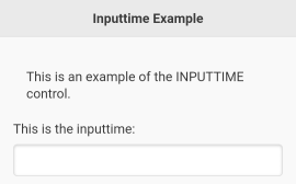


9.7.1 InputTime Customization
See section 7 on how to Apply Customization to Controls Before Adding Them.
INPUTTIME controls can appear in light/dark mode via a "color=a" / "color=b" customization: see 7.7.5 color. You can also align the text in an INPUTTIME control (left-aligned, centered, right-aligned, or justified): see 7.7.1 align. INPUTTIME controls can be set partly transparent: see 7.7.2 alpha. You can change the font of its text: see 7.7.7 font. Finally, it is possible to deeply customize an INPUTTIME control with CSS via the "style" customization: see section 7.7.15 style.
9.7.2 Getting and Setting InputTime Values
All get and set functions are to be used after the GW_RENDER() of the page, they will not work before.
You can get the value picked by the user in an INPUTTIME via GW_GET_VALUE$().
You can disable an INPUTTIME control (not allow it to take the user input) via GW_DISABLE(). You can also hide it via GW_HIDE(). Finally, you can change the value of an INPUTTIME control via GW_MODIFY() and the modification keys "text" to change its caption, or "input" to change its content.
9.8 GW_ADD_INPUTDATETIME()
| Syntax: | |
| ctl_id = GW_ADD_INPUTDATETIME (page_id, caption$, s_ini$) | |
| Parameters: | |
| page_id | Page ID. |
| caption$ | String containing caption, such as "Input Date and Time". |
| s_ini$ | String containing initial value. |
| Returns: | |
| ctl_id | Control ID. |
This controls allows the user to select both a date and a time. The control is presented according to the device localization. So on a US phone the user will pick "Dec 8 2020, 10:02 PM" and it will display "12/08/2020, 10:02 PM" (MM/DD/YYYY format for the date, and AM/PM format for the time) ; while on a French phone, the user will pick the same date and time but it will display "08/12/2020, 22:02" (DD/MM/YYYY format for the date, and 24H format for the time).
While the presentation format differs per locale, the over the wire format will always remain the same (for setting, and for getting the date-time): a string as defined in [RFC 3339] in the format "YYYY-MM-DDTHH:mm:SSZ" with time in 24H format and capital T and Z at the correct places. Example for our previous date-time: "2020-12-08T22:02:00Z"
The distinction between presentation format and over the wire format is very important and can be a pitfall for the programmer: be very cautious about it.
Initializing this control with an empty string as third parameter shows the current date and time.
In the example below, the first screenshot shows what the InputDateTime control looks like when it is first displayed. The second screenshot shows the control once it has been selected by the user (a date and time selection dialog appears). The third screenshot shows the control after a date and time have been selected.
INCLUDE "GW.bas"

% Create a page.
p = GW_NEW_PAGE()

% Prepare title bar string.
Title$ = GW_ADD_BAR_TITLE$("Inputdatetime Example")

% Add title to page.
GW_ADD_TITLEBAR(p, Title$)

% Add text.
GW_ADD_TEXT(p, "This is an example of the INPUTDATETIME control.")

% Add input control.
ctl = GW_ADD_INPUTDATETIME(p, "This is the InputDateTime:", "")

% Now show the page.
GW_RENDER(p)

DO
 % Wait for user action.
r$ = GW_WAIT_ACTION$()

% Example feedback.
POPUP r$

% End when BACK key is pressed.
UNTIL r$ = "BACK"

PRINT GW_GET_VALUE$(ctl)

END "End of Inputdatetime example."
Screenshots:


9.8.1 InputDateTime Customization
See section 7 on how to Apply Customization to Controls Before Adding Them.
INPUTDATETIME controls can appear in light/dark mode via a "color=a" / "color=b" customization: see 7.7.5 color. You can also align the text in an INPUTDATETIME control (left-aligned, centered, right-aligned, or justified): see 7.7.1 align. INPUTDATETIME controls can be set partly transparent: see 7.7.2 alpha. You can change the font of its text: see 7.7.7 font. Finally, it is possible to deeply customize an INPUTDATETIME control with CSS via the "style" customization: see section 7.7.15 style.
9.8.2 Getting and Setting InputDateTime Values
All get and set functions are to be used after the GW_RENDER() of the page, they will not work before.
You can get the value picked by the user in an INPUTDATETIME via GW_GET_VALUE$().
You can disable an INPUTDATETIME control (not allow it to take the user input) via GW_DISABLE(). You can also hide it via GW_HIDE(). Finally, you can change the value of an INPUTDATETIME control via GW_MODIFY() and the modification keys "text" to change its caption, or "input" to change its content.
9.9 GW_ADD_INPUTMONTH()
| Syntax: | |
| ctl_id = GW_ADD_INPUTMONTH (mypage, caption$, s_ini$) | |
| Parameters: | |
| page_id | Page ID. |
| caption$ | String containing caption such as "Input Month". |
| s_ini$ | String containing initial value. |
| Returns: | |
| ctl_id | Control ID. |
This controls allows the user to select a month in a specific year. The control is presented according to the device localization, so the month name and presentation will suit your device language and zone.
While the presentation format differs per locale, the over the wire format will always remain the same (for setting, and for getting the month): "YYYY-MM", year on 4 digits followed by dash followed by month on 2 digits (so prefixed with "0" for January to September).
The distinction between presentation format and over the wire format is very important and can be a pitfall for the programmer: be very cautious about it.
Initializing this control with an empty string as third parameter shows the current month.
INCLUDE "GW.bas"

p = GW_NEW_PAGE()

ctl = GW_ADD_INPUTMONTH(p, "Pick a month:", "")

GW_RENDER(p)

DO
 % Wait for user action.
r$ = GW_WAIT_ACTION$()

% Example feedback.
 POPUP r$

% End when BACK key is pressed.
UNTIL r$ = "BACK"
PRINT GW_GET_VALUE$(ctl)
END "End of InputMonth control."
Screenshots: 
9.9.1 InputMonth Customization
See section 7 on how to Apply Customization to Controls Before Adding Them.
INPUTMONTH controls can appear in light/dark mode via a "color=a" / "color=b" customization: see 7.7.5 color. You can also align the text in an INPUTMONTH control (left-aligned, centered, right-aligned, or justified): see 7.7.1 align. INPUTMONTH controls can be set partly transparent: see 7.7.2 alpha. You can change the font of its text: see 7.7.7 font. Finally, it is possible to deeply customize an INPUTMONTH control with CSS via the "style" customization: see section 7.7.15 style.
9.9.2 Getting and Setting InputMonth Values
All get and set functions are to be used after the GW_RENDER() of the page, they will not work before.
You can get the value picked by the user in an INPUTMONTH via GW_GET_VALUE$().
You can disable an INPUTMONTH control (not allow it to take the user input) via GW_DISABLE(). You can also hide it via GW_HIDE(). Finally, you can change the value of an INPUTMONTH control via GW_MODIFY() and the modification keys "text" to change its caption, or "input" to change its content.
9.10 GW_ADD_INPUTWEEK()
| Syntax: | |
| ctl_id = GW_ADD_INPUTWEEK (page_id, caption$, s_ini$) | |
| Parameters: | |
| page_id | Page ID. |
| caption$ | String containing caption such as "Input Week". |
| s_ini$ | String containing initial value. |
| Returns: | |
| ctl_id | Control ID. |
This controls allows the user to select a week in a specific year. The control is presented according to the device localization, so the week name and presentation will suit your device language and zone.
While the presentation format differs per locale, the over the wire format will always remain the same (for setting, and for getting the week): "YYYY-Wnn", year on 4 digits followed by dash followed by the capital letter "W" followed by the week number on 2 digits (so prefixed with "0" for the first nine weeks). Week numbers of a year go from "W01" to "W53".
The distinction between presentation format and over the wire format is very important and can be a pitfall for the programmer: be very cautious about it.
Initializing this control with an empty string as third parameter shows the current week.
INCLUDE "GW.bas"

p = GW_NEW_PAGE()

ctl = GW_ADD_INPUTWEEK(p, "Pick a week:", "")

GW_RENDER(p)

DO
 % Wait for user action.
r$ = GW_WAIT_ACTION$()

% Example feedback.
 POPUP r$

% End when BACK key is pressed.
UNTIL r$ = "BACK"
PRINT GW_GET_VALUE$(ctl)
END "End of InputWeek control."
Screenshots: 
9.10.1 InputWeek Customization
See section 7 on how to Apply Customization to Controls Before Adding Them.
INPUTWEEK controls can appear in light/dark mode via a "color=a" / "color=b" customization: see 7.7.5 color. You can also align the text in an INPUTWEEK control (left-aligned, centered, right-aligned, or justified): see 7.7.1 align. INPUTWEEK controls can be set partly transparent: see 7.7.2 alpha. You can change the font of its text: see 7.7.7 font. Finally, it is possible to deeply customize an INPUTWEEK control with CSS via the "style" customization: see section 7.7.15 style.
9.10.2 Getting and Setting InputWeek Values
All get and set functions are to be used after the GW_RENDER() of the page, they will not work before.
You can get the value picked by the user in an INPUTWEEK via GW_GET_VALUE$().
You can disable an INPUTWEEK control (not allow it to take the user input) via GW_DISABLE(). You can also hide it via GW_HIDE(). Finally, you can change the value of an INPUTWEEK control via GW_MODIFY() and the modification keys "text" to change its caption, or "input" to change its content.
9.11 GW_ADD_INPUTEMAIL()
| Syntax: | |
| ctl_id = GW_ADD_INPUTEMAIL (page_id, caption$, s_ini$) | |
| Parameters: | |
| page_id | Page ID. |
| caption$ | String containing caption such as "Input eMail". |
| s_ini$ | String containing initial value. |
| Returns: | |
| ctl_id | Control ID. |
This control looks and acts exactly like an Input line, but when clicking in the control a soft keyboard dedicated to writing email addresses is presented to the user, noticeably with an "@" character at the left of the space bar, and a "." character at the right (position may differ depending on your keyboard app, device language, geographical zone etc.)
INCLUDE "GW.bas"

p = GW_NEW_PAGE()

ctl = GW_ADD_INPUTEMAIL(p, "Type your email address:", "mougino@free.fr")

GW_RENDER(p)

DO
 % Wait for user action.
r$ = GW_WAIT_ACTION$()

% Example feedback.
 POPUP r$

% End when BACK key is pressed.
UNTIL r$ = "BACK"
PRINT GW_GET_VALUE$(ctl)
END "End of InputEMail control."
Screenshots: 
9.11.1 InputEmail Customization
See section 7 on how to Apply Customization to Controls Before Adding Them.
INPUTEMAIL controls can appear in light/dark mode via a "color=a" / "color=b" customization: see 7.7.5 color. You can also align the text in an INPUTEMAIL control (left-aligned, centered, right-aligned, or justified): see 7.7.1 align. INPUTEMAIL controls can be set partly transparent: see 7.7.2 alpha. You can change the font of its text: see 7.7.7 font. Finally, it is possible to deeply customize an INPUTEMAIL control with CSS via the "style" customization: see section 7.7.15 style.
9.11.2 Getting and Setting InputEmail Values
All get and set functions are to be used after the GW_RENDER() of the page, they will not work before.
You can get the value written by the user in an INPUTEMAIL via GW_GET_VALUE$().
You can disable an INPUTEMAIL control (not allow it to take the user input) via GW_DISABLE(). You can also hide it via GW_HIDE(). Finally, you can change the value of an INPUTEMAIL control via GW_MODIFY() and the modification keys "text" to change its caption, or "input" to change its content.
9.12 GW_ADD_INPUTNUMBER()
| Syntax: | |
| ctl_id = GW_ADD_INPUTNUMBER (page_id, caption$, s_ini$) | |
| Parameters: | |
| page_id | Page ID. |
| caption$ | String containing caption such as "Input Number". |
| s_ini$ | String containing initial value. |
| Returns: | |
| ctl_id | Control ID. |
This control looks and acts exactly like an Input line, but when clicking in the control a soft keyboard dedicated to writing numbers is presented to the user.
INCLUDE "GW.bas"

p = GW_NEW_PAGE()

ctl = GW_ADD_INPUTNUMBER(p, "Type a number:", "123")

GW_RENDER(p)

DO
 % Wait for user action.
r$ = GW_WAIT_ACTION$()

% Example feedback.
 POPUP r$

% End when BACK key is pressed.
UNTIL r$ = "BACK"
PRINT GW_GET_VALUE(ctl)
END "End of InputNumber control."
Screenshots: 
9.12.1 InputNumber Customization
See section 7 on how to Apply Customization to Controls Before Adding Them.
INPUTNUMBER controls can appear in light/dark mode via a "color=a" / "color=b" customization: see 7.7.5 color. You can also align the text in an INPUTNUMBER control (left-aligned, centered, right-aligned, or justified): see 7.7.1 align. INPUTNUMBER controls can be set partly transparent: see 7.7.2 alpha. You can change the font of its text: see 7.7.7 font. Finally, it is possible to deeply customize an INPUTNUMBER control with CSS via the "style" customization: see section 7.7.15 style.
9.12.2 Getting and Setting InputNumber Values
All get and set functions are to be used after the GW_RENDER() of the page, they will not work before.
You can get the value written by the user in an INPUTNUMBER via GW_GET_VALUE$() or GW_GET_VALUE().
You can disable an INPUTNUMBER control (not allow it to take the user input) via GW_DISABLE(). You can also hide it via GW_HIDE(). Finally, you can change the value of an INPUTNUMBER control via GW_MODIFY() and the modification keys "text" to change its caption, or "input" to change its content.
9.13 GW_ADD_INPUTPASSWORD()
| Syntax: | |
| ctl_id = GW_ADD_INPUTPASSWORD (page_id, caption$, s_ini$) | |
| Parameters: | |
| page_id | Page ID. |
| caption$ | String containing caption such as "Input Password". |
| s_ini$ | String containing initial value. |
| Returns: | |
| ctl_id | Control ID. |
This control looks and acts exactly like an Input line, but the text that is input by the user is hidden while typing (characters are replaced with the * character) and a small bar stating "Secured keyboard" or an equivalent is displayed on top of the soft keyboard.
INCLUDE "GW.bas"

p = GW_NEW_PAGE()

ctl = GW_ADD_INPUTPASSWORD(p, "Type a password:", "Top Secret")
GW_RENDER(p)

DO
 % Wait for user action.
r$ = GW_WAIT_ACTION$()

% Example feedback.
 POPUP r$

% End when BACK key is pressed.
UNTIL r$ = "BACK"
PRINT GW_GET_VALUE$(ctl)
END "End of InputPassword control."
Screenshots: 
9.13.1 InputPassword Customization
See section 7 on how to Apply Customization to Controls Before Adding Them.
INPUTPASSWORD controls can appear in light/dark mode via a "color=a" / "color=b" customization: see 7.7.5 color. You can also align the text in an INPUTPASSWORD control (left-aligned, centered, right-aligned, or justified): see 7.7.1 align. INPUTPASSWORD controls can be set partly transparent: see 7.7.2 alpha. You can change the font of its text: see 7.7.7 font. Finally, it is possible to deeply customize an INPUTPASSWORD control with CSS via the "style" customization: see section 7.7.15 style.
9.13.2 Getting and Setting InputPassword Values
All get and set functions are to be used after the GW_RENDER() of the page, they will not work before.
You can get the value written by the user in an INPUTPASSWORD via GW_GET_VALUE$().
You can disable an INPUTPASSWORD control (not allow it to take the user input) via GW_DISABLE(). You can also hide it via GW_HIDE(). Finally, you can change the value of an INPUTPASSWORD control via GW_MODIFY() and the modification keys "text" to change its caption, or "input" to change its content.
9.14 GW_ADD_INPUTTEL()
| Syntax: | |
| ctl_id = GW_ADD_INPUTTEL (page_id , caption$, s_ini$) | |
| Parameters: | |
| page_id | Page ID. |
| caption$ | String containing caption such as "Input Telephone". |
| s_ini$ | String containing initial value. |
| Returns: | |
| ctl_id | Control ID. |
This control looks and acts exactly like an Input line, but when clicking in the control a soft keyboard dedicated to writing telephone numbers is presented to the user.
INCLUDE "GW.bas"

p = GW_NEW_PAGE()

ctl = GW_ADD_INPUTTEL(p, "Type a phone number:", "+1 234 567 890")

GW_RENDER(p)

DO
 % Wait for user action.
r$ = GW_WAIT_ACTION$()

% Example feedback.
 POPUP r$

% End when BACK key is pressed.
UNTIL r$ = "BACK"
PRINT GW_GET_VALUE$(ctl)
END "End of InputTel control."
Screenshots: 
9.14.1 InputTel Customization
See section 7 on how to Apply Customization to Controls Before Adding Them.
INPUTTEL controls can appear in light/dark mode via a "color=a" / "color=b" customization: see 7.7.5 color. You can also align the text in an INPUTTEL control (left-aligned, centered, right-aligned, or justified): see 7.7.1 align. INPUTTEL controls can be set partly transparent: see 7.7.2 alpha. You can change the font of its text: see 7.7.7 font. Finally, it is possible to deeply customize an INPUTTEL control with CSS via the "style" customization: see section 7.7.15 style.
9.14.2 Getting and Setting Input TelValues
All get and set functions are to be used after the GW_RENDER() of the page, they will not work before.
You can get the value written by the user in an INPUTTEL via GW_GET_VALUE$().
You can disable an INPUTTEL control (not allow it to take the user input) via GW_DISABLE(). You can also hide it via GW_HIDE(). Finally, you can change the value of an INPUTTEL control via GW_MODIFY() and the modification keys "text" to change its caption, or "input" to change its content.
9.15 GW_ADD_INPUTURL()
| Syntax: | |
| ctl_id = GW_ADD_INPUTURL (page_id , caption$, s_ini$) | |
| Parameters: | |
| page_id | Page ID. |
| caption$ | String containing caption such as "Input URL". |
| s_ini$ | String containing initial value. |
| Returns: | |
| ctl_id | Control ID. |
This control looks and acts exactly like an InputLine, but when clicking in the control a soft keyboard dedicated to writing internet addresses aka URLs is presented to the user, noticeably with an "/" character at the left of the space bar, and a "." character at the right (position may differ depending on your keyboard app, device language, geographical zone etc.)
INCLUDE "GW.bas"

p = GW_NEW_PAGE()

ctl = GW_ADD_INPUTURL(p, "Type an url:", "http://mougino.free.fr")

GW_RENDER(p)

DO
 % Wait for user action.
r$ = GW_WAIT_ACTION$()

% Example feedback.
 POPUP r$

% End when BACK key is pressed.
UNTIL r$ = "BACK"
PRINT GW_GET_VALUE$(ctl)
END "End of InputURL control."
Screenshots: 
9.15.1 InputUrl Customization
See section 7 on how to Apply Customization to Controls Before Adding Them.
INPUTURL controls can appear in light/dark mode via a "color=a" / "color=b" customization: see 7.7.5 color. You can also align the text in an INPUTURL control (left-aligned, centered, right-aligned, or justified): see 7.7.1 align. INPUTURL controls can be set partly transparent: see 7.7.2 alpha. You can change the font of its text: see 7.7.7 font. Finally, it is possible to deeply customize an INPUTURL control with CSS via the "style" customization: see section 7.7.15 style.
9.15.2 Getting and Setting InputUrl Values
All get and set functions are to be used after the GW_RENDER() of the page, they will not work before.
You can get the value written by the user in an INPUTURL via GW_GET_VALUE$().
You can disable an INPUTURL control (not allow it to take the user input) via GW_DISABLE(). You can also hide it via GW_HIDE(). Finally, you can change the value of an INPUTURL control via GW_MODIFY() and the modification keys "text" to change its caption, or "input" to change its content.
9.16 GW_ADD_INPUTMINI()
| Syntax: | |
| ctl_id = GW_ADD_INPUTMINI (page_id, "n") | |
| Parameters: | |
| page_id | Page ID. |
| "n" | String of the initial value. |
| Returns: | |
| ctl_id | Control ID. |
An Input mini control is a very compact and inline Input number control. It can typically be used to input coordinates on one line. To take advantage of this control, it is recommended to use the advanced function GW_INJECT_HTML(), so it is best if you are an advanced programmer.
INCLUDE "GW.bas"

p = GW_NEW_PAGE()
GW_INJECT_HTML(p, "Enter coordinates: ")
coord_x = GW_ADD_INPUTMINI(p, "2")
GW_INJECT_HTML(p, " , ")
coord_y = GW_ADD_INPUTMINI(p, "3")
GW_ADD_BUTTON(p, "Submit", "GO")

GW_RENDER(p)

DO
 % Wait for user action.
r$ = GW_WAIT_ACTION$()
 % Example feedback.
POPUP r$
 IF r$ = "GO" THEN END "x: "+GW_GET_VALUE$(coord_x)+" ; y: "+GW_GET_VALUE$(coord_y)

UNTIL r$ = "BACK"
END
Screenshots: 
9.16.1 Input MiniCustomization
See section 7 on how to Apply Customization to Controls Before Adding Them.
INPUTMINI controls can appear in light/dark mode via a "color=a" / "color=b" customization: see 7.7.5 color. INPUTMINI controls can be set partly transparent: see 7.7.2 alpha. You can change the font of the number in it: see 7.7.7 font. Finally, it is possible to deeply customize an INPUTMINI control with CSS via the "style" customization: see section 7.7.15 style.
9.16.2 Getting and Setting Input MiniValues
All get and set functions are to be used after the GW_RENDER() of the page, they will not work before.
You can get the value written by the user in an INPUTMINI via GW_GET_VALUE$() or GW_GET_VALUE().
You can disable an INPUTMINI control (not allow it to take the user input) via GW_DISABLE(). You can also hide it via GW_HIDE(). Finally, you can change the value of an INPUTMINI control via GW_MODIFY() and the modification key "input" to change its content.
9.17 GW_ADD_INPUTLIST()
| Syntax: | |
| ctl_id = GW_ADD_INPUTLIST (page_id, caption$, values_and_actions$[]) | |
| Parameters: | |
| page_id | Page ID. |
| caption$ | String containing caption. |
| values_and_actions$ | Array containing pre-defined strings to match with the user input. |
| Returns: | |
| ctl_id | Control ID. |
An InputList looks very similar to an Input line except that it has a magnifying glass icon inside on the left. Another appropriate name for an Input list would be a Search bar.
The control also acts differently: it will show a list of predefined strings matching what the user is typing, and if the user taps one of these strings it will send an action message directly to the program, accessible via GW_GET_VALUE$().
See the full example and screenshot in the next section.
9.17.1 GW_CLOSE_INPUTLIST()
| Syntax: | |
| GW_CLOSE_INPUTLIST (ctl_id) | |
| Parameters: | |
| ctl_id | Inputlist control ID. |
| Returns: | |
| ctl_id | Control ID. |
Closes an InputList after the user has made a selection (i.e. has tapped on a pre-defined string).
This example shows how to prepare, show, and handle an InputList:
INCLUDE "GW.bas"
% Create a page.
p = GW_NEW_PAGE()
% Prepare title bar string.
Title$ = GW_ADD_BAR_TITLE$("Inputlist Example")
% Add title to page.
GW_ADD_TITLEBAR(p, Title$)
% Add text.
GW_ADD_TEXT(p, "This is an example of the INPUTLIST control.")
% Define and add input control.
ARRAY.LOAD os$[], "Android>OS1", "iOS>OS2", "Linux>OS3", "Mac OS>OS4", "Windows>OS5"
inplist = GW_ADD_INPUTLIST(p, "Type an OS name...", os$[])
% Now show the page.
GW_RENDER(p)
DO % Wait for user action.
 r$ = GW_WAIT_ACTION$()
 % Example feedback.
 POPUP r$
 % Inputlist events
 IF LEFT$(r$, 2) = "OS"
 % close list of pre-defined strings
 GW_CLOSE_INPUTLIST(inplist)
 % get what os # was selected
 sel_os = VAL(MID$(r$,3,1))
 % display the os name in the input control
 GW_MODIFY (inplist, "text", LEFT$(os$[sel_os], -4))
 % (we remove the last 4 characters ">OSn")
 ENDIF
UNTIL r$ = "BACK" % End when BACK key is pressed.
END "End of Inputlist example."
Screenshots: 

9.17.2 InputList Customization
See section 7 on how to Apply Customization to Controls Before Adding Them.
INPUTLIST controls can appear in light/dark mode via a "color=a" / "color=b" customization: see 7.7.5 color. You can also align the text in an INPUTLIST control (left-aligned, centered, right-aligned, or justified): see 7.7.1 align. INPUTLIST controls can be set partly transparent: see 7.7.2 alpha. You can change the font of its text: see 7.7.7 font. Finally, it is possible to deeply customize an INPUTLIST control with CSS via the "style" customization: see section 7.7.15 style.
9.17.3 Getting and Setting InputList Values
All get and set functions are to be used after the GW_RENDER() of the page, they will not work before.
You can get the value written by the user in an INPUTLIST via GW_GET_VALUE$(). You will be notified via a message if the user tapped one of the proposed predefined string: see above.
You can disable an INPUTLIST control (not allow it to take the user input) via GW_DISABLE(). You can also hide it via GW_HIDE(). Finally, you can change the value of an INPUTLIST control via GW_MODIFY() and the modification keys "text" to change its caption, or "input" to change its content. You can also change the list of its predefined strings via GW_AMODIFY() using the modification key "list" and an array containing the new strings.
9.18 GW_ADD_INPUTCOLOR()
| Syntax: | |
| ctl_id = GW_ADD_INPUTCOLOR (page_id, caption$, s_ini$) | |
| Parameters: | |
| page_id | Page ID. |
| caption$ | String containing caption, such as "Input Color". |
| s_ini$ | Initial color, hexadecimal number representing "#RRGGBB". |
| Returns: | |
| ctl_id | Control ID. |
The InputColor control allows the user to pick a color.
Please note that this control is basic and not very convenient. An improved color picker exists: see section 9.22 GW_ADD_COLORPICKER().
In the example below, the first screenshot shows what the Input color control looks like when it is first displayed. The second screenshot shows the control once it has been selected by the user (a color chart appears for color selection). The third screenshot shows the control after a color has been selected.
INCLUDE "GW.bas"

% Create a page.
p = GW_NEW_PAGE()

% Prepare title bar string.
Title$ = GW_ADD_BAR_TITLE$("Inputcolor Example")

% Add title to page.
GW_ADD_TITLEBAR(p,Title$)

% Add text.
GW_ADD_TEXT(p, "This is an example of the INPUTCOLOR control.")

% Add Inputcolor control.
ctl = GW_ADD_INPUTCOLOR(p, "Enter your favorite color:", "#00ff00")

% Now show the page.
GW_RENDER(p)

DO % Wait for user action.
r$ = GW_WAIT_ACTION$()

% Place here any necessary code to process user actions.
 % Example feedback.
POPUP r$

% End when BACK key is pressed.
UNTIL r$ = "BACK"

PRINT GW_GET_VALUE$(ctl)

END "End of Inputcolor example."
Screenshots:


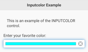
9.18.1 InputColor Customization
See section 7 on how to Apply Customization to Controls Before Adding Them.
INPUTCOLOR controls can appear in light/dark mode via a "color=a" / "color=b" customization: see 7.7.5 color. You can also align the text in an INPUTCOLOR control (left-aligned, centered, right-aligned, or justified): see 7.7.1 align. INPUTCOLOR controls can be set partly transparent: see 7.7.2 alpha. You can change the font of its text: see 7.7.7 font. Finally, it is possible to deeply customize an INPUTCOLOR control with CSS via the "style" customization: see section 7.7.15 style.
9.18.2 Getting and Setting InputColor Values
All get and set functions are to be used after the GW_RENDER() of the page, they will not work before.
You can get the value picked by the user in an INPUTCOLOR via GW_GET_VALUE$().
You can disable an INPUTCOLOR control (not allow it to take the user input) via GW_DISABLE(). You can also hide it via GW_HIDE(). Finally, you can change the value of an INPUTCOLOR control via GW_MODIFY() and the modification keys "text" to change its caption, or "input" to change its content.
9.19 GW_ADD_LOCK_PATTERN()
| Syntax: | |
| ctl_id = GW_ADD_LOCK_PATTERN (page_id, options$) | |
| Parameters: | |
| page_id | Page ID. |
| options$ | Option string, see below |
| Returns: | |
| ctl_id | Control ID. |
A lock pattern is a password protection where the user does not type letters and numbers but rather draws a pattern on screen: e.g.

GW and rfo-basic offer a highly configurable lock pattern control and the means to record, save, read, and proofcheck user patterns. See the full demo below to learn more.
9.19.1 LockPattern Options
You can specify the following options at the time of creating the control:
- GW_ADD_LOCK_PATTERN(page_id, "hide-pattern")will not draw the pattern on screen while the user is swiping his finger. This is an extra security measure to prevent people around the user to see their pattern being drawn.
- GW_ADD_LOCK_PATTERN(page_id, "HxV")
Specifies the number of H = horizontal dots, and V = vertical dots that the Lock Pattern will contain, separated by the letter "x".
H and V are integers that can each vary (independently) from 3 to 9. Most Android lock screens have a 3x3 pattern matrix. You can increase these numbers for improved security, at the expense of complexity for the user to draw/remember their pattern.
The default options (if the option string is empty) is a 3x3 lock pattern with the pattern showing when drawn by the user.
The following pictures show respectively a "3x3" lock pattern and a "4x6" lock pattern:


The two options "hide-pattern" and "HxV" can be combined in the option string, separated by a space. E.g. GW_ADD_LOCK_PATTERN(page_id, "4x4 hide-pattern")
9.19.2 GW_CLEAR_LOCK_PATTERN()
| Syntax: | |
| GW_CLEAR_LOCK_PATTERN (ctl_id) | |
| Parameters: | |
| ctl_id | Control ID. |
Once rendered on screen, the lock pattern will be empty (no line between the dots). After the user touches the screen, connects some dots, and releases his finger, a message will be sent to the program, accessible via GW_WAIT_ACTION$(). This message is of the form "pattern:123456" where the "pattern:" part is fixed and "123456" is a unique code corresponding to the pattern drawn on screen by the user. The user pattern will remain drawn on screen unless the program calls GW_CLEAR_LOCK_PATTERN(ctl_id).
See the full demo below to learn on when to use this command.
9.19.3 GW_SHOW_WRONG_PATTERN()
| Syntax: | |
| GW_SHOW_WRONG_PATTERN (ctl_id) | |
| Parameters: | |
| ctl_id | Control ID. |
This command is to be used to indicate that a wrong lock pattern has been drawn by the user.
INCLUDE "GW.bas"
define$ = "Define a new lock pattern:"
draw$ = "Draw your lock pattern to access the app."
confirm$ = "Confirm the existing lock pattern:"
% Create a page in dark mode.
GW_USE_THEME_CUSTO_ONCE("color=b")
p = GW_NEW_PAGE()
% Prepare title bar string.
Title$ = GW_ADD_BAR_TITLE$("Top Secret App")
% Add title to page.
GW_ADD_TITLEBAR(p, Title$)
% Add text.
txt = GW_ADD_TEXT(p, define$)
% Add Lock Pattern control.
lock = GW_ADD_LOCK_PATTERN(p, "")
% Add a colored button.
GW_USE_THEME_CUSTO_ONCE("style='background:red'")
del_btn = GW_ADD_BUTTON(p, "Modify the lock pattern", "DEL")
GW_ADD_BUTTON(p, "Cancel and Exit App", "BACK")
% Now show the page.
GW_RENDER(p)
% Immediately hide the Modify button depending on the situation.
FILE.EXISTS fe, "lock.pattern"
IF fe % lock pattern already saved
 TEXT.OPEN r, fid, "lock.pattern"
 TEXT.READLN fid, saved_pattern$
 TEXT.CLOSE fid
 PRINT "Existing code: "+CHR$(34)+saved_pattern$+CHR$(34)
 GW_MODIFY(txt, "text", draw$)
ELSE
 GW_HIDE(del_btn)
ENDIF
DO % Wait for user action.
 r$ = GW_WAIT_ACTION$()
 % Received a message from the lock pattern control.
 IF IS_IN("pattern:", r$) = 1
 % Save drawn pattern in a variable.
 drawn_pattern$ = MID$(r$, LEN("pattern:")+1)
 PRINT "Received code: "+CHR$(34)+drawn_pattern$+CHR$(34)
 % Handle saving a new pattern.
 IF saved_pattern$ = ""
 % Very first pattern draw:
 IF first_pattern$ = ""
 first_pattern$ = drawn_pattern$
 % Clear the pattern on screen
 GW_CLEAR_LOCK_PATTERN(lock)
 % And ask for pattern confirmation
 POPUP "Please confirm pattern"
 PRINT "Asking code confirmation"
 % Second pattern draw: matches first :)
 ELSEIF drawn_pattern$ = first_pattern$
 % Clear the pattern on screen
 GW_CLEAR_LOCK_PATTERN(lock)
 % Save the code to a file
 saved_pattern$ = drawn_pattern$
 TEXT.OPEN w, fid, "lock.pattern"
 TEXT.WRITELN fid, saved_pattern$
 TEXT.CLOSE fid
 % Show success to user
 POPUP "Code defined"
 PRINT "Saved code: "+CHR$(34)+saved_pattern$+CHR$(34)
 % And prepare for the next steps
 GW_ENABLE(del_btn)
 GW_SHOW(del_btn)
 GW_MODIFY(txt, "text", draw$)
 % Second pattern drawn: doesn't match first :(
 ELSE
 % Show failure to user
 GW_SHOW_WRONG_PATTERN(lock)
 POPUP "Wrong pattern!\nTry again"
 PRINT "Wrong code"
 % Wait 2s before clearing the (wrong) pattern
 PAUSE 2000
 GW_CLEAR_LOCK_PATTERN(lock)
 ENDIF
 % User drew correctly the saved pattern
 ELSEIF drawn_pattern$ = saved_pattern$
 % He previously asked to delete it > granted
 IF ask_to_delete
 % Show sucess to user
 ask_to_delete = 0
 GW_CLEAR_LOCK_PATTERN(lock)
 POPUP "Confirmed!\nReseting access..."
 % Delete code from disk and variable
 FILE.DELETE fd, "lock.pattern"
 saved_pattern$ = ""
 first_pattern$ = ""
 % Proceed to recording a new code
 GW_HIDE(del_btn)
 GW_MODIFY(txt, "text", define$)
 PRINT "Code reset - File deleted"
 % Default case: correct code grants access to the top secret page!
 ELSE
 GOTO TopSecret
 ENDIF
 % User drew a pattern other than the saved one
 ELSE
 % Inform user
 GW_SHOW_WRONG_PATTERN(lock)
 IF ask_to_delete THEN POPUP "Wrong lock pattern!\nOperation cancelled"
 % Wait 1s and clear the pattern on screen
 PAUSE 1000
 GW_CLEAR_LOCK_PATTERN(lock)
 % If pattern was needed for a reset operation, cancel
 IF ask_to_delete
 ask_to_delete = 0
 GW_MODIFY(txt, "text", draw$)
 GW_ENABLE(del_btn)
 ENDIF
 ENDIF % end of pattern treatment
 % User pressed the "Modify lock pattern" button
 ELSEIF r$ = "DEL"
 % Ask user for existing code to confirm operation
 ask_to_delete = 1
 GW_MODIFY(txt, "text", confirm$)
 POPUP "Existing code needed"
 GW_DISABLE(del_btn)
 ENDIF
UNTIL r$ = "BACK" % End when BACK key is pressed.
END "End of Lock Pattern example."
TopSecret:
% Build and show a top secret page ;)
GW_USE_THEME_CUSTO_ONCE("color=b")
p2 = GW_NEW_PAGE()
GW_ADD_TITLEBAR(p2, Title$)
GW_START_CENTER(p2)
GW_USE_THEME_CUSTO_ONCE("fit-screen")
GW_ADD_IMAGE(p2, "http://mougino.free.fr/tmp/granted.gif")
GW_ADD_TEXT(p2, "")
GW_USE_THEME_CUSTO_ONCE("fit-screen")
GW_ADD_IMAGE(p2, "http://mougino.free.fr/tmp/topsecret.gif")
GW_STOP_CENTER(p2)
GW_RENDER(p2)
GW_WAIT_ACTION$()
END
Screenshots: 

9.20 GW_ADD_SELECTBOX()
| Syntax: | |
| ctl_id = GW_ADD_SELECTBOX (page_id, caption$, values$[]) | |
| Parameters: | |
| page_id | Page ID. |
| caption$ | String containing caption. |
| values$[] | String array containing items to display. |
| Returns: | |
| ctl_id | Control ID. |
This function adds a SelectBox control to the page. It is a pull-down list of predefined texts that the user can select from. Any item that starts with the character "#" is considered a title/separator, and cannot be selected.
In the following example, the first screenshot shows the control when it is first displayed. The second screen shot shows it after the user picked it. And the third screenshot shows the control after the user selected an item.
INCLUDE "GW.bas"

% Create a page.
p = GW_NEW_PAGE()

% Prepare title bar string.
Title$ = GW_ADD_BAR_TITLE$("Selectbox Example")

% Add title to page.
GW_ADD_TITLEBAR(p, Title$)

% Add descriptive text.
GW_ADD_TEXT(p, "This is an example of the SELECTBOX control:")

% Array contains two titles and four selectable items.
ARRAY.LOAD a$[], "#LOWER CASE", "abc", "def", "#UPPER CASE", "ABC", "DEF"

% Now add the control.
ctl = GW_ADD_SELECTBOX(p, "Selectbox", a$[])

% Now show the page.
GW_RENDER(p)

DO
% Wait for user action.
r$ = GW_WAIT_ACTION$()

 % Place here any necessary code to process user actions.

% Some feedback.
POPUP r$

% End when BACK key is pressed.
UNTIL r$ = "BACK"
PRINT GW_GET_VALUE$(ctl)

END "End of Selectbox example."
Screenshots:

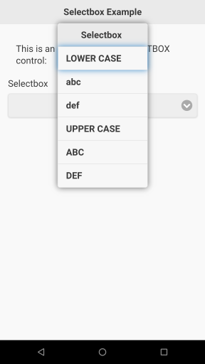

9.20.1 SelectBox Customization
See section 7 on how to Apply Customization to Controls Before Adding Them.
SELECTBOX controls can appear in light/dark mode via a "color=a" / "color=b" customization: see 7.7.5 color. You can change the font of its text: see 7.7.7 font. Finally, it is possible to deeply customize an SELECTBOX control with CSS via the "style" customization: see section 7.7.15 style.
9.20.2 Getting and Setting SelectBox Values
All get and set functions are to be used after the GW_RENDER() of the page, they will not work before.
You can get the value picked by the user from the SELECTBOX via GW_GET_VALUE$(). You can add a listener on the "change" event of the SELECTBOX to be notified via a message if the user makes a selection.
You can disable a SELECTBOX control (not allow it to take the user input) via GW_DISABLE(). You can also hide it via GW_HIDE(). Finally, you can change the value of a SELECTBOX control via GW_MODIFY() and the modification keys "text" to change its caption, or "selected" set to the array index as a string (e.g. "1", "2"...) to change its selection. You can also change the list of its pre-defined strings via GW_AMODIFY() using the modification key "content" and an array containing the new strings.
9.21 GW_ADD_SLIDER()
| Syntax: | |
| ctl_id = GW_ADD_SLIDER (page_id, caption$, n_min, n_max, n_step, n_ini) | |
| Parameters: | |
| page_id | Page ID. |
| caption$ | String containing caption. |
| n_min | Leftmost minimum value of the continuum. |
| n_max | Rightmost maximum value of the continuum. |
| n_step | Increments of the continuum. e.g. 1 for integers, 0.1 for decimals |
| n_ini | Initial value of the slider. |
| Returns: | |
| ctl_id | Control ID. |
This function adds a slider control to the page. Sliders are used to enter numeric values along a continuum.
INCLUDE "GW.bas"

p = GW_NEW_PAGE()

% Prepare title bar string.
title$ = GW_ADD_BAR_TITLE$("Slider Example")

% Add title to page.
GW_ADD_TITLEBAR(p, title$)

% Add descriptive text.
GW_ADD_TEXT(p, "This is an example of the SLIDER control:")

% Add first slider.
slide1 = GW_ADD_SLIDER(p, "First Slider", 5, 26, 1, 13)

% Add a button to get slider value.
GW_ADD_BUTTON(p, "Get first slider value","get")

% Add text for first slider value.
text1 = GW_ADD_TEXT(p, " ")

% Add second slider.
slide2 = GW_ADD_SLIDER(p, "Second Slider", 1, 10, 1, 1)

% Add text for second slider value.
text2 = GW_ADD_TEXT(p, " ")

% Listen for first slider action.
GW_ADD_LISTENER(p, slide1, "change", "slide1")

% Listen for second slider action.
GW_ADD_LISTENER(p, slide2, "change", "slide2")

GW_RENDER(p)

DO
 % Wait for user action.
r$ = GW_WAIT_ACTION$()

 % Place here any necessary code to process
 % user actions.
 % Example feedback.
POPUP r$

SW.BEGIN r$

% Button was pressed.
SW.CASE "get"
s$ = GW_GET_VALUE$(slide)
GW_MODIFY(text1, "text", s$)
SW.BREAK

% First slider changed.
SW.CASE "slide1"
GW_MODIFY(text1, "text", r$)
SW.BREAK

% Second slider changed.
SW.CASE "slide2"
s$ = GW_GET_VALUE$(slide2)
GW_MODIFY(text2, "text", s$)
SW.BREAK

SW.END

% End when BACK key is pressed.
UNTIL r$="BACK"

END "End of Slider example."
Screenshots: 
9.21.1 Slider Customization
See section 7 on how to Apply Customization to Controls Before Adding Them.
Sliders can be presented in 6 different colors: color=a for light blue (default) ; color=b for green ; color=c for red ; color=d for orange ; color=e for pink ; and color=f for dark blue. See section 7.7.5 color.
9.21.2 Getting and Setting Slider Values
All get and set functions are to be used after the GW_RENDER() of the page, they will not work before.
You can get the value picked by the user in a slider via GW_GET_VALUE$() or GW_GET_VALUE().
You can disable a slider (not allow it to take the user input) via GW_DISABLE(). You can also hide it via GW_HIDE(). Finally, you can change the value of a slider via GW_MODIFY() and the modification keys "text" to change its caption, "val" to change its current value, "min" to change its minimum value, "max" to change its maximum value, and finally "step" to change its increments value.
9.22 GW_ADD_COLORPICKER()
| Syntax: | |
| ctl_id = GW_ADD_COLORPICKER (page_id, caption$, ini_color$) | |
| Parameters: | |
| page_id | Page ID. |
| caption$ | String containing color picker caption. |
| ini_color$ | Initial color, hexadecimal number representing "#RRGGBB" |
| Returns: | |
| ctl_id | Control ID. |
Adds a color picker control. As you navigate through the colors, this control will generate messages which can be tested for by GW_WAIT_ACTION$() or GW_ACTION$() functions.
INCLUDE "GW.bas"

% Create a page.
p = GW_NEW_PAGE()

% Prepare title bar string.
Title$ = GW_ADD_BAR_TITLE$("Colorpicker Example")

% Add title to page.
GW_ADD_TITLEBAR(p,Title$)

% Add descriptive text.
GW_ADD_TEXT(p, "This is an example of the COLORPICKER control:")

% Now add the colorpicker control.
CP = GW_ADD_COLORPICKER(p, "Pick a color", "#00ff00")

% Add a button to get the color code.
GW_ADD_BUTTON(p, "Get the color", "Get")

% Add textbox to show color code.
TB = GW_ADD_TEXTBOX(p, "")

% Now show the page.
GW_RENDER(p)

DO
% Wait for user action.
r$ = GW_WAIT_ACTION$()

% Place here any necessary code to process user actions.
 % Example feedback.
POPUP r$

% Was the button pressed?
IF r$ = "Get" then ~
GW_MODIFY(TB, "text", GW_GET_VALUE$(CP))

% End when BACK key is pressed.
UNTIL r$ = "BACK"

END "End of Colorpicker example."
Screenshots: 

10 Interacting with Controls
The following functions and commands allow you to obtain information about controls on a page, or change how they are displayed.
10.1 GW_GET_VALUE$()
| Syntax: | |
| e$ = GW_GET_VALUE$ (ctl_id) | |
| Parameters: | |
| ctl_id | Control ID. |
| Returns: | |
| e$ | String value from control. |
This function returns the live string value of a control. It is to be used for INPUT controls and other controls where the user has a mean of changing its content.
This needs to be called after the GW_RENDER() of the page, it will not work before.
The following table lists the controls compatible with GW_GET_VALUE$() and the values returned:
| CHECKBOX | Returns string "1" if checkbox is checked, or string "0" if it is unchecked. This result is also available as an integer through the functions GW_GET_VALUE() and GW_CHECKBOX_CHECKED(). |
| COLORPICKER | Returns the live color value of the control. The value is in the form "#rrggbb" where rr, gg and bb are the hexadecimal values of the red, green and blue components of the color. |
| DIALOG_INPUT | Returns the live value of the DIALOG input line, as changed by the user. You can retrieve an integer version (or 0 if the value is not a number) through GW_GET_VALUE(). |
| DIALOG_CHECKBOX | Returns string "1" if DIALOG checkbox is checked, or string "0" if it is unchecked. This result is also available as an integer through the functions GW_GET_VALUE() and GW_CHECKBOX_CHECKED(). |
| FLIPSWITCH | Returns the one of the two string values that is currently switched. E.g. for a FLIPSWITCH with values "Yes" and "No": if "Yes" is showing it will return "Yes", This result is also available through the function GW_FLIPSWITCH_CHANGED(). |
| INPUT* | Returns a live string value of the control, as changed by the user. For INPUTNUMBER and INPUTMINI You can retrieve an integer version of the value via GW_GET_VALUE(). |
| RADIO | Returns string "1" if radio control is selected, or string "0" if it is not selected. This result is also available as an integer through the functions GW_GET_VALUE() and GW_RADIO_SELECTED(). |
| SELECTBOX | Returns a live string value of the index line of the control currently selected by the user. You can retrieve an integer version via GW_GET_VALUE(). |
| SLIDER | Returns a live string value of the number currently selected by the user. You can retrieve an integer version via GW_GET_VALUE(). |
| DIALOG_MESSAGE, LISTVIEW | GW_GET_VALUE() not supported. To track the user feedback, use an action message in your button array instead e.g.: ar$[1] = "Label>ACTION" |
| AUDIO, BUTTON, CLASS, FOOTBAR, IMAGE, LINK, PANEL, SPINNER, TABLE, TEXT, TEXTBOX, TITLE, TITLEBAR, VIDEO | GW_GET_VALUE() not supported for read-only controls: returned value is "undefined" |
10.2 GW_GET_VALUE()
| Syntax: | |
| n = GW_GET_VALUE (ctl_id) | |
| Parameters: | |
| ctl_id | Control ID. |
| Returns: | |
| n | Numeric value from control. |
This function returns the live integer value of a control or 0 if the value is not a number. It is to be used for INPUT controls and other controls where the user can change its content. See the table in the previous chapter for details on supported controls and their values.
This needs to be called after the GW_RENDER() of the page, it will not work before.
10.3 GW_ID$()
| Syntax: | |
| ctl_name$ = GW_ID$ (ctl_id) | |
| Parameters: | |
| ctl_id | Control ID. |
| Returns: | |
| ctl_name$ | String containing name of control. |
This function returns the string descriptor of a given control. It can be useful for advanced programming, or specifically for COLORPICKER controls that -when changed- send messages prefixed with their ID string descriptor.
INCLUDE "GW.bas"
cpp = GW_NEW_PAGE()
colpik = GW_ADD_COLORPICKER (cpp, "Colorpicker control:", "FF00FF")
GW_RENDER (cpp)
DO
r$ = GW_WAIT_ACTION$()
 IF IS_IN (GW_ID$(colpik), r$) = 1 THEN % color picker change
 ncol$ = MID$ (r$, IS_IN(":", r$)+1) % extract '#rrggbb' out of
 % 'CtlId:#rrggbb'
 POPUP "Changed color to " + ncol$
 ENDIF
UNTIL r$ = "BACK"
10.4 GW_ID()
| Syntax: | |
| ctl_id = GW_ID (ctl_name$) | |
| Parameters: | |
| ctl_name$ | String containing name of control. |
| Returns: | |
| ctl_id | Control ID. |
This function returns the descriptor ID number for a given control string descriptor. It can be useful for advanced programming.
10.5 GW_LAST_ID()
| Syntax: | |
| ctl_id = GW_LAST_ID () | |
| Returns: | |
| ctl_id | Control ID. |
This function returns the ID of the last created control. For example, a control added like this:
...
box=GW_ADD_INPUTBOX(p, "", "")
...
can also be added like this:
...
GW_ADD_INPUTBOX(p, "", "")
box=GW_LAST_ID()
...
This functions is needed if you are using the second form of control creation: GW_ADD_CONTROL$(param1, ...), that returns a string instead of a control ID. In this case, call GW_LAST_ID() after creation to get the control ID. See section 12 GW_ADD_*$() Functions.
GW_LAST_ID() can also be used when you add a dynamic number of controls, such as in a loop (e.g. listing images on sdcard), and you want to know how many controls were added.
10.6 GW_FOCUS()
| Syntax: | |
| GW_FOCUS (ctl_id) | |
| Parameters: | |
| ctl_id | Control ID. |
This function places the focus on (or in) the selected control. It is especially useful when validating a form page filled with the typical INPUT controls: name, birth date, email etc. when you want to warn the user of an error and show him where to fix.
This needs to be called after the GW_RENDER() of the page, it will not work before.
This example demonstrates a complete form to register a user for a web market app:
ARRAY.LOAD buzz[], 1, 100
% Load the GW library
INCLUDE "GW.bas"
% Create a new page
p = GW_NEW_PAGE()
% Add the needed input controls
GW_ADD_TITLE(p, "Personal Information")
firstname = GW_ADD_INPUTLINE(p, "First Name:", "")
lastname = GW_ADD_INPUTLINE(p, "Last Name:", "")
dateofbirth = GW_ADD_INPUTDATE(p, "Date of Birth:", "")
address = GW_ADD_INPUTLINE(p, "Ship To:", "")
phone = GW_ADD_INPUTTEL(p, "Phone number:", "")
GW_ADD_TITLE(p, "Web Account")
email = GW_ADD_INPUTEMAIL(p, "Email address:", "")
password1 = GW_ADD_INPUTPASSWORD(p, "Type your password", "")
password2 = GW_ADD_INPUTPASSWORD(p, "Confirm your password", "")
% Add the validation button
GW_ADD_BUTTON(p, "Register Form", "REG")
% Show the page
GW_RENDER(p)
% Get user actions
DO
 r$ = GW_WAIT_ACTION$()
 IF r$="REG"
 err = 0
 ctl = firstname : GOSUB CheckControl
 ctl = lastname : GOSUB CheckControl
 ctl = dateofbirth : GOSUB CheckControl
 ctl = address : GOSUB CheckControl
 ctl = phone : GOSUB CheckControl
 ctl = email : GOSUB CheckControl
 ctl = password1 : GOSUB CheckControl
 ctl = password2 : GOSUB CheckControl
 IF GW_GET_VALUE$(password1) <> GW_GET_VALUE$(password2)
 POPUP "Passwords don't match!"
 ctl = password2
 GOSUB ShowWarning
 ENDIF
 IF err = 0 THEN END "Registration Ok!"
 ENDIF
UNTIL r$= "BACK"
END "Registration Canceled :("
CheckControl:
v$ = GW_GET_VALUE$(ctl)
IF v$ = "" | v$ = "<empty>"
 err = err+1
 GOSUB ShowWarning
ELSE
 GW_MODIFY(ctl, "style:color", "green")
ENDIF
RETURN
ShowWarning:
GW_MODIFY(ctl, "input", "<empty>")
IF ctl < password1 THEN GW_MODIFY(ctl, "style:color", "red")
IF err = 1
 GW_FOCUS(ctl)
 VIBRATE buzz[], -1
 POPUP "Error - Please correct"
ENDIF
RETURN
10.7 GW_ENABLE()
| Syntax: | |
| GW_ENABLE (ctl_id) | |
| Parameters: | |
| ctl_id | Control ID. |
This function enables the control. The user will be able to interact with it (this is the default condition). This needs to be called after the GW_RENDER() of the page, it will not work before.
10.8 GW_DISABLE()
| Syntax: | |
| GW_DISABLE (ctl_id) | |
| Parameters: | |
| ctl_id | Control ID. |
This function disables the control. The user will not be able to interact with it. This needs to be called after the GW_RENDER() of the page, it will not work before.
10.9 GW_SHOW()
| Syntax: | |
| GW_SHOW (ctl_id) | |
| Parameters: | |
| ctl_id | Control ID. |
This function makes the control visible (default condition). This needs to be called after the GW_RENDER() of the page, it will not work before.
10.10 GW_HIDE()
| Syntax: | |
| GW_HIDE (ctl_id) | |
| Parameters: | |
| ctl_id | Control ID. |
This function hides (makes not visible) the control. This needs to be called after the GW_RENDER() of the page, it will not work before.
10.11 GW_MODIFY()
| Syntax: | |
| GW_MODIFY (ctl_id, key$, new_value$) | |
| Parameters: | |
| ctl_id | Control ID. |
| key$ | String containing key names. |
| new_value$ | String containing new value for control’s key. |
This function allows you to change the value, label and/or state of a control. This needs to be called after the GW_RENDER() of the page, it will not work before.
Note that this function cannot change parameters previously set by either GW_USE_THEME_CUSTO_ONCE() or GW_NEW_THEME_CUSTO(), except for the "style" parameter.
The following table lists the keys associated with different control types, and their allowed new values.
| all (inc. CLASS) | style:subkey Example: "style:color" OR style Example: "style" |
A string containing new value. Example: "red" OR A string containing one or more "subkey:new_value" pairs, separated by semicolons. Example:"background:blue;color:red" |
| AUDIO | content | URL or local file string |
| BUTTON | text|link | Any string |
| CHECKBOX | checked|text | Text: any label string Checked: "0" or "1" |
| COLORPICKER | text|input | Text: any label string Input: color string in the form "#rrggbb" |
| DIALOG_INPUT | text|title|input | Text/Title: any label string Input: any string - if starts with "A>": INPUTLINE - if starts with "1>": INPUTNUMBER - if starts with "*>": INPUTPASSWORD - if starts with "@>": INPUTEMAIL - if starts with "<>": INPUTURL |
| DIALOG_CHECKBOX | text|title|checked | Text/Title: any label string Checked: "0" or "1" |
| DIALOG_MESSAGE | text|title | Any string |
| FLIPSWITCH | text|selected | Text: any label string Selected: string of the first or second control value |
| FOOTBAR | title|lbutton|rbutton | Any string |
| IMAGE | content | URL or local file string |
| INPUT* | text|input | Any string |
| LINK | text|link | Any string |
| PANEL | content | Any string |
| RADIO | selected|text | Text: any label string Selected: "0" or "1" |
| SELECTBOX | selected|text | Text: any label string Selected: a string of the array index |
| SLIDER | val|min|max|step|text | Text: any label string Others: the new numeral value, as a string |
| SPINNER | text | Any string |
| TABLE | content | Any string |
| TEXT | text | Any string |
| TEXTBOX | text | Any string |
| TITLE | text | Any string |
| VIDEO | content | URL or local file string |
Note that there are two ways of modifying the "style" value. The second format allows you to change multiple style values separated by semicolons.
10.12 GW_AMODIFY()
| Syntax: | |
| GW_AMODIFY (ctl_id, key$, new_values$[]) | |
| Parameters: | |
| ctl_id | Control ID. |
| key$ | String containing key names. |
| new_values$[] | String array containing new values for control’s key. |
GW_AMODIFY() ('A' for Array) allows you to change the full content of controls that take an array as a parameter. For example you can change a full table loaded with hundreds of cells, with a totally new one, by the means of a simple call to GW_AMODIFY().
The following table lists the keys associated with different control types, and their allowed new values.
| DIALOG_* | buttons | new_array$[] |
| FOOTBAR | lmenu|rmenu | new_array$[] |
| INPUTLIST | list | new_array$[] |
| LISTVIEW | content | new_array$[] |
| SELECTBOX | content | new_array$[] |
| TABLE | content | new_array$[] |
| TITLEBAR | lmenu|rmenu | new_array$[] |
10.13 GW_MODIFY and GW_AMODIFY Notes
The functions GW_MODIFY() and GW_AMODIFY() ('A' for Array) need to be called after the GW_RENDER() of the page that contains the control to be modified. This is because the control does not exist before rendering the page.
If you navigate between pages, the pages will be rendered in their initial state. If you want to reflect modifications previously made by the user, it is good practice to GW_MODIFY() or GW_AMODIFY() the modified controls immediately after the GW_RENDER().
zz$ = "not changed" % Initial state.
INCLUDE "GW.bas"
% Page 1 creation.
page1 = GW_NEW_PAGE()
% First page title bar.
GW_ADD_TITLEBAR (page1, "first page")
% Add a textbox and two buttons.
tb = GW_ADD_TEXTBOX(page1, "")
GW_ADD_BUTTON(page1, "change state", "change")
GW_ADD_BUTTON(page1, "go to page 2", "page 2")
% Page 2 creation.
page2 = GW_NEW_PAGE()
% Second page title bar.
GW_ADD_TITLEBAR(page2, "second page")
% Add a button.
GW_ADD_BUTTON(page2, "go to page 1", "page 1")
% Page 1: render and interact with the page.
p1:
GW_RENDER(page1)
% Here we modify page 1.
GW_MODIFY(tb, "text", zz$)
DO
 % Wait for user action.
 r$ = GW_WAIT_ACTION$()
 % Test for the "change state" button.
 IF r$ = "change" THEN
 IF zz$ = "changed" THEN zz$ = "not changed" ELSE zz$ = "changed"
 GW_MODIFY(tb, "text", zz$)
 ENDIF
 %Test for the "go to page 2" button.
 IF r$ = "page 2" THEN GOTO p2
% End when BACK key is pressed.
UNTIL r$ = "BACK"
END
% Page 2: render and interact with the page.
p2:
GW_RENDER(page2)
DO
 % Wait for user action.
 r$ = GW_WAIT_ACTION$()
 %Test for the "go to page 1" button.
 IF r$ = "page 1" THEN GOTO p1
% End when BACK key is pressed.
UNTIL r$ = "BACK"
END
11 Dialogs and Spinners
A Dialog allows you to display a message to the user. Some dialogs also allow the user to perform some actions in response to the message.
Dialogs are added to a page but, unlike controls, they are not displayed when the page is rendered. Instead, your program has to display a dialog, usually as a result of some user interaction, by the GW_SHOW_DIALOG() function.
A spinner is like a dialog in that it conveys a message, usually indicating that a process is taking place, but the user cannot interact with it.
11.1 GW_ADD_DIALOG_MESSAGE()
| Syntax: | |
| dialog_id = GW_ADD_DIALOG_MESSAGE (page_id, title$, message$, buttons_and_actions$[]) | |
| Parameters: | |
| page_id | Page ID. |
| title$ | String containing the title displayed at the top of the dialog. |
| message$ | String containing a message displayed above the buttons. |
| buttons_and_actions$[] | String array containing button legends and actions. |
| Returns: | |
| dialog_id | Dialog ID. |
The MESSAGE dialog displays a message followed by one or more predefined buttons. Each button is defined by one element of the array parameter. It must be in the format "ButtonLegend>Action". The ButtonLegend is the text that appears in the button, and the Action is what you want to happen when the button is selected by the user.
In the following example, the first screenshot shows the page before the dialog is displayed. The second screenshot shows the displayed dialog.
INCLUDE "GW.bas"

% Create a page.
p = GW_NEW_PAGE()

% Prepare title bar string.
Title$ = GW_ADD_BAR_TITLE$("DialogMessage Example")

% Add title to page.
GW_ADD_TITLEBAR(p,Title$)

% Add descriptive text.
GW_ADD_TEXT(p, "This is an example of the DIALOG_MESSAGE control:")

% Add button to activate the dialog.
GW_ADD_BUTTON(p, "Let's do this!", "show")

% Let's prepare the dialog.
ARRAY.LOAD a$[], "OK>done", "Not OK>cancel"
Dlg = GW_ADD_DIALOG_MESSAGE(p, "My Dialog", "A message from our sponsor", a$[])

% Now show the page.
GW_RENDER(p)

DO
% Wait for user action.
r$ = GW_WAIT_ACTION$()

% Place here any necessary code to process user actions.

% Parse user action.
SW.BEGIN r$

% Test for button press.
SW.CASE "show"
GW_SHOW_DIALOG(Dlg)
SW.BREAK

% Test for first dialog pick.
SW.CASE "done"
POPUP "OK was picked"
SW.BREAK

% Test for second dialog pick.
SW.CASE "cancel"
POPUP "Not OK was picked"
SW.BREAK

SW.END

% End when BACK key is pressed.
UNTIL r$ = "BACK"
END "End of DialogMessage example."
Screenshots: 

11.2 GW_ADD_DIALOG_CHECKBOX()
| Syntax: | |
| dialog_id = GW_ADD_DIALOG_CHECKBOX (page_id, title$, message$, checkbox_label$, buttons_and_actions$[]) | |
| Parameters: | |
| page_id | Page ID. |
| title$ | String containing the title displayed at the top of the dialog. |
| message$ | String containing a message displayed above the buttons. |
| checkbox_label$ | String containing the text for the checkbox. |
| buttons_and_actions$[] | String array containing button legends and actions. |
| Returns: | |
| dialog_id | Dialog ID. |
The CHECKBOX dialog displays a message followed by a checkbox and one or more predefined buttons. Each button is defined by one element of the array parameter. It must be in the format "ButtonLegend>Action". The ButtonLegend is the text that appears in the button, and the Action is what you want to happen when the button is selected by the user.
If you want the checkbox to be checked by default, prefix its string with a ">".
In the following example, the first screenshot shows the page before the dialog is displayed. The second screenshot shows the displayed dialog. And the third screenshot shows a possible result of the dialog.
INCLUDE "GW.bas"

% Create a page.
p = GW_NEW_PAGE()

% Prepare title bar string.
Title$ = GW_ADD_BAR_TITLE$("DialogCheckbox Example")

% Add title to page.
GW_ADD_TITLEBAR(p,Title$)

% Add descriptive text.
GW_ADD_TEXTBOX(p, "This is an example of the DIALOG_CHECKBOX control:")

% Add button to activate the dialog.
GW_ADD_BUTTON(p, "Let's do this!", "show")

% Add a text area.
tt = GW_ADD_TEXTBOX(p, "Dialog not displayed")

% Let's prepare the dialog.
ARRAY.LOAD a$[], "OK>done", "Not OK>cancel"
Dlg = GW_ADD_DIALOG_CHECKBOX(p, "My Dialog", "A message from our sponsor", "Check please!", a$[])

% Now show the page.
GW_RENDER(p)

DO
% Wait for user action.
r$ = GW_WAIT_ACTION$()

% Place here any necessary code to process user actions.

% Parse user action.
SW.BEGIN r$

% Test for button press.
SW.CASE "show"
GW_SHOW_DIALOG(Dlg)
SW.BREAK

% Test for first dialog pick.
SW.CASE "done"
POPUP "OK was picked"
SW.BREAK

% Test for second dialog pick.
SW.CASE "cancel"
POPUP "Not OK was picked"
SW.BREAK

SW.END

% Test for check status.
IF GW_CHECKBOX_CHECKED(Dlg) then
GW_MODIFY(tt, "text", "Checked")
ELSE
GW_MODIFY(tt, "text", "Not Checked")
ENDIF

% End when BACK key is pressed.
UNTIL r$ = "BACK"

END "End of DialogCheckbox example."
Screenshots: 


11.3 GW_ADD_DIALOG_INPUT()
| Syntax: | |
| dialog_id = GW_ADD_DIALOG_INPUT (page_id, title$, message$, default_input$, buttons_and_actions$[]) | |
| Parameters: | |
| page_id | Page ID. |
| title$ | String containing the title displayed at the top of the dialog. |
| message$ | String containing a message displayed above the buttons. |
| default_input$ | String containing default input text. |
| buttons_and_actions$[] | String array containing button legends and actions. |
| Returns: | |
| dialog_id | Dialog ID. |
The INPUT dialog displays a message followed by an input textbox and one or more predefined buttons. Each button is defined by one element of the array parameter. It must be in the format "ButtonLegend>Action". The ButtonLegend is the text that appears in the button, and the Action is what you want to happen when the button is selected by the user.
The string containing the initial value of the input textbox can determine what kind of text to expect (and allow) from the user. This is done by starting the string with a predefined "filter" characters followed by the text that you want initially displayed. The following table describes the filters. Note that ".." signifies the text that you want initially displayed, and the ">" character separates it from the filter:
| ".." or "A>.." | Anything | "Type here" or "A>Type here" | Any text is permitted. |
| "0>.." or "1>.." | Number | "0>12.00" | Only digits, "-" and "+" permitted. |
| "*>.." | Password | "*>Secret" | Any text is permitted, but is displayed as asterisks. |
| "@>.." | "@>myself@gw.com" | An E-mail address is expected. | |
| "<>.." | URL | "mywebsite.com" | A URL is expected. |
NOTE: Depending on your Android device, an input dialog may unexpectedly change the background color of the navigation bar found at the bottom of your screen. It only affects devices that have a "soft" navigation bar rather than "hard" switches. In that case, the problem appears only if your input dialog has so many buttons that they extend below the bottom of the screen. However, the problem is not evident is your page also has certain other controls such as a link, inputline, or flipswitch.
The problem can appear under the following conditions:
- Add an input dialog to the page by GW_ADD_DIALOG_INPUT(), as well as other controls as needed. The dialog must have more buttons than will fit on the screen, so that scrolling might be necessary.
- Display the page by GW_RENDER().
- At some point, your program will display the dialog by GW_SHOW_DIALOG(). Your standard Android keyboard will also be displayed at the bottom of the screen.
- Dismiss the keyboard by pressing the BACK key on the navigation bar. The background color of the navigation bar will take on the same color as the page.
- If you use the BACK key again to dismiss the dialog, the navigation bar background color will remain the same color as the page.
In the following example, the first screenshot shows the page before the dialog is displayed. The second screenshot shows the displayed dialog. And the third screenshot shows a possible result of the dialog.
INCLUDE "GW.bas"

% Create a page.
p = GW_NEW_PAGE()

% Prepare title bar string.
Title$ = GW_ADD_BAR_TITLE$("DialogInput Example")

% Add title to page.
GW_ADD_TITLEBAR(p,Title$)

% Add descriptive text.
GW_ADD_TEXTBOX(p, "This is an example of the DIALOG_INPUT control:")

% Add button to activate the dialog.
GW_ADD_BUTTON(p, "Let's do this!", "show")

% Add a text area.
tt = GW_ADD_TEXTBOX(p, "Dialog not displayed")

% Let's prepare the dialog.
ARRAY.LOAD a$[], "OK>done", "Not OK>cancel"
GW_USE_THEME_CUSTO_ONCE("inline") % make it have inline buttons
Dlg = GW_ADD_DIALOG_INPUT(p, "My Dialog", "A message from our sponsor", "Input here", a$[])

% Now show the page.
GW_RENDER(p)

DO
% Wait for user action.
r$ = GW_WAIT_ACTION$()

% Place here any necessary code to process user actions.

% Parse user action.
SW.BEGIN r$

% Test for button press.
SW.CASE "show"
GW_SHOW_DIALOG(Dlg)
SW.BREAK

% Test for first dialog pick.
SW.CASE "done"
POPUP "OK was picked"
SW.BREAK

% Test for second dialog pick.
SW.CASE "cancel"
POPUP "Not OK was picked"
SW.BREAK

SW.END

% Get the input text.
GW_MODIFY(tt, "text", GW_GET_VALUE$(Dlg))

% End when BACK key is pressed.
UNTIL r$ = "BACK"

END "End of DialogInput example."
Screenshots: 


11.4 GW_SHOW_DIALOG$()
| Syntax: | |
| GW_SHOW_DIALOG$ (dialog_id) | |
| Parameters: | |
| dialog_id | Dialog ID. |
This function provides a string that can be used as an action message to open a dialog directly from any button, or link. It can also be used inside dialog buttons, to chain other dialogs.
You can refer to the examples in these sections to see a use of GW_SHOW_DIALOG$():
8.2 GW_ADD_BUTTON() and 8.5 GW_ADD_LINK().
11.5 GW_SHOW_DIALOG()
| Syntax: | |
| GW_SHOW_DIALOG (dialog_id) | |
| Parameters: | |
| dialog_id | Dialog ID. |
Display manually a specified dialog. This needs to be called after the GW_RENDER() of the page, it will not work before.
11.6 GW_CLOSE_DIALOG()
| Syntax: | |
| GW_CLOSE_DIALOG (dialog_id) | |
| Parameters: | |
| dialog_id | Dialog ID. |
Close a dialog. A dialog is automatically closed when the user selects a dialog button. This function is used to close the dialog before any user interaction. This needs to be called after the GW_RENDER() of the page, it will not work before.
11.7 GW_CUSTO_DLGBTN()
| Syntax: | |
| GW_CUSTO_DLGBTN (page_id, dialog_id, button_label$, param_values$) | |
| Parameters: | |
| page_id | Page ID. |
| dialog_id | Dialog ID. |
| button_label$ | Text of the button to be customized. |
| param_values$ | Customization string containing any combination of "param=value" and/or "param" separated by a space. |
Although BUTTONs in a page can be customized by GW_USE_THEME_CUSTO_ONCE(), buttons in a dialog can only be customized by GW_CUSTO_DLGBTN(). This is because the buttons of the dialog are provided as a parameter in an array:
...
ARRAY.LOAD btn$[], "OK>ok", "CANCEL", "EXIT>BACK"
GW_ADD_DIALOG_MESSAGE(mypage, "Dialog title", "Bla bla bla.", btn$[])
...
Customizing the dialog buttons has to be done after the dialog has been created.
This example demonstrates the customization of dialog buttons:
INCLUDE "GW.bas"
% Create a page.
p = GW_NEW_PAGE()
% Prepare title bar string.
Title$ = GW_ADD_BAR_TITLE$("Dialog Custo Example")
% Add title to page.
GW_ADD_TITLEBAR(p,Title$)
% Add descriptive text.
GW_ADD_TEXTBOX(p, "This is an example of the DIALOG buttons customization:")
% Add button to activate the dialog.
GW_ADD_BUTTON(p, "Let's do this!", "show")
% Add a text area.
tt = GW_ADD_TEXTBOX(p, "Dialog not displayed")
% Let's prepare the dialog.
ARRAY.LOAD a$[], "OK>done", "Not OK>cancel"
GW_USE_THEME_CUSTO_ONCE("inline") % make it have inline buttons
Dlg = GW_ADD_DIALOG_MESSAGE(p, "My Dialog", "A message from our sponsor", a$[])
% And customize its buttons retrospectively.
GW_CUSTO_DLGBTN(p, Dlg, a$[1], "icon=check") % OK
GW_CUSTO_DLGBTN(p, Dlg, a$[2], "icon=alert iconpos=left style='background:red; color:white'") % Not OK
% Now show the page.
GW_RENDER(p)
DO
 % Wait for user action.
 r$ = GW_WAIT_ACTION$()
 % Place here any necessary code to process user actions.
 % Parse user action.
 SW.BEGIN r$
 % Test for button press.
 SW.CASE "show"
 GW_SHOW_DIALOG(Dlg)
 SW.BREAK
 % Test for first dialog pick.
 SW.CASE "done"
 POPUP "OK was picked"
 SW.BREAK
 % Test for second dialog pick.
 SW.CASE "cancel"
 POPUP "Not OK was picked"
 SW.BREAK
 SW.END
% End when BACK key is pressed.
UNTIL r$ = "BACK"
END "End of Dialog Custo example."
Screenshot:
11.8 Dialog transitions
GW offers a set of 10 different transitions to show the user when a dialog opens or closes:
| DIALOG | fade | flip | flow | none | pop | slide | slidedown | slidefade | slideup | turn | pop |
Read about how to set transitions in sections 4.1.1 GW_DEFAULT_TRANSITIONS() and 4.3.5 GW_SET_TRANSITION().
The following example demonstrates all available dialog transitions:
INCLUDE "GW.bas"
% Create transition array.
ARRAY.LOAD transition$[], "fade", "flip", "flow", "none", "pop", "slide", "slidedown", "slidefade", "slideup", "turn"
% Create a new page.
p = GW_NEW_PAGE()
% Create a titlebar title and button.
title$ = GW_ADD_BAR_TITLE$("Dialog Transitions Demo")
GW_USE_THEME_CUSTO_ONCE("notext icon=power")
rbtn$ = GW_ADD_BAR_RBUTTON$(">BACK")
% Add the titlebar to the page.
GW_ADD_TITLEBAR(p, title$ + rbtn$)
% Add a textbox.
GW_ADD_TEXTBOX(p, "Tap one of the 10 buttons to open a dialog with the corresponding transition:")
% Create 10 dialogs, one per transition.
% And 10 buttons to open them.
ARRAY.LOAD ok$[], "Ok"
DIM dialog[10]
GW_START_CENTER(p)
FOR i = 1 TO 10
 e$ = "Transition for opening/closing is: "+transition$[i]
 dialog[i] = GW_ADD_DIALOG_MESSAGE(p, "Dialog Message", e$, ok$[])
 GW_SET_TRANSITION(dialog[i], transition$[i])
 GW_USE_THEME_CUSTO_ONCE("inline")
 GW_ADD_BUTTON(p, transition$[i], GW_SHOW_DIALOG$(dialog[i]))
NEXT
GW_STOP_CENTER(p)
% Render the page.
GW_RENDER(p)
% Handle user input.
DO
 r$ = GW_WAIT_ACTION$()
 % Place here any necessary code to process user actions.
 % Leave when the user hit the Back key.
UNTIL r$ = "BACK"
END "End of Dialog Transitions Demo"
11.9 Dialog Customization
See chapter 11.7 GW_CUSTO_DLGBTN().
11.10 Getting and Setting Dialog Values
All get and set functions are to be used after the GW_RENDER() of the page, they will not work before.
You can get a notification that the user pressed a BUTTON in all 3 kinds of DIALOG (MESSAGE/CHECKBOX/INPUT) via action messages in the string array elements: ARRAY.LOAD ar$[], "caption1>action_message1", "caption2>action_message2"...
You can get the checkbox state of a GW_ADD_DIALOG_CHECKBOX(): 1 if checked by the user or 0 if left unchecked, via the function GW_CHECKBOX_CHECKED() using the dialog ID as the parameter.
You can get the input entered by the user in a GW_ADD_DIALOG_INPUT() via the function GW_GET_VALUE$() using the dialog ID as the parameter.
Once a dialog has been rendered, you can still change its TITLE via GW_MODIFY() and the modification key "title". You can also change its message via GW_MODIFY() and the modification key "text".
For a GW_ADD_DIALOG_CHECKBOX(), you can change the state of its checkbox via GW_MODIFY(), the modification key "checked", and "1" to check it or "0" to set it unchecked.
Finally, for a GW_ADD_DIALOG_INPUT(), you can change its input text via GW_MODIFY() and the modification key "input": in this case, you can change the type of input (input line, input number, input password, input email or input URL) by pre-pending the new string given to GW_MODIFY() respectively with "A>", "1>", "*>", "@>", or "<>".
11.11 GW_ADD_SPINNER()
| Syntax: | |
| spin_id = GW_ADD_SPINNER (page_id, message$) | |
| Parameters: | |
| page_id | Page ID. |
| message$ | Message to display. |
This function adds a spinner to the page. The spinner will display your message and show an animation that implies that something is happening, and we have to wait for it to finish. Spinners are most often employed to let the user know that it’s time to be patient while some action is taking place.
INCLUDE "GW.bas"

% Create a page.
p = GW_NEW_PAGE()

% Prepare title bar string.
Title$ = GW_ADD_BAR_TITLE$("Spinner Example")

% Add title to page.
GW_ADD_TITLEBAR(p, Title$)

% Add descriptive text.
GW_ADD_TEXTBOX(p, "This is an example of the SPINNER control:")

% Add button to activate the spinner.
GW_ADD_BUTTON(p, "Let's do this!", "show")

% Add button to stop the spinner.
GW_ADD_BUTTON(p, "Let's stop it!", "stop")

% Let's prepare the spinner.
spin = GW_ADD_SPINNER(p, "Something is happening")

% Now show the page.
GW_RENDER(p)

DO
% Wait for user action.
r$ = GW_WAIT_ACTION$()

% Place here any necessary code to process user actions.

% Parse user action.
SW.BEGIN r$

% Test for button to start.
SW.CASE "show"
GW_SHOW_SPINNER(spin)
SW.BREAK

% Test for button to stop.
SW.CASE "stop"
GW_HIDE_SPINNER()
SW.BREAK

SW.END

% End when BACK key is pressed.
UNTIL r$ = "BACK"

END "End of Spinner example."
Screenshots: 
11.12 GW_SHOW_SPINNER()
| Syntax: | |
| GW_SHOW_SPINNER (spin_id) | |
| Parameters: | |
| spin_id | Spinner ID. |
Display the specified spinner. This needs to be called after the GW_RENDER() of the page, it will not work before.
11.13 GW_HIDE_SPINNER()
| Syntax: | |
| GW_HIDE_SPINNER () | |
| Parameters: | |
| spin_id | Spinner ID. |
Hide the spinner currently displayed. This needs to be called after the GW_RENDER() of the page, it will not work before.
11.14 Spinner Customization
By default a spinner appears on a transparent background on top of the page, corresponding to the customization string "color=a", but it is possible to display it in a semi-transparent black box with the customization "color=b":


If you create the spinner with an empty message, by GW_ADD_SPINNER (page_id, "") it will appear without any box nor text:

This example shows possible background color customizations for a spinner:
INCLUDE "GW.bas"
% Create a page.
p = GW_NEW_PAGE()
% Prepare title bar string.
Title$ = GW_ADD_BAR_TITLE$("Spinner Customization")
% Add title to page.
GW_ADD_TITLEBAR(p, Title$)
% Add descriptive text.
GW_ADD_TEXT(p, "Click a button to show a spinner:")
% Create a notext light mode spinner.
GW_USE_THEME_CUSTO_ONCE("color=a")
spin_nt_l = GW_ADD_SPINNER(p, "")
% Create a notext dark mode spinner.
GW_USE_THEME_CUSTO_ONCE("color=b")
spin_nt_d = GW_ADD_SPINNER(p, "")
% Create a light mode spinner with text.
spin_t_l = GW_ADD_SPINNER(p, "Loading...")
% Create a dark mode spinner with text.
GW_USE_THEME_CUSTO_ONCE("color=b")
spin_t_d = GW_ADD_SPINNER(p, "Please be patient.")
% Add buttons to activate each spinner.
GW_ADD_BUTTON(p, "No text, light mode", "nt_l")
GW_USE_THEME_CUSTO_ONCE("color=b")
GW_ADD_BUTTON(p, "No text, dark mode", "nt_d")
GW_ADD_BUTTON(p, "With text, light mode", "t_l")
GW_USE_THEME_CUSTO_ONCE("color=b")
GW_ADD_BUTTON(p, "With text, dark mode", "t_d")
% Add a button to hide the currently displayed spinner.
GW_USE_THEME_CUSTO_ONCE("style='background:red;color:white'")
GW_ADD_BUTTON(p, "Hide the spinner", "hide")
% Now show the page.
GW_RENDER(p)
DO % Wait for user action.
 r$ = GW_WAIT_ACTION$()
 % Parse user action.
 SW.BEGIN r$
 % Show spinner notext light.
 SW.CASE "nt_l"
 GW_SHOW_SPINNER(spin_nt_l)
 SW.BREAK
 % Show spinner notext dark.
 SW.CASE "nt_d"
 GW_SHOW_SPINNER(spin_nt_d)
 SW.BREAK
 % Show spinner w/ text light.
 SW.CASE "t_l"
 GW_SHOW_SPINNER(spin_t_l)
 SW.BREAK
 % Show spinner w/ text dark.
 SW.CASE "t_d"
 GW_SHOW_SPINNER(spin_t_d)
 SW.BREAK
 % Hide spinner.
 SW.CASE "hide"
 GW_HIDE_SPINNER()
 SW.BREAK
 SW.END
% End when BACK key is pressed.
UNTIL r$ = "BACK"
END "End of Spinner Customization example."
The animation that a spinner will display can be customized by using an icon obtained via GW_ADD_ICON(), and the customization string "icon="+GW_ID$() of this icon, as seen in the following example:
INCLUDE "GW.bas"

% Create page.
p = GW_NEW_PAGE()

% Prepare title bar string.
ti$ = GW_ADD_BAR_TITLE$("Spinner Custo Example")

% Add title bar with buttons to page.
GW_ADD_TITLEBAR(p, ti$)

% Create icons from online resources.
red = GW_ADD_ICON(p, "http://mougino.free.fr/tmp/redloader.gif", 32, 32)
four = GW_ADD_ICON(p, "http://mougino.free.fr/tmp/4colloader.gif", 32, 32)

% Add 2 custom spinners.
GW_USE_THEME_CUSTO_ONCE("icon="+gw_id$(four))
spin1 = GW_ADD_SPINNER(p, "")

GW_USE_THEME_CUSTO_ONCE("icon="+GW_ID$(red))
spin2 = GW_ADD_SPINNER(p, "")

% Add text.
btc$ = "US$ 1,000"
GW_ADD_TEXT(p, "Your Bitcoin wallet is currently worth:")
GW_USE_THEME_CUSTO_ONCE("align=center")
btc = GW_ADD_TITLE(p, btc$)
GW_ADD_TEXT(p, "Swipe down to refresh results.")

% Add listener.
GW_ADD_LISTENER(p, 0, "swipedown", "refresh")

% Show the page.
GW_RENDER(p)

% Quit on BACK key.
DO
r$ = GW_WAIT_ACTION$()

IF r$ = "refresh"
 IF spin <> spin1 THEN spin = spin1 ELSE spin = spin2
 GW_SHOW_SPINNER(spin)
 PAUSE 1800
 GW_CLOSE_PAGE(p)
 btc$ += ",000"
 GW_RENDER(p)
 GW_MODIFY(btc, "text", btc$)
ENDIF

UNTIL r$ = "BACK"

END "End of Spinner Custo Example"
11.15 Changing Spinner Text
Once a spinner has been created (and the page rendered) it is still possible to change its content by the means of the GW_MODIFY() function and "text" key.
The following example shows how to do so:
INCLUDE "GW.bas"
% Create a page.
p = GW_NEW_PAGE()
% Prepare title bar string.
Title$ = GW_ADD_BAR_TITLE$("Change Spinner Text")
% Add title to page.
GW_ADD_TITLEBAR(p, Title$)
% Add descriptive text.
GW_ADD_TEXT(p, "A spinner is automatically loaded, and its values are changing while an operation takes place.")
GW_ADD_TEXT(p, "Hit the back key to cancel the operation and exit, or wait patiently.")
% Let's prepare the spinner.
spin = GW_ADD_SPINNER(p, "Ready, set...")
% Now show the page.
GW_RENDER(p)
% And display the spinner!
GW_SHOW_SPINNER(spin)
% Simulate a long operation.
FOR i = 1 TO 123
 % Change the spinner text
 GW_MODIFY(spin, "text", "Analyzing file #" + INT$(i))
 % Do a random pause varying between 100 ms and 1.5 s
 PAUSE INT(14*RND()+1) * 100
 % Cancel and exit if the user hits the Back Key.
 IF GW_ACTION$() = "BACK" THEN END "End of Change Spinner Text example. Interrupted by user."
NEXT
END "End of Change Spinner Text example. You got patience!"
12 GW_ADD_*$() Functions
As seen in previous chapters, you can add controls to a page by using functions of the format:
ctl_id = GW_ADD_*(page_id, param1, ...)
where * stands for the name of the control. The function places the control on the page and returns the control's ID number. In other words, a page is simply a container for the controls.
However, there are times when you may want to embed a control in a different type of container. Chapters 13 Panels and 14 Advanced Functions describe such containers, namely panels and placeholders. In order to place controls in these containers, all of the add control functions have a second format that omits the first parameter page_id, and returns a string instead of a control ID:
html$ = GW_ADD_*$(param1, ...)
where, again, the * stands for the control name. Typically, the returned string is used to build an HTML string that is placed in the container (see sections 13.8 Populating a Panel With GW Controls and 14.1.3 Populating a place holder with GW controls example).
You can still get the ID of a control just created by using the GW_LAST_ID() function, so these two blocks of code are stricly equivalent (they produce the same variables and HTML content):
p = GW_NEW_PAGE()
ctl_id = GW_ADD_TEXT(p, "Hello, World!")
GW_RENDER(p)
- and -
p = GW_NEW_PAGE()
my_ph = GW_ADD_PLACEHOLDER(p)
GW_FILL_PLACEHOLDER(p, my_ph, GW_ADD_TEXT$("Hello, World!"))
ctl_id = GW_LAST_ID()
GW_RENDER(p)
The following is a list of the second format of the controls.
- GW_ADD_TITLEBAR$ (left$ + center$ + right$)
- GW_ADD_FOOTBAR$ (left$ + center$ + right$)
- GW_ADD_AUDIO$ (link_to_audio$)
- GW_ADD_BUTTON$ (caption$, action$)
- GW_ADD_ICON$ (path_to_img$, width, height)
- GW_ADD_IMAGE$ (path_to_image$)
- GW_ADD_LINK$ (link$, action$)
- GW_ADD_LISTVIEW$ (values_and_actions$[])
- GW_ADD_PROGRESSBAR$ (caption$)
- GW_ADD_TABLE$ (n_cols, table$[])
- GW_ADD_TEXT$ (s_ini$)
- GW_ADD_TEXTBOX$ (s_ini$)
- GW_ADD_TITLE$ (title$)
- GW_ADD_VIDEO$ (link_to_video$)
- GW_ADD_CHECKBOX$ (caption$)
- GW_ADD_RADIO$ (radio_parent, caption$)
- GW_ADD_FLIPSWITCH$ (caption$, s_opt1$, s_opt2$)
- GW_ADD_INPUTLINE$ (caption$, s_ini$)
- GW_ADD_INPUTBOX$ (caption$, s_ini$)
- GW_ADD_INPUTDATE$ (caption$, s_ini$)
- GW_ADD_INPUTTIME$ (caption$, s_ini$)
- GW_ADD_INPUTDATETIME$ (caption$, s_ini$)
- GW_ADD_INPUTMONTH$ (caption$, s_ini$)
- GW_ADD_INPUTWEEK$ (caption$, s_ini$)
- GW_ADD_INPUTEMAIL$ (caption$, s_ini$)
- GW_ADD_INPUTNUMBER$ (caption$, s_ini$)
- GW_ADD_INPUTPASSWORD$ (caption$, s_ini$)
- GW_ADD_INPUTTEL$ (caption$, s_ini$)
- GW_ADD_INPUTURL$ (caption$, s_ini$)
- GW_ADD_INPUTMINI$ ("n")
- GW_ADD_INPUTLIST$ (caption$, values_and_actions$[])
- GW_ADD_INPUTCOLOR$ (caption$, s_ini$)
- GW_ADD_LOCK_PATTERN$ (options$)
- GW_ADD_SELECTBOX$ (caption$, values$[])
- GW_ADD_SLIDER$ (caption$, n_min, n_max, n_step, n_ini)
- GW_ADD_COLORPICKER$ (caption$, ini_color$)
For details on the parameters of the above functions, refer to chapters 8 Standard Controls and 9 Input Controls.
NOTE: the following controls will automatically close a panel when activated by the user: BUTTON, LINK, LISTVIEW (selectable), and LOCK_PATTERN.
13 Panels
A panel is like a second smaller page covering the main page and usually presenting options or additional information.
Panels are added to a page but, unlike controls, they are not displayed when the page is rendered. Instead, your program has to display a panel, usually as a result of some user interaction, by the GW_SHOW_PANEL() function.
Once opened, a panel can be closed by the user by swiping it away, or tapping outside of it. It is good practice to add a listener to receive a message when the panel closes, and take appropriate actions.
Here is a real-life example of an option panel as taken from the Basic Compiler Android app available at https://play.google.com/store/apps/details?id=com.rfo.compiler.

13.1 GW_ADD_PANEL()
| Syntax: | |
| panel_id = GW_ADD_PANEL (page_id, panel_content$) | |
| Parameters: | |
| page_id | Page ID. |
| panel_content$ | String containing all the HTML content that is to be displayed in the panel. |
| Returns: | |
| panel_id | Panel ID. |
This function adds a panel to the page.
13.2 GW_SHOW_PANEL$()
| Syntax: | |
| GW_SHOW_PANEL$ (panel_id) | |
| Parameters: | |
| panel_id | Panel ID. |
This function provides a string that can be used as an action message to open a panel directly from any button, or link.
You can refer to the examples in these sections to see a use of GW_SHOW_PANEL$( ):
8.2 GW_ADD_BUTTON() and 8.5 GW_ADD_LINK().
13.3 GW_SHOW_PANEL()
| Syntax: | |
| GW_SHOW_PANEL (panel_id) | |
| Parameters: | |
| panel_id | Panel ID. |
Display the specified panel. This needs to be called after the GW_RENDER() of the page, it will not work before.
13.4 GW_CLOSE_PANEL()
| Syntax: | |
| GW_CLOSE_PANEL (panel_id) | |
| Parameters: | |
| panel_id | Panel ID. |
Close the opened panel. This needs to be called after the GW_RENDER() of the page, it will not work before.
13.5 Panel Example
For the following example, the first screenshot shows the page before the panel is displayed. The second screenshot shows the panel displayed.
INCLUDE "GW.bas"

eol$ = chr$(10)
% Create a page.
p = GW_NEW_PAGE()

% Prepare title bar string.
Title$ = GW_ADD_BAR_TITLE$("Panel Example")

% Add title to page.
GW_ADD_TITLEBAR(p,Title$)

% Add descriptive text.
GW_ADD_TEXT(p, "This is an example of the PANEL control:")

% Add button to activate the panel.
GW_ADD_BUTTON(p, "Let's do this!", "show")

% Let's prepare the panel.
p$ = "Long, long ago ..."
p$ += eol$ + eol$
p$ += "In a <b>galaxy</b> far, far away ..."
pan = GW_ADD_PANEL(p, p$)

% Now show the page.
GW_RENDER(p)

DO
% Wait for user action.
r$ = GW_WAIT_ACTION$()

% Place here any necessary code to process user actions.

% Test for button press.
IF r$ = "show" then GW_SHOW_PANEL(pan)

% End when BACK key is pressed.
UNTIL r$ = "BACK"

END "End of PANEL example."
Screenshots: 

13.6 Panel Customization
By default a panel is opened on the left of the page. You can change that with the customization parameter "position". See section 7.7.14 position. The following example creates two panels, one appearing on the left (default) and one on the right:
INCLUDE "GW.bas"
% Create a page.
p = GW_NEW_PAGE()
% Prepare title bar string.
Title$ = GW_ADD_BAR_TITLE$("Panel Customization")
% Add title to page.
GW_ADD_TITLEBAR(p,Title$)
% Prepare left panel.
GW_USE_THEME_CUSTO_ONCE("position=left")
lpanel = GW_ADD_PANEL(p, " <h1>Left panel</h1>")
% Prepare right panel.
GW_USE_THEME_CUSTO_ONCE("position=right")
rpanel = GW_ADD_PANEL(p, " <h1>Right panel</h1>")
% Add descriptive text.
GW_ADD_TEXT(p, "This is an example of the panel customization.")
% Add 2 inline buttons to activate the panels.
GW_USE_THEME_CUSTO_ONCE("inline")
GW_ADD_BUTTON(p, "Open left panel", GW_SHOW_PANEL$(lpanel))
GW_USE_THEME_CUSTO_ONCE("inline")
GW_ADD_BUTTON(p, "Open right panel", GW_SHOW_PANEL$(rpanel))
% Now show the page.
GW_RENDER(p)
DO
 % Wait for user action.
 r$ = GW_WAIT_ACTION$()
 % Place here any necessary code to process user actions.
 POPUP r$
% End when BACK key is pressed.
UNTIL r$ = "BACK"
END "End of Panel Customization example."
13.7 Panel Transitions
By default when a panel is opening it pushes the rest of the page to the right. This is known as the "push" transition. GW offers 2 other transitions: "reveal" uncovers the panel which is hidden under the page, while "overlay" swipes the panel over the page, without pushing it.
| PANEL | push | reveal | overlay | push |
Read about how to set transitions in sections 4.1.1 GW_DEFAULT_TRANSITIONS() and 4.3.5 GW_SET_TRANSITION().
The following example demonstrates all available panel transitions:
% Create transition array.
ARRAY.LOAD transition$[], "push", "reveal", "overlay"
% Load the library.
INCLUDE "GW.bas"
% Create a new page.
p = GW_NEW_PAGE()
% Prepare titlebar strings.
title$ = GW_ADD_BAR_TITLE$("Panel transitions")
GW_USE_THEME_CUSTO_ONCE("notext icon=power")
btn$ = GW_ADD_BAR_RBUTTON$(">BACK")
% Add the titlebar to the page.
GW_ADD_TITLEBAR(p, title$ + btn$)
% Create 3 panels, one per transition.
DIM panel[3]
FOR i = 1 TO 3
 panel_content$ = " <h2>Panel #" + INT$(i) + "</h2>"
 panel_content$ += "<p>Transition: <b>" + transition$[i] + "</b></p>"
 panel[i] = GW_ADD_PANEL(p, panel_content$)
 GW_SET_TRANSITION(panel[i], transition$[i])
NEXT
% Add a descriptive text.
GW_ADD_TEXT(p, "Each panel has its own transition effect: push, reveal, and overlay.")
% Create 3 buttons, 1 per panel.
FOR i = 1 TO 3
 GW_ADD_BUTTON(p, "Open panel #"+INT$(i), GW_SHOW_PANEL$(panel[i]))
NEXT
% Render page.
GW_RENDER(p)
% Handle user input.
DO
 r$ = GW_WAIT_ACTION$()
 POPUP r$
UNTIL r$ = "BACK"
END "End of Panel transitions example"
13.8 Populating a Panel With GW Controls
Originally, controls can be added on a page only, by using the functions GW_ADD_*(page_id, param1, ...), where * stands for the name of the control. GW offers an alternate way to add controls: all the control functions have a second form, that omits the first parameter page_id, and that returns a string instead of a control ID: GW_ADD_*$(param1, ...). This form allows you to add controls inside a panel. To get the control ID of a control just created with the second form (returning a string), you can use the GW_LAST_ID() function.
See section 12 GW_ADD_*$() Functions for details, and the next chapter for an example applicable to panels.
13.9 Changing Panel Content
Once a panel has been created (and the page rendered) it is still possible to change its content by the means of the GW_MODIFY() function and "content" key.
The following example shows how to add GW controls to a panel and how to change its content after the page has already been created and rendered:
INCLUDE "GW.bas"
% Create a page.
p = GW_NEW_PAGE()
% Prepare title bar string.
Title$ = GW_ADD_BAR_TITLE$("Changing panel content")
% Add title to page.
GW_ADD_TITLEBAR(p, Title$)
% Create initial panel code.
html$ = GW_ADD_TITLE$("Settings")
html$ += GW_ADD_TEXT$("Choose an option (you cannot go back!)")
html$ += GW_ADD_RADIO$(0, "First option")
first_radio = GW_LAST_ID()
html$ += GW_ADD_RADIO$(first_radio, "Second option")
html$ += GW_ADD_RADIO$(first_radio, "Third option")
html$ += GW_ADD_RADIO$(first_radio, "Fourth option")
last_radio = GW_LAST_ID()
% Add the panel.
panel = GW_ADD_PANEL(p, html$)
% Add a listener on it.
GW_ADD_LISTENER(p, panel, "close", "PanelClosed")
% Add a button
GW_ADD_BUTTON(p, "Open settings panel", GW_SHOW_PANEL$(panel))
% Now show the page.
GW_RENDER(p)
DO
 % Wait for user action.
 r$ = GW_WAIT_ACTION$()
 % User closed the panel.
 IF r$ = "PanelClosed" & !choice
 % What option did the user pick?
 FOR i = first_radio TO last_radio
 IF GW_RADIO_SELECTED(i) THEN choice = i - first_radio + 1
 NEXT

 % User picked an option.
 IF choice <> 0
 html$ = GW_ADD_TITLE$("Settings")
 html$ += GW_ADD_TEXT$("Option #"+INT$(choice)+" was chosen.")
 GW_MODIFY(panel, "content", html$)
 POPUP "Choice saved.\nOpen panel again."
 ENDIF
 ENDIF % End of panel closed
% End when BACK key is pressed.
UNTIL r$ = "BACK"
END "End of Changing panel content example."
14 Advanced Functions
14.1 Place Holders
Place holders are empty controls that, once filled, allow a page to be modified after creation. After each filling of a place holder, the page needs to be rendered again to show the changes.
Most apps only need to show a small change inside a page, like informing the user by changing a TEXT control through GW_MODIFY(), or hiding/showing a button depending on a condition (the filling of a form for example). You can see such an example in section Error: Reference source not found Error: Reference source not found: immediately after GW_RENDER() we GW_HIDE() the "Modify pattern" button, then only once the pattern has been defined by the user do we GW_SHOW() it.
Other (bigger) changes in a page can be accommodated quite easily by using controls taking an array as a parameter: just change the array with the GW_AMODIFY() function (the "A" of "AMODIFY" meaning Array) and the whole content of the control will be modified. A typical example would be a file explorer type of app where the programmer would use a LISTVIEW loaded with an array of all the names of the folders and files on sdcard, then when the user taps a line corresponding to a subfolder, the programmer just needs to scan the subfolder content into a new array and GW_AMODIFY() the LISTVIEW accordingly.
But sometimes, you need to be able to change big parts of the page, like adding a set of different new controls. This can be achieved via a place holder and its respective functions GW_ADD_PLACEHOLDER() and GW_FILL_PLACEHOLDER().
A place holder is an empty section of the page that can be filled with any HTML-formatted content. For a power user, you can add HTML/CSS/JS code straight from the box:
GW_FILL_PLACEHOLDER(my_ph, "<span style='color:red'>new content</span><script>a++;</script>")
But there is a simpler way! Originally, controls can be added on a page only, by using the functions GW_ADD_*(page_id, param1, ...), where * stands for the name of the control. GW offers an alternate way to add controls: all the control functions have a second form, that omits the first parameter page_id, and that returns a string instead of a control ID: GW_ADD_*$(param1, ...). This form allows you to add controls inside a place holder. To get the control ID of a control just created with the second form (returning a string), you can use the GW_LAST_ID() function.
See section 12 GW_ADD_*$() Functions for details. The next sections will give more detail and show an example of this advanced feature applicated to place holders.
14.1.1 GW_ADD_PLACEHOLDER()
| Syntax: | |
| p_h = GW_ADD_PLACEHOLDER (page_id) | |
| Parameters: | |
| page_id | Page ID. |
| Returns: | |
| p_h | Placeholder ID. |
This function adds a place holder in the page. Unless filled, a placeholder is invisible and does nothing. You need to fill it with GW_FILL_PLACEHOLDER() and then call GW_RENDER() to reflect the changes.
14.1.2 GW_FILL_PLACEHOLDER()
| Syntax: | |
| GW_FILL_PLACEHOLDER (page_id, p_h, html_code$) | |
| Parameters: | |
| page_id | Page ID. |
| p_h | Placeholder ID. |
| html_code$ | String containing HTML code. |
This function fills a placeholder with some HTML content. The HTML content can be a GW control thanks to the GW_ADD_*$(param1, ...) form offered to create controls, but it can also be any HTML or jQuery or JavaScript or CSS code as taken from the web.
14.1.3 Populating a place holder with GW controls example
This example shows what is possible to do with a place holder, and how to use the second form of functions to create controls:
INCLUDE "GW.bas"
% Create a page.
p = GW_NEW_PAGE()
% Prepare title bar string.
Title$ = GW_ADD_BAR_TITLE$("Placeholder Example")
% Add title to page.
GW_ADD_TITLEBAR(p, Title$)
% Array containing a list of controls.
ARRAY.LOAD controls$[], "#Choose a control", "checkbox", "radio control", "flip switch", "input line"
% Add a selectbox and a listener on it.
sbox = GW_ADD_SELECTBOX(p, "", controls$[])
GW_ADD_LISTENER(p, sbox, "change", "SEL")
% And a placeholder.
p_h = GW_ADD_PLACEHOLDER(p)
% Now show the page.
GW_RENDER(p)
DO
 % Wait for user action.
 r$ = GW_WAIT_ACTION$()
 % User changed the select box.
 IF r$ = "SEL"
 % What control did the user pick?
 choice = GW_GET_VALUE(sbox)

 % Title line in selectbox = no choice made
 IF choice = 1
 % do nothing
 % Checkbox
 ELSEIF choice = 2
 html$ = GW_OPEN_GROUP$()
 FOR i = 1 TO 3
 html$ += GW_ADD_CHECKBOX$(">Option "+INT$(i))
 NEXT
 html$ += GW_CLOSE_GROUP$()
 GW_FILL_PLACEHOLDER(p, p_h, html$)
 GW_RENDER(p) % needed to show the changes!
 GW_MODIFY(sbox, "selected", INT$(choice))
 % Radio
 ELSEIF choice = 3
 html$ = GW_OPEN_GROUP$()
 GW_USE_THEME_CUSTO_ONCE("inline")
 html$ += GW_ADD_RADIO$(0, "001")
 papa = GW_LAST_ID()
 FOR i = 2 TO 4
 GW_USE_THEME_CUSTO_ONCE("inline")
 html$ += GW_ADD_RADIO$(papa, "00"+INT$(i))
 NEXT
 html$ += GW_CLOSE_GROUP$()
 GW_FILL_PLACEHOLDER(p, p_h, html$)
 GW_RENDER(p) % needed to show the changes!
 GW_MODIFY(sbox, "selected", INT$(choice))
 % Flip switch
 ELSEIF choice = 4
 html$ = GW_ADD_FLIPSWITCH$("Light status", "off", ">on")
 GW_FILL_PLACEHOLDER(p, p_h, html$)
 GW_RENDER(p) % needed to show the changes!
 GW_MODIFY(sbox, "selected", INT$(choice))
 % Input line
 ELSEIF choice = 5
 GW_USE_THEME_CUSTO_ONCE("color=b")
 html$ = GW_ADD_INPUTLINE$("What's up Doc?", "Nothing much")
 GW_FILL_PLACEHOLDER(p, p_h, html$)
 GW_RENDER(p) % needed to show the changes!
 GW_MODIFY(sbox, "selected", INT$(choice))
 ENDIF
 ENDIF % end of selectbox changed
% End when BACK key is pressed.
UNTIL r$ = "BACK"
END "End of Placeholder example."
Screenshots: 


14.1.4 Place holder real life use-case
Now that you know how a place holder works and what it can do, you could be tempted to ask the question: why? When is the use of a place holder recommended or simply useful?
Here is a real life use-case (/app) where the place holder was needed and used:
In the BASIC Compiler Android app available at https://play.google.com/store/apps/details?id=com.rfo.compiler the author uses a place holder to populate the first page with the recent projects, from a list of files on the sdcard:

To fill the place holder, the author uses a mix of raw HTML code, and GW controls in their second form: GW_ADD_IMAGE$(GetProjectIcon$(file$)). You can review the code on Github:
https://github.com/mougino/Basic-compiler/blob/master/assets/rfo-compiler/source/rfo-comp-projedit.bas (search for "placeholder" in the file).
14.2 GW_INJECT_HTML()
| Syntax: | |
| GW_INJECT_HTML (page_id, HTML_code$) | |
| Parameters: | |
| page_id | Page ID. |
| HTML_code$ | String containing HTML code. |
This functions allows you to inject HTML code directly in the page at the time of creation (before a GW_RENDER()). This feature is quite similar to the placeholder reviewed above, but simpler as it is used only when creating the page.
This function can be particularly useful to advanced users in order to add customized jQuery controls, through HTML injection.
14.3 GW_INJECT_JS()
| Syntax: | |
| GW_INJECT_JS (page_id, javascript$) | |
| Parameters: | |
| page_id | Page ID. |
| HTML_code$ | String containing HTML code. |
This functions allows two things: if javascript$ is a path to a .js file (local, base folder in rfo-basic/data/ ; or remote via an URL) it references it and adds it to the GW page. If javascript$ is some javascript code, it injects it directly in the page, between <script> tags. GW_INJECT_JS() is to be used at the time of creation, before a GW_RENDER().
This function can be particularly useful to advanced users in order to interact with the jQuery controls used by the GW library, through JavaScript injection.
14.4 GW_INJECT_CSS()
| Syntax: | |
| GW_INJECT_CSS (page_id, css$) | |
| Parameters: | |
| page_id | Page ID. |
| HTML_code$ | String containing HTML code. |
This functions allows two things: if css$ is a path to a .css file (local, base folder in rfo-basic/data/ ; or remote via an URL) it references it and adds it to the GW page. If css$ is some CSS code, it injects it directly in the page (in the HTML header, between <style> tags). GW_INJECT_CSS() is to be used at the time of creation, before a GW_RENDER().
This function can be particularly useful to advanced users in order to deeply customize the jQuery controls used by the GW library, through CSS injection.
Here is an example that adds a large permanent scroll bar at the right of a GW textbox, allowing the user to quickly navigate in a document:
INCLUDE "GW.bas"
% Create a page.
p = GW_NEW_PAGE()
% Prepare title bar string.
Title$ = GW_ADD_BAR_TITLE$("Inject CSS Example")
% Add title to page.
GW_ADD_TITLEBAR(p, Title$)
% Add custom CSS to show large permanent
% scrollbar at the right of textboxes.
GW_INJECT_CSS(p, "textarea.ui-input-text {height:inherit !important; overflow-y:auto !important} ::-webkit-scrollbar{width:35px !important} ::-webkit-scrollbar-track{background:rgba(0,0,0,0.5) !important} ::-webkit-scrollbar-thumb{margin-right:5px !important;border-radius:5px !important;background:rgba(255,255,255,0.5) !important}")
% Now add a 12-row textbox, filled with a sample program.
GRABFILE buf$, "../source/Sample_Programs/f29_stack.bas"
GW_USE_THEME_CUSTO_ONCE("rows=12")
GW_ADD_INPUTBOX(p, "Enjoy browsing this sample program with a big comfy scrollbar:", buf$)
% Show the page.
GW_RENDER(p)
DO
 % Wait for user action.
 r$ = GW_WAIT_ACTION$()
 POPUP r$
% Until the BACK key is pressed.
UNTIL r$ = "BACK"
END "End of Inject CSS example."
Screenshot: 
14.5 JS()
| Syntax: | |
| JS ("some java script") | |
| Parameters: | |
| "some java script" | A string containing ... some Java script !!! |
Executes a JavaScript snippet on the current page.
Like the previous chapters, this function is reserved for advanced programmers.
Using JS() you can have access to inner HTML/Javascript variables, e.g. the User Agent:
INCLUDE "GW.bas"
% Create a page.
p = GW_NEW_PAGE()
% Prepare title bar string.
Title$ = GW_ADD_BAR_TITLE$("Simple JS Example")
% Add title to page.
GW_ADD_TITLEBAR(p, Title$)
% Add a textbox and a button.
txt = GW_ADD_TEXTBOX(p, "--")
btn = GW_ADD_BUTTON(p, "Get the WebView User Agent", "UA")
% Show the page.
GW_RENDER(p)
DO
 % Wait for user action.
 r$ = GW_WAIT_ACTION$()

 % User clicked on "Get user agent"
 IF r$ = "UA"
 % Disable the button
 GW_DISABLE(btn)
 % Run a script to send built-in javascript variable from WebView to BASIC!
 JS("RFO(navigator.userAgent)")
 % Note: RFO() is the built-in function in GW to communicate from the HTML world to BASIC!
 % Get the variable
 ua$ = GW_WAIT_ACTION$()

 % Show it in the textbox
 GW_MODIFY(txt, "text", ua$)
 ENDIF
% Wait that the BACK key is pressed.
UNTIL r$ = "BACK"
END "End of JS Simple example."
Screenshots: 
But JS() is more powerful than that, as it allows you to have a script running on the UI side, while doing something totally different in BASIC at the same time! (threaded execution).
Threaded execution is used in the BASIC Compiler Android app available at https://play.google.com/store/apps/details?id=com.rfo.compiler : the author uses a script to make the progressbar fill smoothly during the "Dexifying" step, i.e. while executing a complex binary program at the system level (called via SYSTEM.OPEN in BASIC!)
Here is a simplified threaded execution demo:
INCLUDE "GW.bas"
timing = 10 % seconds
% Create a page.
p = GW_NEW_PAGE()
% Prepare title bar string.
Title$ = GW_ADD_BAR_TITLE$("Complex JS Example")
% Add title to page.
GW_ADD_TITLEBAR(p, Title$)
% Add a progressbar to the page.
progressbar = GW_ADD_PROGRESSBAR(p, "Ready to compile.")
% Script to auto-update progress-bar
% Usage: 1. call JS("var pgini=20")
% 2. call JS("autoIncreasePgBar(+50, 3000)") % increase progress bar of 50 % in 3 seconds
pg$ = GW_ID$(progressbar)
e$ ="var pgcur=0; var interval;function doPg(tgt)"
e$+="{pgcur+=0.1;$('#"+pg$+"').val(parseFloat(pgini)"
e$+="+parseFloat(pgcur));$('input[name="+pg$+"]').slider"
e$+="('refresh');if(pgcur>=tgt){clearInterval(interval);}}"
e$+="function autoIncreasePgBar(tgtDelta, tgtTime){"
e$+="interval=setInterval(function(){doPg(tgtDelta);},"
e$+="0.1*tgtTime/tgtDelta);}"
GW_INJECT_HTML(p, "<script>"+e$+"</script>")
% Add some space and a button to start operations.
GW_ADD_TEXT(p, "")
start_btn = GW_ADD_BUTTON(p, "Start compilation!", "START")
% Show the page.
GW_RENDER(p)
DO
 % Wait for user action.
 r$ = GW_WAIT_ACTION$()

 % User clicked on "Start compilation"
 IF r$ = "START"
 % Disable the button
 GW_DISABLE(start_btn)
 c0 = CLOCK() % record the current time
 % Auto-increment the progressbar from 0 to 100% in timing*1000 milliseconds
 JS("var pgini=0")
 JS("autoIncreasePgBar(+100, "+INT$(1000*timing)+")")

 % Simulate dummy operations, but you could
 % run real resource-consuming tasks instead!
 GW_MODIFY(progressbar, "text", "Copying files needed for compilation...")
 PAUSE 1500
 e$ = "Changing package name in files... "
 FOR i = 1 TO 142
 GW_MODIFY(progressbar, "text", e$ + "("+INT$(i)+"/142)")
 PAUSE 25
 ignore$ = GW_ACTION$() % read and ignore user actions
 NEXT
 FOR i = 1 TO 5
 GW_MODIFY(progressbar, "text", "Adding resource #"+INT$(i))
 PAUSE 250
 ignore$ = GW_ACTION$() % read and ignore user actions
 NEXT
 GW_MODIFY(progressbar, "text", "Compiling...")
 cf = c0 + timing*1000 % time when the script finishes
 cw = cf - CLOCK() % time to wait until script finishes
 IF cw > 1 THEN PAUSE cw + 1000 % wait until then + some buffer
 GW_MODIFY(progressbar, "text", "Done! Press the back key to exit")
 ignore$ = GW_ACTION$() % read and ignore user actions until now
 ENDIF
% Now wait that the BACK key is pressed.
UNTIL r$ = "BACK"
END "End of JS Complex example."
Screenshots: 
15 Themes
Themes allow you to change the look of your GW apps. There are 9 available themes:
- "default" (the default theme, always available)
- "flat-ui"
- "classic"
- "ios"

- "bootstrap"
- "android-holo"
- "square-ui"
- "metro"

- and the "native-droid" family:


Each theme consists of several files. Existence of theme files on the device can be checked for with GW_THEME_EXISTS(). If absent, a theme can be downloaded from our HTTP servers with GW_DOWNLOAD_THEME(). You can handle theme check and downloading in your GW app (like the demo does), or you can let the library deal with it. In the latter case, theme will be silently downloaded and require no action from the user. If the download fails, the GW lib will throw a runtime error. This can be avoided if you handle theme check and download yourself.
GW_LOAD_THEME() must be called before the page creation with GW_NEW_PAGE(), or the page will not inherit the theme. It is also good practice to call GW_UNLOAD_THEME() right after the GW_RENDER() of the page, so that the next created page will not inadvertently inherit the theme of the previous page.
15.1 GW_DOWNLOAD_THEME()
| Syntax: | |
| GW_DOWNLOAD_THEME (theme_name$) | |
| Parameters: | |
| theme_name$ | String containing name of a theme. |
Download all files associated with a theme to the device.
15.2 GW_LOAD_THEME()
| Syntax: | |
| GW_LOAD_THEME (theme_name$) | |
| Parameters: | |
| theme_name$ | String containing name of a theme. |
Set a theme to be used by all newly created pages. This theme must have already been downloaded into your device.
15.3 GW_UNLOAD_THEME()
| Syntax: |
| GW_UNLOAD_THEME () |
Unloads the current theme. Equivalent to GW_LOAD_THEME ("default") so that subsequently created pages will have the default theme until a new theme is loaded.
15.4 GW_THEME$[]
| Syntax: | |
| theme_name$ = GW_THEME$[n] | |
| Parameters: | |
| n | Theme number 1 to 9 |
| Returns: | |
| theme_name$ | String containing the name of the theme. |
Returns the name of a chosen theme. See list at http://mougino.free.fr/tmp/GW/. Note that this is not a function, but rather an array.
15.5 GW_THEME_EXISTS()
| Syntax: | |
| test = GW_THEME_EXISTS (theme_name$) | |
| Parameters: | |
| theme_name$ | String containing name of a theme. |
| Returns: | |
| test | 0 = files not on device. 1 = files on device. |
Tests if all of the files associated with a theme are on the device.
16 GW APK and Resource Management
Although rfo-basic is an interpreter, your program can be turned into an APK (Android PacKage = standalone executable) by the Basic Compiler: https://play.google.com/store/apps/details?id=com.rfo.compiler
The Basic Compiler handles the GW library natively: it can detect if your program makes use of it, and embeds the needed resources (the "data/GW" folder) into the created APK. If your program makes use of additional resources, like images, fonts, javascript snippets (*.js), etc., you need to add them (check their filename) in the Basic Compiler resource screen in order to embed them in your APK as well.
Now, if you have already compiled an rfo-basic program that uses the GR (graphic) mode or the Console mode, you may know that you do not need to extract the resources to the sdcard for your program to work: rfo-basic can access the resources directly from within the APK.
This is not true for the HTML mode (used by GW). In HTML mode, any resource used by your program needs to be extracted to the sdcard first, and accessed from there. GW automatically extracts the resources it needs into the "<appname>/data/GW" folder, but if you use additional resources, you need to extract them by yourself on the sdcard. The following sections explain how to do it.
16.1 IS_APK()
| Syntax: | |
| mode = IS_APK () | |
| Returns: | |
| mode | 0 = interpreter, 1 = APK. |
This function returns a 1 if your program is running as a user APK. Or it returns a 0 if your program is running through the interpreter. You need this function if you want to extract your program resources onto the sdcard for your APK to work correctly.
16.2 MAKE_SURE_IS_ON_SD()
| Syntax: | |
| status = MAKE_SURE_IS_ON_SD (file_name$) | |
| Parameters: | |
| file_name$ | Name of file to copy. |
| Returns: | |
| status | 0 = error, 1 = no error. |
This function checks for the existence on the sdcard of the resource file referenced by the parameter. If it does not exist, it will try to copy it from the APK. See the full example below.
16.3 GW APK Resource Management Example
The following example assumes that your program was compiled into an APK, with the two following files (originally provided with rfo-basic) embedded in it at time of compilation: "cartman.png" and "whee.mp3".
Source code:
INCLUDE "GW.bas"
% Make sure that the needed resources are on sdcard.
IF IS_APK()
 MAKE_SURE_IS_ON_SD("cartman.png")
 MAKE_SURE_IS_ON_SD("whee.mp3")
ENDIF
% Create a page.
p = GW_NEW_PAGE()
% Now load the resources.
AUDIO.LOAD whee, "whee.mp3"
IF !whee THEN END GETERROR$() % something bad happened
cartman = GW_ADD_ICON(p, "cartman.png", 24, 24)
% Prepare title bar string.
lbtn$ = GW_ADD_BAR_LBUTTON$(GW_ICON$(cartman) + ">WHEE")
title$ = GW_ADD_BAR_TITLE$("GW APK demo")
% Add title to page.
GW_ADD_TITLEBAR(p, lbtn$ + title$)
% Add a title.
e$ = "APK mode: "
IF IS_APK() THEN e$ += "enabled" ELSE e$ += "disabled"
GW_ADD_TITLE(p, e$)
% Add a text and a button
GW_ADD_TEXT(p, "Tap Cartman to hear something.")
GW_ADD_BUTTON(p, "Exit demo", "BACK")
% Render the page
GW_RENDER(p)
DO
 % Wait for user action.
 r$ = GW_WAIT_ACTION$()
 % Place here any necessary code to process user actions.
 % Example feedback.
 IF r$ = "WHEE" THEN AUDIO.STOP : AUDIO.PLAY whee
% End when BACK key is pressed.
UNTIL r$ = "BACK"
IF IS_APK() THEN EXIT ELSE END "End of GW APK demo."
Screenshot:
17 Debugging and Development Functions
17.1 GW_DUMP()
| Syntax: | |
| GW_DUMP (page_id) | |
| Parameters: | |
| page_id | Page ID. |
This is a legacy function: see 17.3 GW_ADD_DEBUGGER() for the next-generation debugger.
This function is for advanced users to dump the HTML-generated content of a page to the rfo-basic console and also copy it to the clipboard.
The author of GW has used this feature extensively during the library development and when debugging new issues. The code displayed will not make sense to a lot of people, but developers proficient in jQuery can see what’s happening under the hood using GW.
For more basic programmers, this function can help detect simple issues like badly terminated quotes or the like (e.g. a string starting with a double quote and ending with a simple quote > the visible effect is usually the ‘loss’ of the whole control on screen, and sometimes of controls following it...)
17.2 GW_DUMP_TO_FILE()
| Syntax: | |
| GW_DUMP_TO_FILE (page_id, "myfile.html") | |
| Parameters: | |
| page_id | Page ID. |
| "myfile.html" | A string containing the path to a file. |
This is a legacy function: see 17.3 GW_ADD_DEBUGGER() for the next-generation debugger.
This function is very similar to the previous GW_DUMP(), but here it dumps the HTML generated content of the page in a file. Default location of the file, if not specified, is in rfo-basic/data.
During the development of the GW library, the author has used this function to transfer the resulting .html file onto a computer and open it in Chrome and use the Chrome Dev Tools* to debug and understand how to achieve the desired results: work on X or Y jQuery class of a control to have it behave as desired, etc.
Unfortunately at the time, Chrome Dev Tools* were only accessible on a PC not in Android. Thus the need for this function. Now an embedded debugger, very similar to Chrome Dev Tools, is available natively in the GW lib! See next chapter.
* see https://developers.google.com/web/tools/chrome-devtools for more information.
17.3 GW_ADD_DEBUGGER()
| Syntax: | |
| GW_ADD_DEBUGGER (page_id) | |
| Parameters: | |
| page_id | Page ID. |
This function adds a full featured HTML + CSS + Javascript debugger on top of the GW page.
The debugger is accessible through an icon placed at the lower right corner of the page:

Tap this icon to access the different debugger tools that are described in the next sections. Tap it again to hide the debugger. Long-press and drag & drop the icon to move it on the page.
You can resize the debugger height by holding and dragging the top bar with the tool names:

17.3.1 Console
The debugger tool "Console" shows the Web Console.
The Web Console logs information associated with a web page including error, warning and informational messages thrown by the JavaScript engine. It can be used to see any mistake in the Javascript code written by the user or in the GW functions.
The bar starting with ">" at the very bottom of the Web Console, under the logs, enables you to interact with the web page by executing JavaScript expressions in the context of the page.
Screenshot: 
The previous screenshot shows the Web Console with an error (in red) thrown by rfo-basic executing an unknown Javascript function, via JS("unknownJSfunction()"). This error is then followed by 2 commands manually entered by the user and their result, used to respectively get a BUTTON ‘link’ and ‘text’ properties:
A program can add logs to the Web Console via the function GW_LOG(): see paragraph 17.4.
INCLUDE "GW.bas"

% Create a page with title.
p = GW_NEW_PAGE()
GW_ADD_TITLEBAR(p, "GW Debugger "+GW_VER$())

% Add controls.
GW_ADD_INPUTLINE(p, "Inputline:","Bla bla")
lnk=GW_ADD_LINK(p, "This is a Link", "")
btn=GW_ADD_BUTTON(p, "This is a Button", "")
GW_USE_THEME_CUSTO_ONCE("style='background:green; color:white'")
GW_ADD_BUTTON(p, "Modify links to \"GO\"", "CHANGE:GO")
GW_USE_THEME_CUSTO_ONCE("style='background:red; color:white'")
GW_ADD_BUTTON(p, "Modify links to \"\"", "CHANGE:EMPTY")

% Add debugger!
GW_ADD_DEBUGGER(p)

% Now show page.
GW_RENDER(p)

% Call a dummy javascript
JS("unknownJSfunction()")

DO
% Wait for user action.
r$ = GW_WAIT_ACTION$()
 POPUP r$
GW_LOG("Action message: "+r$) % Show log in web console

IF r$="CHANGE:GO"
GW_MODIFY(lnk, "link", "GO")
GW_MODIFY(btn, "link", "GO")
ELSEIF r$="CHANGE:EMPTY"
GW_MODIFY(lnk, "link", "")
GW_MODIFY(btn, "link", "")
ENDIF

% End when BACK key is pressed.
UNTIL r$ = "BACK"

END
17.3.2 Info
The debugger tool "Info" shows information about the page currently displayed:
- The Location shows the local path where the page resources (*.js, *.css, *.jpg etc.) are loaded from.
- The User Agent shows the string used by the browser to identify itself over HTTP.
- The Device information present the web-screen and viewport resolution and pixel ratio between the web-screen and actual device screen resolution.
- The System information gives you the OS name and version.
Screenshot: 
17.3.3 Elements
The debugger tool "Elements" shows crucial information about elements (aka "controls") on the page: their parents, id, classes, attributes, and CSS properties and even computed Style!
The "Elements" tool offers a toolbar at the bottom of the debugger:

The first icon is the element selector: it gives the possibility to select an element/control on the page and show its properties by simply tapping on it.
The second icon (circular clockwise arrow) allows to refresh the element data, computed style etc. in case of dynamic change.
The third icon in the form of an eye enables/disables display directly on page of the element properties and guidelines:

The last icon (circular counter-clockwise arrow) unselects any selected element and shows properties of the page element itself.
Here is the detail of all types of information provided by the "Elements" tool:
|
Screenshot of the element hierarchy/parents (first line) and sum-up (second line) in the form: type#id.class1.class2 property1=’…’ property2=’…’ ... |
|
Screenshot of the element attributes: id, link (href), class, etc. |
|
Screenshot of the CSS styles. |
|
Screenshot of the CSS styles (detail). |
|
Screenshot of the computed style: margin, padding, border... |


17.3.4 Resources
The debugger tool "Resources" shows the resource files/data used by the page: local storage, session storage, cookies, java scripts (*.js), stylesheets (*.css), iframes and multimedia files (image, audio, video).
Screenshots: 
17.3.5 Snippets
The debugger tools "Snippets" offer small utilities to help analyze the page content:
- "Border All" draws dotted borders around all elements/controls to visually identify them
Screenshot: 
- "Search text" highlights a given text on page
Screenshots: 
- "Edit Page" toggles the page body property "contentEditable" to true so that the user can edit/add elements directly on page with the virtual keyboard. Please note that this feature is for testing purpose only as changes cannot be saved.
- "Load Fps Plugin" adds a debugger tool that measures the webview frames per second.
- "Load Timing Plugin" adds a debugger tool that shows performance and resource timing.
- "Load Orientation Plugin" adds a 3D widget showing the orientation as given by sensors.
- "Load Touches Plugin" adds a debugger tool that gives touch coordinates on screen.
- "Reload Page" forces the page to reload in its original state (equivalent to a GW_RENDER(p), beware that any GW_MODIFY used in your program are discarded).
17.3.6 Dom
The debugger tool "Dom" displays the DOM (Document Object Model) Tree of the page, i.e. its HTML code. You can scroll in the code, select specific elements/controls and by tapping the lower bar "Inspect Select Element" open its details in the "Elements" tool.
Screenshots: 
17.3.7 About
The debugger tool "About" displays the version of the GW library, debugger information, as well as the BASIC! version, the name of the program being run, and APK/editor mode.
Screenshots: 
17.4 GW_LOG()
| Syntax: | |
| GW_LOG (data$) | |
| Parameters: | |
| data$ | String to be displayed in the web console log. |
This function adds a log entry to the Web Console, visible from the GW debugger. See an example in the paragraph 17.3.1 Console.
17.5 Syntax Highlighting Functions
Syntax highlighting is a feature of text editors that are used for programming. The feature displays text, especially source code, in different colors and fonts according to the category of terms.
GW offers three functions to generate a syntax highlighted text. You can see this feature in action in the GW demo, when opening a code panel.
17.5.1 GW_KEYWORD_NB()
| Syntax: | |
| n = GW_KEYWORD_NB () | |
| Returns: | |
| n | Number of keywords. |
This function returns the number of GW keywords currently existing in the running version of the library. The returned number can be used to dimension an array that will contain all GW keywords, see next sections.
17.5.2 GW_POPULATE_KEYWORD_ARRAY()
| Syntax: | |
| GW_POPULATE_KEYWORD_ARRAY (array$[]) | |
| Parameters: | |
| array$[] | A string array that will be filled with the GW keywords. |
This function fills an array with the GW functions and keywords.
The array needs to be dimensioned by GW_KEYWORD_NB() beforehand.
17.5.3 GW_CODE_HIGHLIGHT$()
| Syntax: | |
| h$ = GW_CODE_HIGHLIGHT$ (raw_code$, bold$[], blue$[], red$[]) | |
| Parameters: | |
| raw_code$ | The initial raw text to be formatted. |
| bold$[] | A string array of all the keywords to be colored in bold black. |
| blue$[] | A string array of all the keywords to be colored in blue. |
| red$[] | A string array of all the keywords to be colored in red. |
| Returns: | |
| h$ | The formatted (syntax highlighted) result. |
This function creates an HTML syntax highlighted version from a raw string. Specific keywords or characters can be specified in three distinct string arrays in order to be colored respectively in bold black, blue and red.
Here is an example that displays a syntax highlighted version of the GW demo:
INCLUDE "GW.bas"
% Create a page.
p = GW_NEW_PAGE()
% Prepare title bar string.
title$ = GW_ADD_BAR_TITLE$("Syntax Highlighting demo")
% Add title to page.
GW_ADD_TITLEBAR(p, title$)
% Get content of the GW demo.
GRABFILE demo$, "../source/GW_demo.bas"
% Create an array for rfo-basic keywords
ARRAY.LOAD bold$[], "~", "INCLUDE", "END IF", "IF", "THEN", "ELSE", "GOTO", "GOSUB", "INT$" ~
 "LEFT$", "IS_IN", "POPUP", "ARRAY.LOAD", "ARRAY.DELETE", "ARRAY.SHUFFLE", "ARRAY.LENGTH" ~
 "PAUSE", "PRINT", "END", "DO", "UNTIL", "WHILE", "REPEAT", "RETURN", "SPLIT", "FOR", "NEXT" ~
 "LOWER$", "CHR$", "TIMER.SET", "TIMER.CLEAR", "TIMER.RESUME", "ONTIMER:", "VIBRATE", "TONE" ~
 "BYTE.OPEN", "BYTE.COPY", "LIST.CREATE", "LIST.ADD", "LIST.TOARRAY", "LIST.SIZE", "LIST.REMOVE"
% Dimension and fill an array with the GW keywords.
DIM blue$[GW_KEYWORD_NB()]
GW_POPULATE_KEYWORD_ARRAY(blue$[])
% Create an array for relational operators
ARRAY.LOAD red$[], "+", ",", "(", ")", "!", "& ", "|", "%", "[", "]"
% Convert the raw code of the GW demo to syntax highlighted version.
% Warning: this may take a while!
POPUP "Formatting...\nPlease be patient"
hilited$ = GW_CODE_HIGHLIGHT$(demo$, bold$[], blue$[], red$[])
% Now display the code in a text control.
GW_ADD_TEXT(p, hilited$)
% Render the page
GW_RENDER(p)
DO
 % Wait for user action.
 r$ = GW_WAIT_ACTION$()
 % Place here any necessary code to process user actions.
 % Example feedback.
 POPUP r$
% End when BACK key is pressed.
UNTIL r$ = "BACK"
END "End of Syntax Highlighting demo."
Screenshots: 
18 Third-Party Extensions
The GW library can be enhanced by third-party extensions. This chapter describes some extensions available on our servers, as well as the means to extend GW with any jQuery or Javascript existing library, and finally how to drive another Android app from rfo-basic/GW.
18.1 GW_DOWNLOAD_THIRD_PARTY()
Available on our servers are two library extensions, i.e. additional .bas files that you INCLUDE right after calling INCLUDE "GW.bas": and that provide additional GW_* functions. These extensions are "GW_GALLERY.bas" and "GW_PICK_FILE.bas", both described in the next chapters.
From inside rfo-basic, you can download the two GW extensions with these lines of code:
INCLUDE "GW.bas"
GW_DOWNLOAD_THIRD_PARTY("GW_GALLERY.bas")
GW_DOWNLOAD_THIRD_PARTY("GW_PICK_FILE.bas")
You only have to run these lines once, the .bas files will be placed in your rfo-basic/source folder. Then in order to make a program with the GW Gallery, use:
INCLUDE "GW.bas"
INCLUDE "GW_GALLERY.bas"
...
And for a program using the File/Folder Picker, use:
INCLUDE "GW.bas"
INCLUDE "GW_PICK_FILE.bas"
...
18.2 GW Gallery
This is an rfo-basic include file offering a powerful image gallery. It can be downloaded here:
http://mougino.free.fr/tmp/GW/third-party-libs
From inside rfo-basic, you can download this extension with these two lines of code:
INCLUDE "GW.bas"
GW_DOWNLOAD_THIRD_PARTY("GW_GALLERY.bas")
The GW gallery can be populated with any image you wish, online or local. A typical example would be a browser of pictures on your phone.
18.2.1 GW_ADD_GALLERY()
| Syntax: | |
| ctl_id = GW_ADD_GALLERY (page, height, images$[]) | |
| Parameters: | |
| page | Page ID. |
| height | Height (in pixels) of image thumbnails. |
| images$[] | Array of image file names (with complete path). |
| Returns: | |
| ctl_id | Control ID. |
Adds an image gallery on the page.
The images must be referenced by their path: URL in case of online images ; or local path starting from the root path rfo-basic/data for local images, so if you want to show images in the DCIM folder (Digital Camera IMages), you need to start all your paths with "../../DCIM/" (the first ../../ allowing you to reach the sdcard root starting from rfo-basic/data).
The height parameter is the height of the image thumbnails in pixels. Usual values vary from 60 to 120 pixels.
The gallery is composed of two screens: thumbnail view, and full-screen image viewer.
Once rendered on a page, the thumbnail view is displayed. See screenshot below.
When the user taps on an image from the thumbnail view, it opens the second screen: a full-screen image viewer. The image viewer has a bar at the bottom to navigate among the other pictures thumbnails, this bar can be lowered (hidden) by the user. The user can swipe right and left to navigate among images while in full screen. At the top of the image viewer are zoom buttons. You can also zoom-in or out with a quick double-tap, or with a simple tap with two fingers. Finally, a X button allows you to close the full-screen viewer and to go back to the thumbnail view.
| 1. GW Gallery thumbnail view | 2. Full-screen image viewer |
 |
 |
18.2.2 GW_GALLERY_IS_OPEN()
| Syntax: | |
| test = GW_GALLERY_IS_OPEN (ctl_id) | |
| Parameters: | |
| ctl_id | Control ID. |
| Returns: | |
| test | 0 = full-screen viewer not open (thumbnail view is showing). 1 = full-screen gallery viewer is open. |
This function tells if the full-screen image viewer is opened (returns 1) or not (returns 0).
18.2.3 GW_CLOSE_GALLERY()
| Syntax: | |
| GW_CLOSE_GALLERY (ctl_id) | |
| Parameters: | |
| ctl_id | Control ID. |
This function closes the full-screen image viewer if it is opened. If it is already closed, this function does nothing.
18.2.4 GW_AMODIFY()
| Syntax: | |
| GW_AMODIFY (gallery_id, "content", new_images$[]) | |
| Parameters: | |
| gallery_id | Control ID of the GW gallery. |
| "content" | Constant signifying that gallery contents is to be modified. |
| new_images$[] | Array of image file names (with complete path). |
This function allows you to load new images in an existing gallery. The array must contain the URLs to online images, or the path to local images, starting at rfo-basic/data.
18.2.5 GW_GALLERY_UPDATE()
| Syntax: | |
| GW_GALLERY_UPDATE (ctl_id, thb_height) | |
| Parameters: | |
| ctl_id | Control ID. |
| thb_height | New height of the gallery thumbnails, in pixels. |
This function allows you to update the thumbnails height, in pixels, of an existing gallery.
18.2.6 Gallery Demo
INCLUDE "GW.bas"
% Check if the GW Gallery is there.
% If not, download it!
GW_DOWNLOAD_THIRD_PARTY("GW_GALLERY.bas")
% Register the GW Gallery.
INCLUDE "GW_GALLERY.bas"
% Make an array of online images.
DIM img$[12]
FOR i = 1 TO 12
 img$[i] = "http://mougino.free.fr/tmp/GW/sample" + RIGHT$("0"+INT$(i), 2) + ".jpg"
NEXT
% Create a page.
p = GW_NEW_PAGE()
% Prepare title bar string.
title$ = GW_ADD_BAR_TITLE$("GW Gallery demo")
% Add title to page.
GW_ADD_TITLEBAR(p, title$)
% Add a text.
GW_ADD_TEXT(p, "This is a GW Gallery filled with online images:")
% Add a GW Gallery with thumbnails 120px high.
gal = GW_ADD_GALLERY(p, 120, img$[])
% Add a button.
GW_ADD_BUTTON(p, "Shuffle the gallery", "SHUF")
% Render the page
GW_RENDER(p)
DO
 % Wait for user action.
 r$ = GW_WAIT_ACTION$()
 % Place here any necessary code to process user actions.
 % User pressed the Shuffle button.
 IF r$ = "SHUF"
 ARRAY.SHUFFLE img$[]
 GW_AMODIFY(gal, "content", img$[])
 % Pressing the Back key when the gallery is open closes it.
 ELSE IF r$ = "BACK" & GW_GALLERY_IS_OPEN(gal)
 GW_CLOSE_GALLERY (gal)
 r$ = ""
 END IF
% End when BACK key is pressed.
UNTIL r$ = "BACK"
END "End of GW Gallery demo"
18.3 GW File/Folder Picker
This is an rfo-basic include file offering a simple file/folder picker. It can be downloaded here:
http://mougino.free.fr/tmp/GW/third-party-libs
From inside rfo-basic, you can download this extension with these two lines of code:
INCLUDE "GW.bas"
GW_DOWNLOAD_THIRD_PARTY("GW_PICK_FILE.bas")
The file/folder picker initially starts at the root of the internal memory.
18.3.1 GW_PICK_FILE$()
| Syntax: | |
| picked_file$ = GW_PICK_FILE$ (filter$) | |
| Parameters: | |
| filter$ | List of accepted file extensions, separated by comas. |
| Returns: | |
| picked_file$ | The full path to the file picked by the user, or the empty string "" if they canceled the operation. |
This function opens a page similar to a file browser, for the user to pick a file.
The list of files shown/selectable by the user can be restricted to certain extensions: e.g. use GW_PICK_FILE$("*.java,*.c,*.bas") to show/select java, C and basic code files. The default (empty string) is the same as specifying GW_PICK_FILE$("*.*"): it shows/allows you to select all file extensions.
The user can navigate through subfolders, by tapping their name (line of the listview). Tapping the name/line of a file selects this file and returns the result to the calling routine. The top left button of the title bar allows you to cancel the operation (returns an empty string "").
Screenshots: 
18.3.2 GW_PICK_FOLDER$()
| Syntax: | |
| picked_folder$ = GW_PICK_FOLDER$ ( ) | |
| Returns: | |
| picked_folder$ | The full path to the folder picked by the user, or the empty string "" if they canceled the operation. |
This function opens a page similar to a file browser, for the user to pick a folder. The returned folder string will end with "/".
The user can navigate through subfolders by tapping their name (line of the listview). They select a folder via the top right button "Select" available in the title bar. The top left button of the title bar allows you to cancel the operation (returns an empty string "").
Screenshot: 
18.3.3 GW File/Folder Picker Demo
INCLUDE "GW.bas"
% Check if the GW File Picker is there.
% If not, download it!
GW_DOWNLOAD_THIRD_PARTY("GW_PICK_FILE.bas")
% Register the GW File Picker.
INCLUDE "GW_PICK_FILE.bas"
% Create a page.
p = GW_NEW_PAGE()
% Prepare title bar string.
title$ = GW_ADD_BAR_TITLE$("GW File/Folder Picker")
% Add title to page.
GW_ADD_TITLEBAR(p, title$)
% Add a textbox, inputline and button to pick a file.
pit = GW_ADD_TEXTBOX (p, "File picked:")
pil = GW_ADD_INPUTLINE (p, "Filter on file extensions:", "*.bas, *.txt")
GW_ADD_BUTTON (p, "Pick a File", "PFI")
% Add some space, a textbox and button to pick a folder.
GW_ADD_TEXT (p, "")
pot = GW_ADD_TEXTBOX (p, "Folder picked:")
GW_ADD_BUTTON (p, "Pick a Folder", "PFO")
% Render the page
GW_RENDER(p)
DO
 % Wait for user action.
 r$ = GW_WAIT_ACTION$()
 % Place here any necessary code to process user actions.
 % User pressed the Pick File button.
 IF r$ = "PFI"
 % Show the file picker.
 filter$ = GW_GET_VALUE$(pil)
 e$ = GW_PICK_FILE$(filter$)
 % Now that we are back, render the current page again.
 GW_RENDER(p)
 % Show the file picked by the user.
 IF e$ = "" THEN
 e$ = "[cancelled by user]"
 ELSE
 % Returned file path is relative to rfo-basic/data folder.
 % Tidy it up a little for presentation:
 WHILE LEFT$(e$,3) = "../" : e$ = MID$(e$,4) : REPEAT
 e$ = CHR$(34,47) + e$ + CHR$(34)
 END IF
 GW_MODIFY(pit, "text", "File picked: " + e$)
 % User pressed the Pick Folder button.
 ELSEIF r$ = "PFO"
 % Show the folder picker.
 e$ = GW_PICK_FOLDER$()
 % Now that we are back, render the current page again.
 GW_RENDER(p)
 % Show the file picked by the user.
 IF e$ = "" THEN
 e$ = "[cancelled by user]"
 ELSE
 % Returned folder path is relative to rfo-basic/data.
 % Tidy it up a little for presentation:
 WHILE LEFT$(e$,3) = "../" : e$ = MID$(e$,4) : REPEAT
 e$ = CHR$(34,47) + e$ + CHR$(34)
 END IF
 GW_MODIFY(pot, "text", "Folder picked: " + e$)
 END IF
% End when BACK key is pressed.
UNTIL r$ = "BACK"
END "End of GW File/Folder Picker demo"
18.4 Loading a Third Party Javascript Library in GW
The GW library is HTML powered. As such it allows you to make use of any third party javascript libraries you can find on the web.
18.4.1 Javascript Signature Pad Demo
The following example shows how to embed the signature pad library from https://github.com/zetakey/signsend
You can download the script "signature.js", slightly modified to work with GW, from http://mougino.free.fr/tmp/GW/doc/ > "signature.js".
There is only one change, line 113, in the function signatureSave(). The following line:
console.log(dataURL);
has been replaced with:
RFO(dataURL);
in order to send the base64 signature data to rfo-basic, rather than outputting it to the console.
The following program demonstrates the use of the signature pad:
INCLUDE "GW.bas"
% Create a page.
p = GW_NEW_PAGE()
% Prepare title bar string.
GW_USE_THEME_CUSTO_ONCE("notext icon=back")
lbtn$ = GW_ADD_BAR_LBUTTON$(">BACK")
title$ = GW_ADD_BAR_TITLE$("Signature Pad Demo")
% Add title to page.
GW_ADD_TITLEBAR(p, lbtn$ + title$)
% Reference the "signature.js" script.
% Script must be placed in rfo-basic/data.
GW_INJECT_JS(p, "signature.js")
% Create a canvas to draw the signature.
% Canvas id must be 'newSignature' according to js script.
signaturepad$ = "<div id='canvas' style='width:276; margin:0 auto'><canvas class='roundCorners' id='newSignature' style='padding:0; margin:0; border:1px solid #c4caac'></canvas></div>"
% Inject the canvas in the page.
GW_INJECT_HTML(p, signaturepad$)
% Create and inject the script to initialize the signature pad.
script$ = "<script>signatureCapture();</script>"
GW_INJECT_HTML(p, script$)
% Add two buttons.
GW_ADD_BUTTON(p,"Save signature","SAVE")
GW_ADD_BUTTON(p,"Clear signature","CLEAR")
% And an inputbox.
GW_USE_THEME_CUSTO_ONCE("rows=10")
txt = GW_ADD_INPUTBOX(p, "data64", "")
% Render the page
GW_RENDER(p)
DO
 % Wait for user action.
 r$ = GW_WAIT_ACTION$()
 % Place here any necessary code to process user actions.
 % User pressed the Clear button.
 IF r$="CLEAR" THEN
 % Call javascript function contained in signature.js
 JS("signatureClear()")
 GW_MODIFY(txt, "input", "")
 % User pressed the Save button.
 ELSEIF r$="SAVE" THEN
 % Call javascript function contained in signature.js
 JS("signatureSave()")
 % This sends the base64 signature data to GW
 % > read it with GW_WAIT_ACTION$()
 sigdata$ = GW_WAIT_ACTION$()
 GW_MODIFY(txt, "input", sigdata$)
 END IF
% End when BACK key is pressed.
UNTIL r$ = "BACK"
END "End of Signature Pad Demo"
Screenshot:
18.4.2 jQuery Treeview Demo
The following example shows how to embed the jQuery Fancytree library from https://github.com/mar10/fancytree.
The following program demonstrates how to embed and make use of this library:
INCLUDE "GW.bas"
% Create a page.
p = GW_NEW_PAGE()
% Prepare title bar string.
GW_USE_THEME_CUSTO_ONCE("notext icon=back")
lbtn$ = GW_ADD_BAR_LBUTTON$(">BACK")
title$ = GW_ADD_BAR_TITLE$("jQuery Treeview Demo")
% Add title to page.
GW_ADD_TITLEBAR(p, lbtn$ + title$)
% Reference the FancyTree online script.
base_url$ = "https://www.jqueryscript.net/demo/jQuery-jQuery-UI-Dynamic-Tree-View-Plugin-Fancytree/"
GW_INJECT_JS(p, base_url$ + "src/jquery.fancytree.js")
% Also reference the FancyTree CSS file.
GW_INJECT_CSS(p, base_url$ + "src/skin-win8/ui.fancytree.css")
% Inject an HTML list of data.
GW_INJECT_HTML(p, "<div id='tree'>")
GW_INJECT_HTML(p, " <ul id='treeData' style='display: none;'>")
GW_INJECT_HTML(p, " <li id='id1' title='Look, a tool tip!'>item1 with key and tooltip")
GW_INJECT_HTML(p, " <li id='id2'>item2")
GW_INJECT_HTML(p, " <li id='id3' class='folder'>Folder <em>with some</em> children")
GW_INJECT_HTML(p, " <ul>")
GW_INJECT_HTML(p, " <li id='id3.1'>Sub-item 3.1")
GW_INJECT_HTML(p, " <ul>")
GW_INJECT_HTML(p, " <li id='id3.1.1'>Sub-item 3.1.1")
GW_INJECT_HTML(p, " <li id='id3.1.2'>Sub-item 3.1.2")
GW_INJECT_HTML(p, " <li id='id3.1.3'>Sub-item 3.1.3")
GW_INJECT_HTML(p, " </ul>")
GW_INJECT_HTML(p, " <li id='id3.2'>Sub-item 3.2")
GW_INJECT_HTML(p, " <ul>")
GW_INJECT_HTML(p, " <li id='id3.2.1'>Sub-item 3.2.1")
GW_INJECT_HTML(p, " <li id='id3.2.2'>Sub-item 3.2.2")
GW_INJECT_HTML(p, " </ul>")
GW_INJECT_HTML(p, " </ul>")
GW_INJECT_HTML(p, " <li id='id4' class='expanded'>Document with some children (expanded on init)")
GW_INJECT_HTML(p, " <ul>")
GW_INJECT_HTML(p, " <li id='id4.1' class='active focused'>Sub-item 4.1 (active and focus on init)")
GW_INJECT_HTML(p, " <ul>")
GW_INJECT_HTML(p, " <li id='id4.1.1'>Sub-item 4.1.1")
GW_INJECT_HTML(p, " <li id='id4.1.2'>Sub-item 4.1.2")
GW_INJECT_HTML(p, " </ul>")
GW_INJECT_HTML(p, " <li id='id4.2'>Sub-item 4.2")
GW_INJECT_HTML(p, " <ul>")
GW_INJECT_HTML(p, " <li id='id4.2.1'>Sub-item 4.2.1")
GW_INJECT_HTML(p, " <li id='id4.2.2'>Sub-item 4.2.2")
GW_INJECT_HTML(p, " </ul>")
GW_INJECT_HTML(p, " </ul>")
GW_INJECT_HTML(p, " </ul>")
GW_INJECT_HTML(p, "</div>")
% Render the page
GW_RENDER(p)
% Call the script to render the treeview.
JS("$('#tree').fancytree()")
DO
 % Wait for user action.
 r$ = GW_WAIT_ACTION$()
 % Place here any necessary code to process user actions.
 % Example feedback.
 POPUP r$
% End when BACK key is pressed.
UNTIL r$ = "BACK"
END "End of jQuery Treeview Demo"
Screenshot:
18.5 Interfacing GW With a Third Party Android App
You can use GW to build a nice UI to present results coming from other Android apps called at a lower system level.
Here we will demonstrate how to build a GW app that interfaces with the ZXING barcode scanning Android app and displays the scan result.
You need to install ZXING Barcode Scanner on your device from https://play.google.com/store/apps/details?id=com.google.zxing.client.android
Make sure to leave the default options of ZXING (especially: copy the result to clipboard).
Then using the code below, the first screenshot shows what the GW app looks like when it is first displayed. The second screenshot shows the Zxing barcode scanner called when the user presses the "Launch barcode scanner" button. The third screenshot shows the GW app after a QR code has been scanned in Zxing.
INCLUDE "GW.bas"
% Create a page.
p = GW_NEW_PAGE()
% Prepare title bar string.
title$ = GW_ADD_BAR_TITLE$("GW Barcode Scanner example")
% Add title to page.
GW_ADD_TITLEBAR(p, title$)
% Add a customized button.
barcode = GW_ADD_ICON(p, "http://mougino.free.fr/tmp/barcode.png", 32, 32)
GW_USE_THEME_CUSTO_ONCE("icon="+GW_ID$(barcode))
GW_ADD_BUTTON(p, "Launch barcode scanner", "ZXING")
% Add a title and a textbox.
GW_ADD_TITLE(p, "Result:")
res = GW_ADD_TEXTBOX(p, "")
% Render the page
GW_RENDER(p)
DO
 % Wait for user action.
 r$ = GW_WAIT_ACTION$()
 % Place here any necessary code to process user actions.
 % User pressed "Launch barcode scanner"
 IF r$="ZXING"
 GOSUB zxing
 % User tapped on a scanned link
 ELSEIF IS_IN("LNK:", r$) = 1
 BROWSE MID$(r$, 5)
 END IF
% End when BACK key is pressed.
UNTIL r$ = "BACK"
CLIPBOARD.PUT ClipMem$ % restore clipboard
END "End of GW Barcode Scanner demo"
zxing:
% Sub-routine to call Zxing and wait for result.
CLIPBOARD.GET ClipMem$
CLIPBOARD.PUT "||sc#@#"
SYSTEM.OPEN
SYSTEM.WRITE "am start -a com.google.zxing.client.android.SCAN --user 0"
DO
 CLIPBOARD.GET Zw$
UNTIL Zw$ <> "||sc#@#" & Zw$ <> ""
SYSTEM.CLOSE
IF Zw$ = "||sc#@#end"
 GW_MODIFY(res, "text", "Sorry, you get nothing. If you want to start a new scan please make sure that ZXING's clipboard state is switched to on.")
ELSE
 IF IS_IN("http", Zw$) = 1 THEN Zw$ = GW_LINK$(Zw$)
 GW_MODIFY(res, "text", "Scancode: "+Zw$)
ENDIF
RETURN
Test QR code:  Screenshots:


19 GW Tips and Tricks
These tips & tricks make use of advanced functions as seen in section 14 Advanced Functions.
19.1 Switch an App from Light to Dark Mode.
You can see a real life example of this feature in the BASIC Super User app, which can be downloaded at https://play.google.com/store/apps/details?id=com.rfo.su: the "eye" icon at the top left of the title bar allows you to switch the app from light mode to dark mode.


The source code of BASIC Super User is at https://github.com/mougino/Basic-super-user and more specifically the most interesting part for us here is in https://github.com/mougino/Basic-super-user/blob/main/assets/rfo-super-user/source/rfo-prep-flavor.bas
At the bottom of this file is a SUB routine called "ChangeTheme:". We’ll adapt it to make a simpler example. There are two tricks we will use to switch between modes:
For the PAGE itself (and all its children controls, that will inherit its mode), we’ll switch between the CUSTOmization "color=a" (light) and "color=b" (dark). See 7.7.5 color as a reminder.
Going a little further, in the (default) light mode, the app uses a black PNG on a fully transparent background as the app icon, centered on the page:

When going in dark mode, this black PNG will not show on a black background. In order to reverse its color to white, we will use a neat CSS trick: "filter:invert(100%)".
We will also make use of two undocumented super-advanced GW functions: GW_PAGE$(page_id) and GW_SET_SKEY("page", page_id, new_html$). The former returns the HTML generated code of a given page. The second replaces the HTML generated code of a given page in the GW global bundle.
All in all, this demo shows how it’s done:
% These are the HTML attributes corresponding to an app in light mode.
ARRAY.LOAD lite_attr$[], "='a'", "invert(0%" %, "#fff", "#ccc", "#0000ff", "#aaaaff", "#aaaaaa"
% These are the HTML attributes corresponding to an app in dark mode.
ARRAY.LOAD dark_attr$[], "='b'", "invert(100%" %, "#000", "#333", "#ffff00", "#888800", "#888888"
% Count the number of attributes to be changed, for later.
ARRAY.LENGTH n_attr, dark_attr$[]
% Load the GW library.
INCLUDE "GW.bas"
% Create the two modes (light mode by default).
light = GW_NEW_THEME_CUSTO("color='a'")
dark = GW_NEW_THEME_CUSTO("color='b'")
% Create a page in light mode.
GW_USE_THEME_CUSTO(light)
p = GW_NEW_PAGE()
% Prepare title bar string.
Title$ = GW_ADD_BAR_TITLE$("Light/Dark Mode Demo")
% Prepare an 'eye' bar button.
GW_USE_THEME_CUSTO_ONCE("icon=eye notext")
Lbtn$ = GW_ADD_BAR_LBUTTON$(">CHMODE")
% Add the title bar.
GW_ADD_TITLEBAR(p, Lbtn$ + Title$)
% Add a panel.
panel = GW_ADD_PANEL(p, "<h1>I'm a panel</h1>\n<p>Tap outside of me to close me.</p>")
% Add a link to open the panel.
GW_ADD_LINK(p, "Open the panel.", GW_SHOW_PANEL$(panel))
% Add an inputline.
GW_ADD_INPUTPASSWORD(p, "Type your password:", "")
% Create a css class.
logo_css$ =".ico{width:150px;filter:invert(0%)}"
GW_INJECT_CSS(p, logo_css$)
% Add an app logo = a black PNG on fully transparent background.
GW_START_CENTER(p)
GW_USE_THEME_CUSTO_ONCE("class=ico")
GW_ADD_IMAGE(p, "http://mougino.free.fr/tmp/kihoskh.png")
GW_STOP_CENTER(p)
% Add a button.
GW_ADD_BUTTON(p, "Exit the App", "BACK")
% Now show the page.
GW_RENDER(p)
DO
 % Wait for user action.
 r$ = GW_WAIT_ACTION$()
 % User clicked the 'eye' button.
 IF r$ = "CHMODE"
 % Reverse light mode <-> dark mode
 dark_mode = 1 - dark_mode
 % Retrieve the HTML code of the page.
 html_page$ = GW_PAGE$(p)
 % Modify its attributes!
 FOR i = 1 TO n_attr
 IF dark_mode % target = dark mode
 html_page$ = REPLACE$(html_page$, lite_attr$[i], dark_attr$[i])
 ELSE % target = light mode
 html_page$ = REPLACE$(html_page$, dark_attr$[i], lite_attr$[i])
 ENDIF
 NEXT
 % Replace the HTML code of the page.
 GW_SET_SKEY("page", p, html_page$)
 % Render the (modified) page!
 GW_RENDER(p)
 ENDIF
% End when BACK key is pressed.
UNTIL r$ = "BACK"
END "End of Light/Dark Mode Demo."
Screenshots: 

20 Index of GW Functions and Variables
GW_A
GW_C
GW_D
GW_E
GW_F
GW_G
GW_H
GW_I
GW_K
GW_L
GW_M
GW_N
GW_O
GW_P
GW_POPULATE_KEYWORD_ARRAY()209
GW_R
GW_S
GW_T
GW_U
GW_V
GW_W
GW_Z
Other